miel sacré

miel sacré

naming, logo,
packaging
2011

σχεδιασμός λογοτύπου,
όνομα, συσκευασία
2011

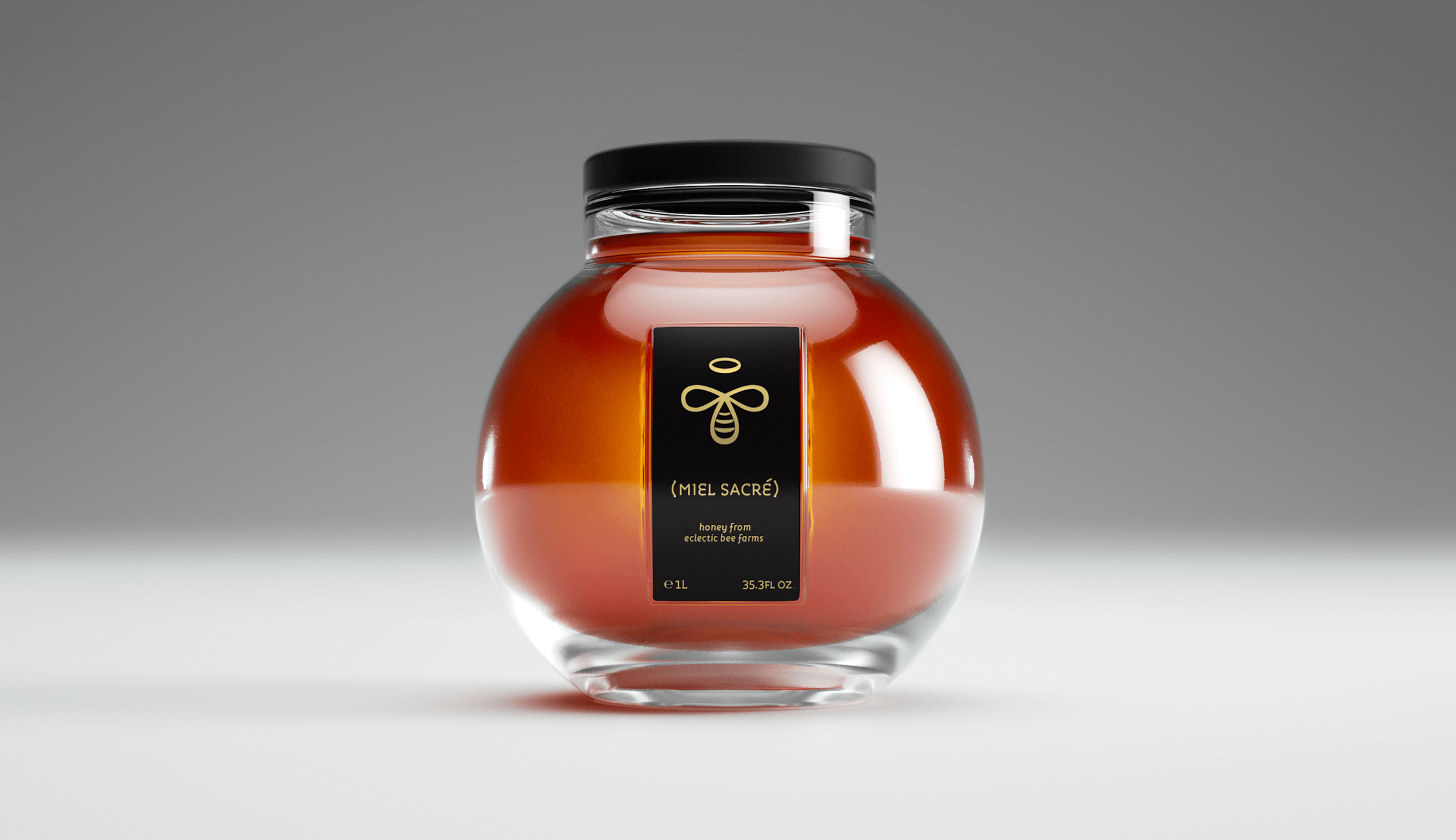
Miel Sacré is a brand developed completely by us. The logo was an initiative project for the French Agricultural Partnership API.

Τo miel sacré αποτελεί μια ολοκληρωμένη πρόταση για συσκευασία μελιού από εμάς. Το λογότυπο σχεδιάστηκε αρχικά για τον γαλλικό συνεταιρισμό API.

After the logo design, we proceeded with the naming and packaging of the product.

Στη συνέχεια, θέλοντας να δείξουμε μια εκδοχή για προϊόν premium αγοράς, δημιουργήσαμε, σε αντιστοιχία με το λογότυπο, το όνομα miel sacré (το άγιο μέλι).

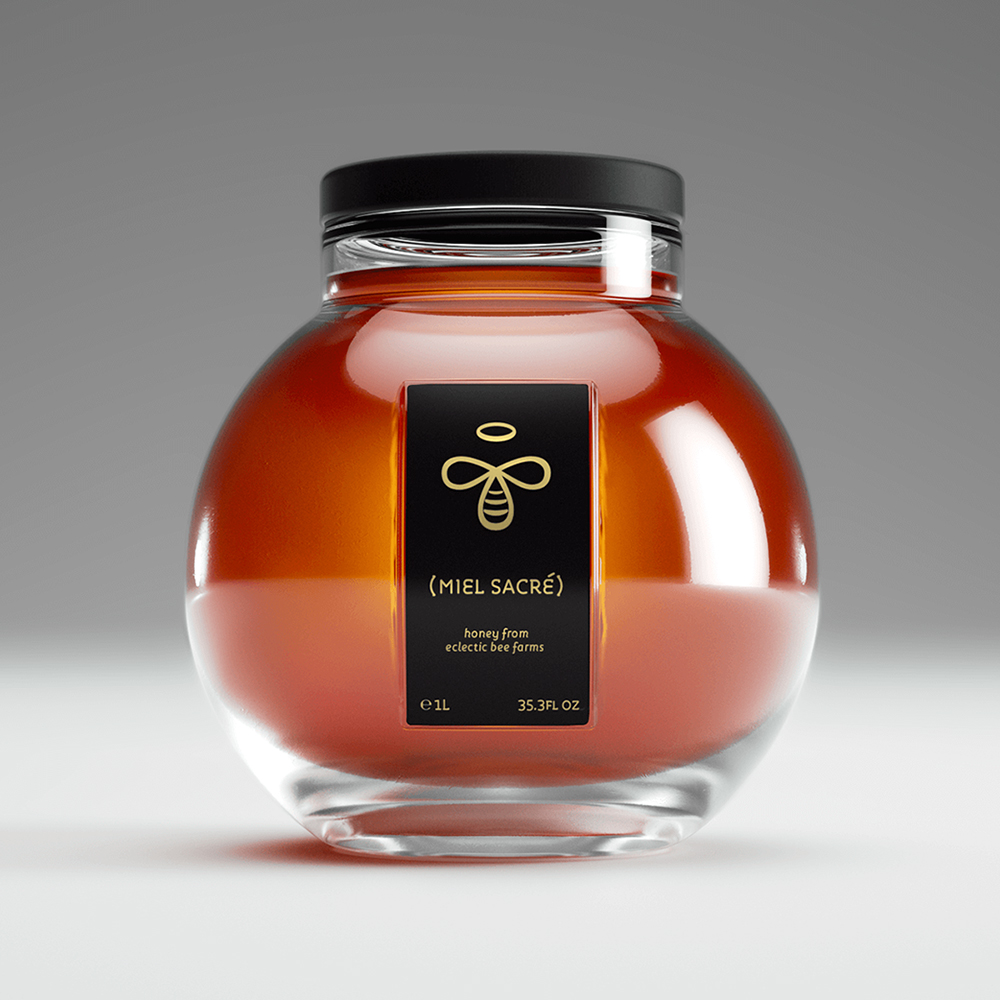
Our proposal consists of a new and bold packaging solution alongside a contemporary visual language.

Η συσκευασία, από το δοχείο έως την ετικέτα, αποτελεί εξ ολοκλήρου σχεδιαστική μας πρόταση.

poseidon med II

poseidon med II

logo, slogan,
campaign identity
2016

λογότυπο, σλόγκαν,
ταυτότητα καμπάνιας
2016

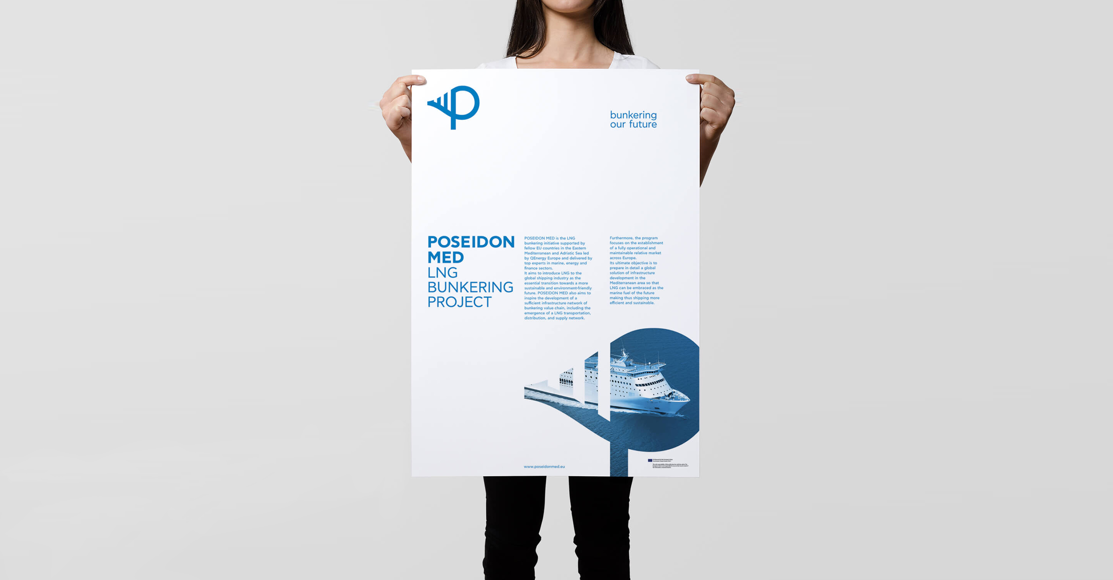
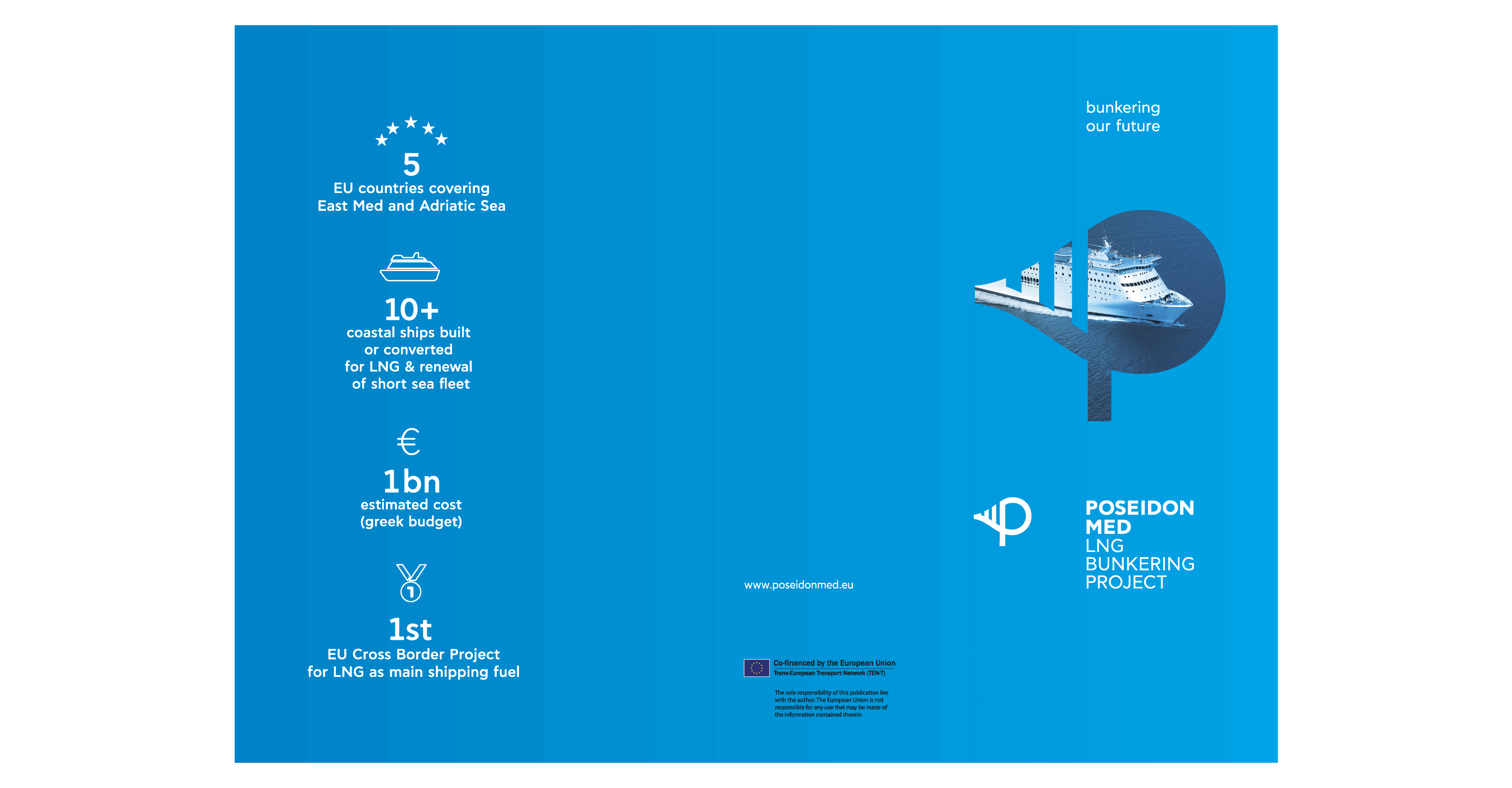
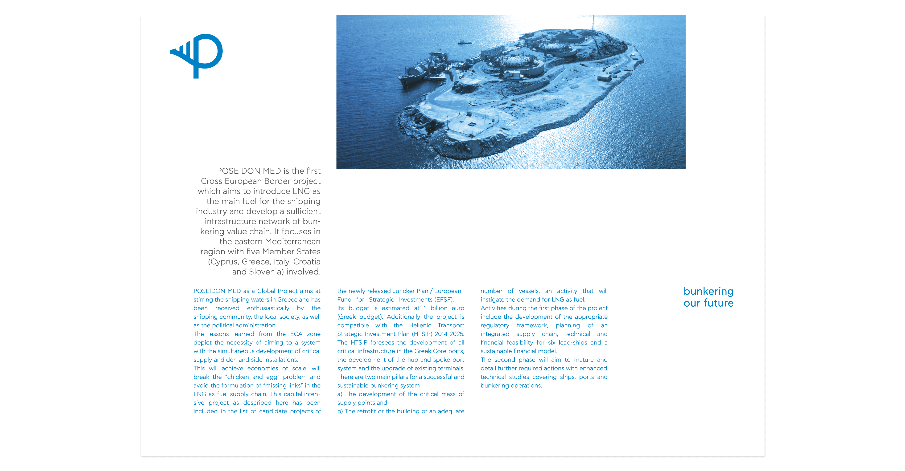
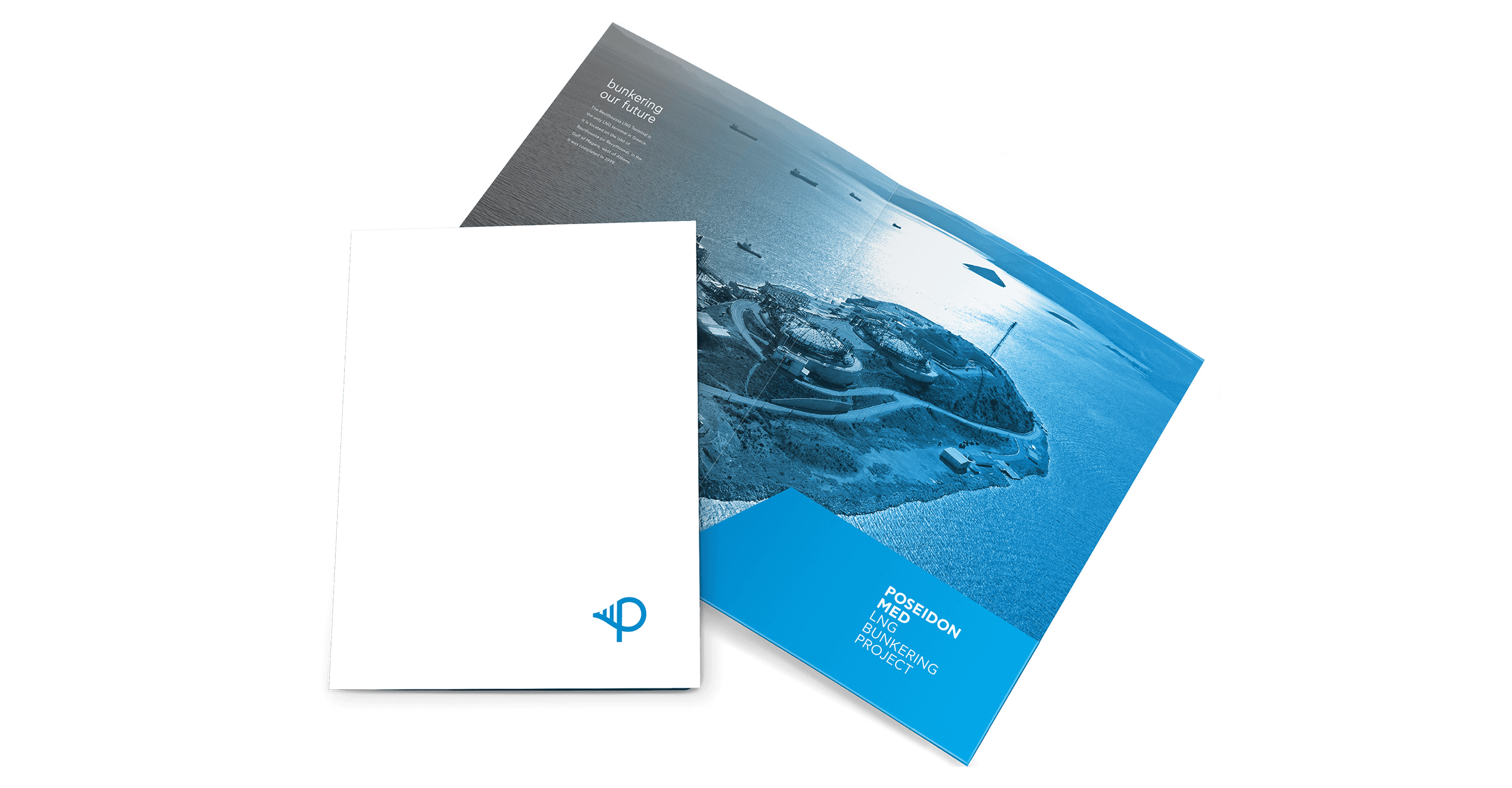
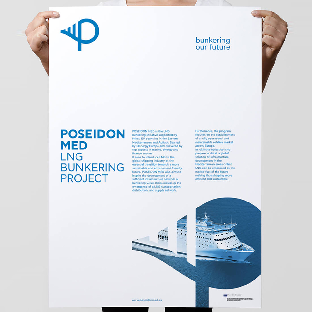
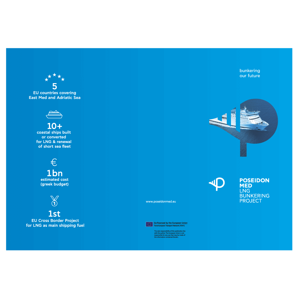
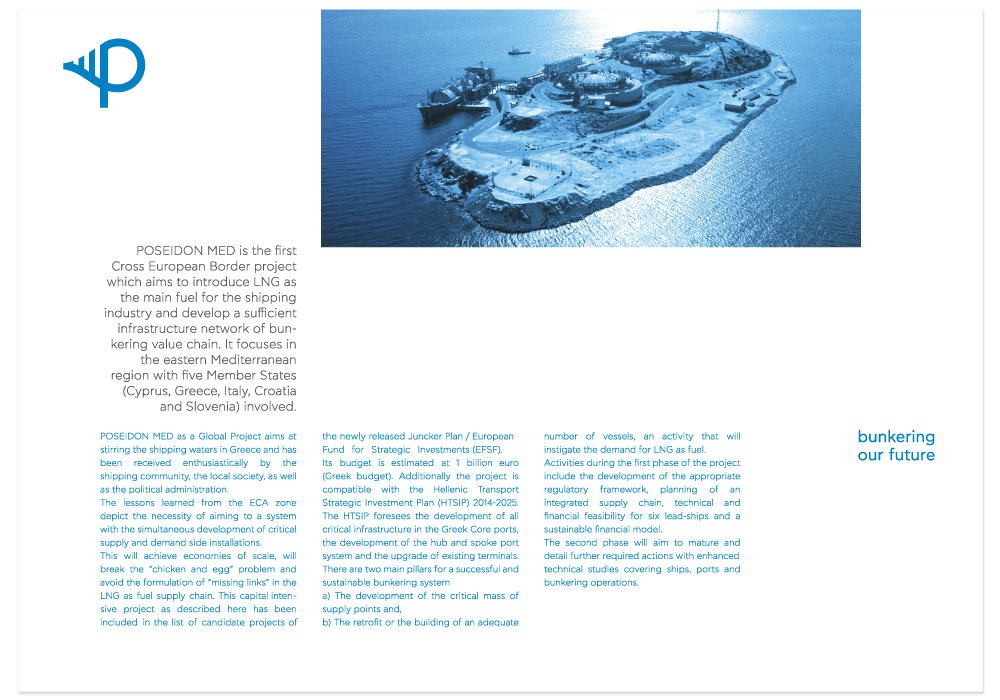
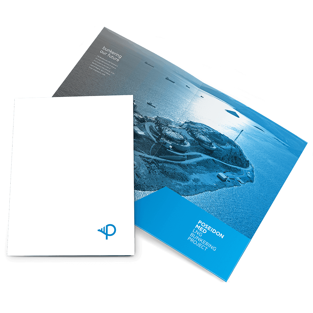
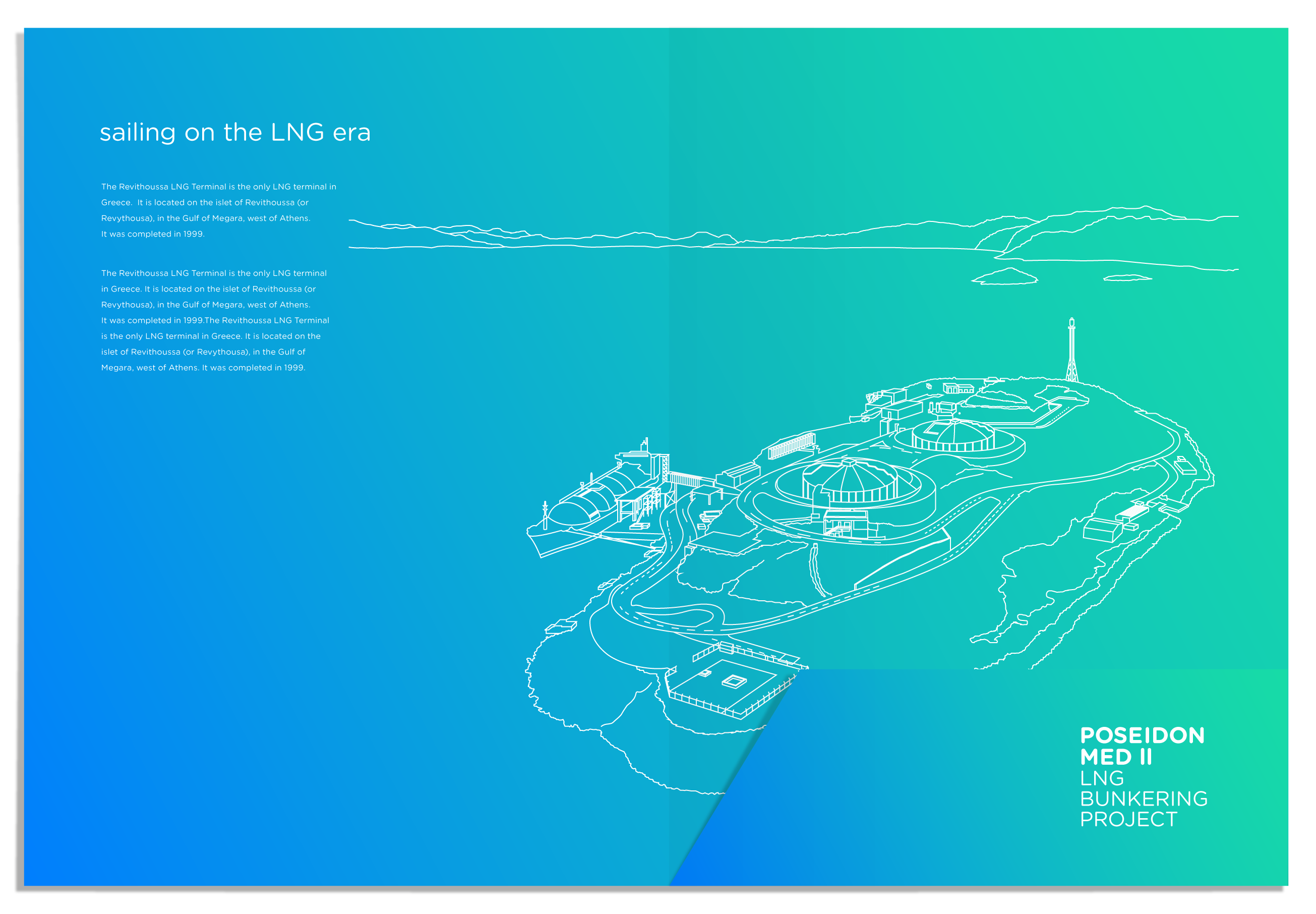
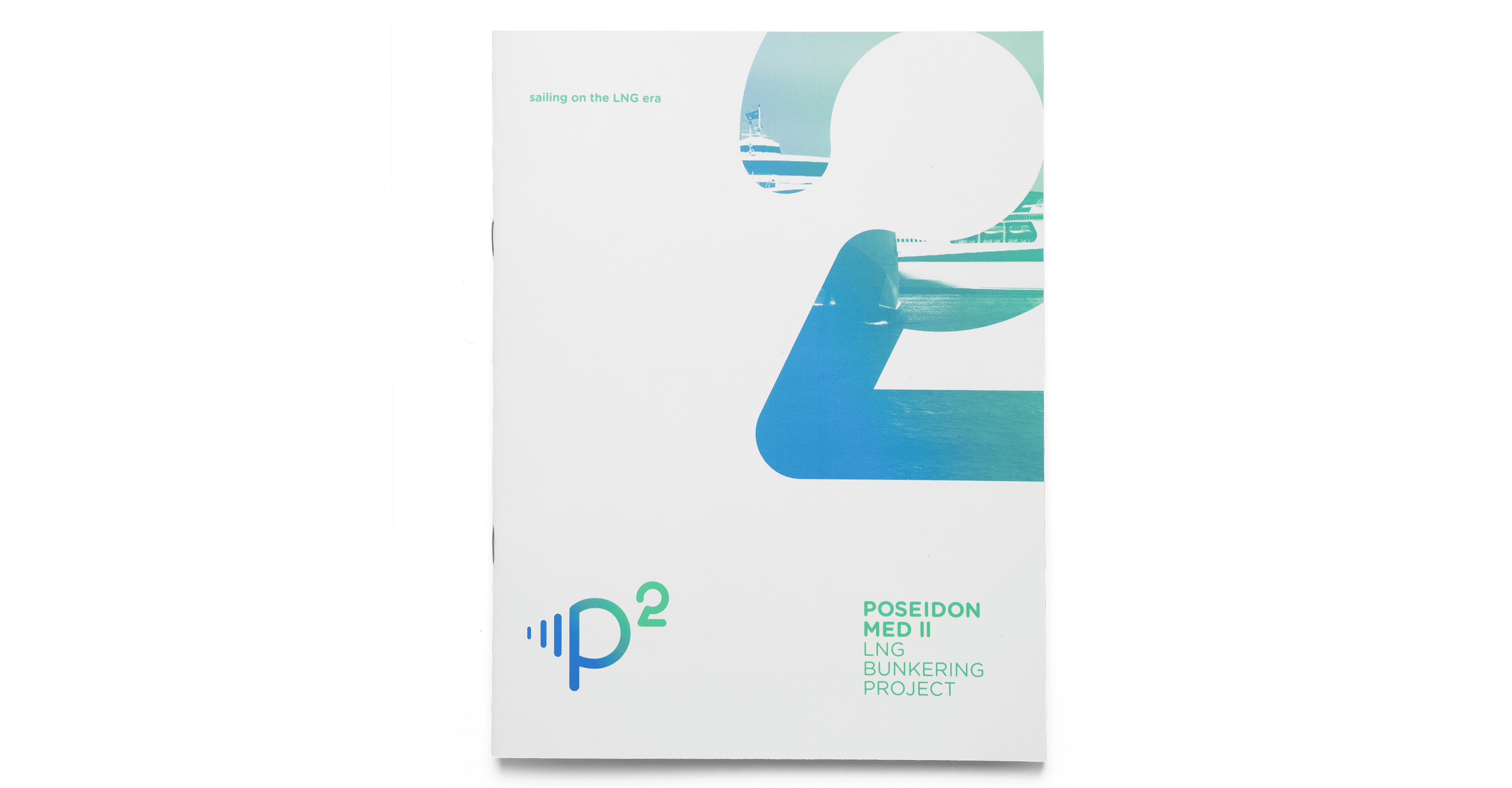
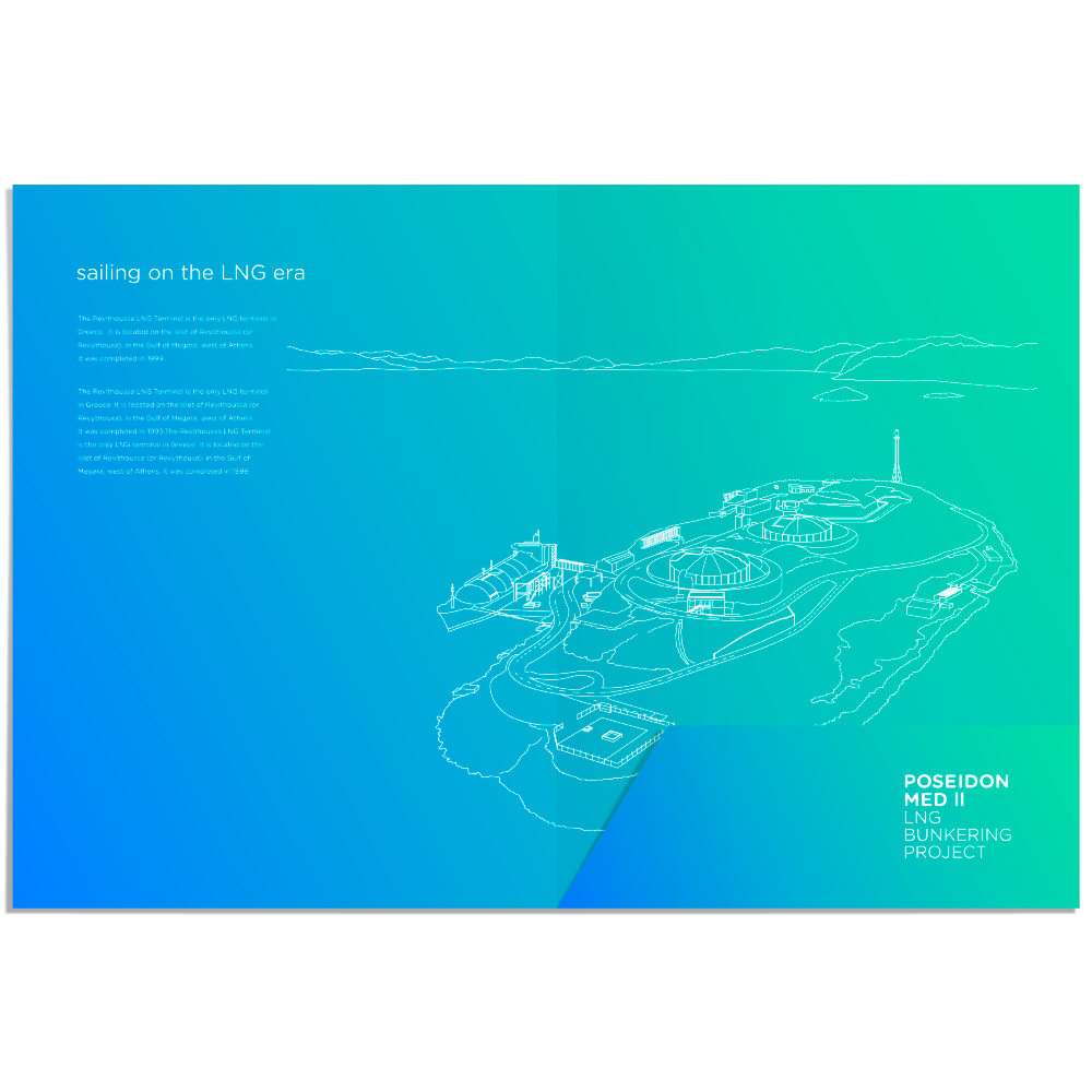
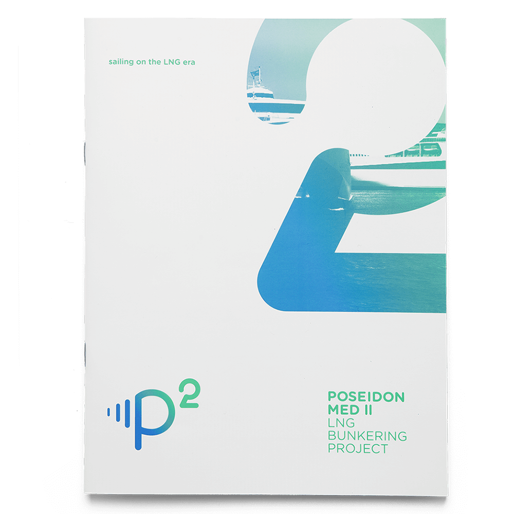
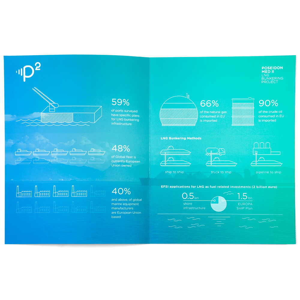
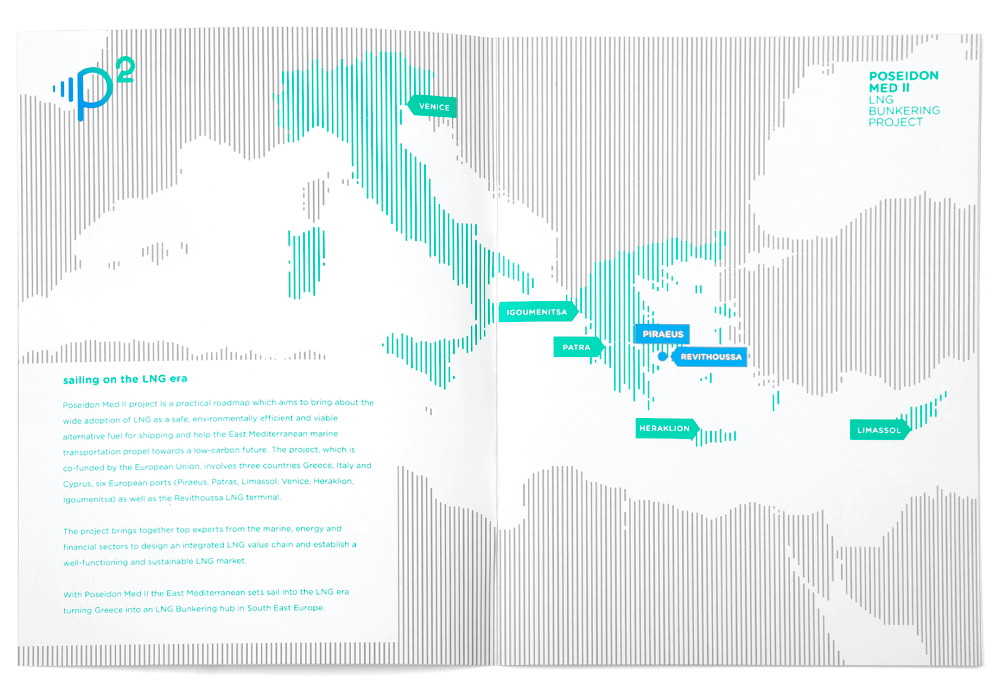
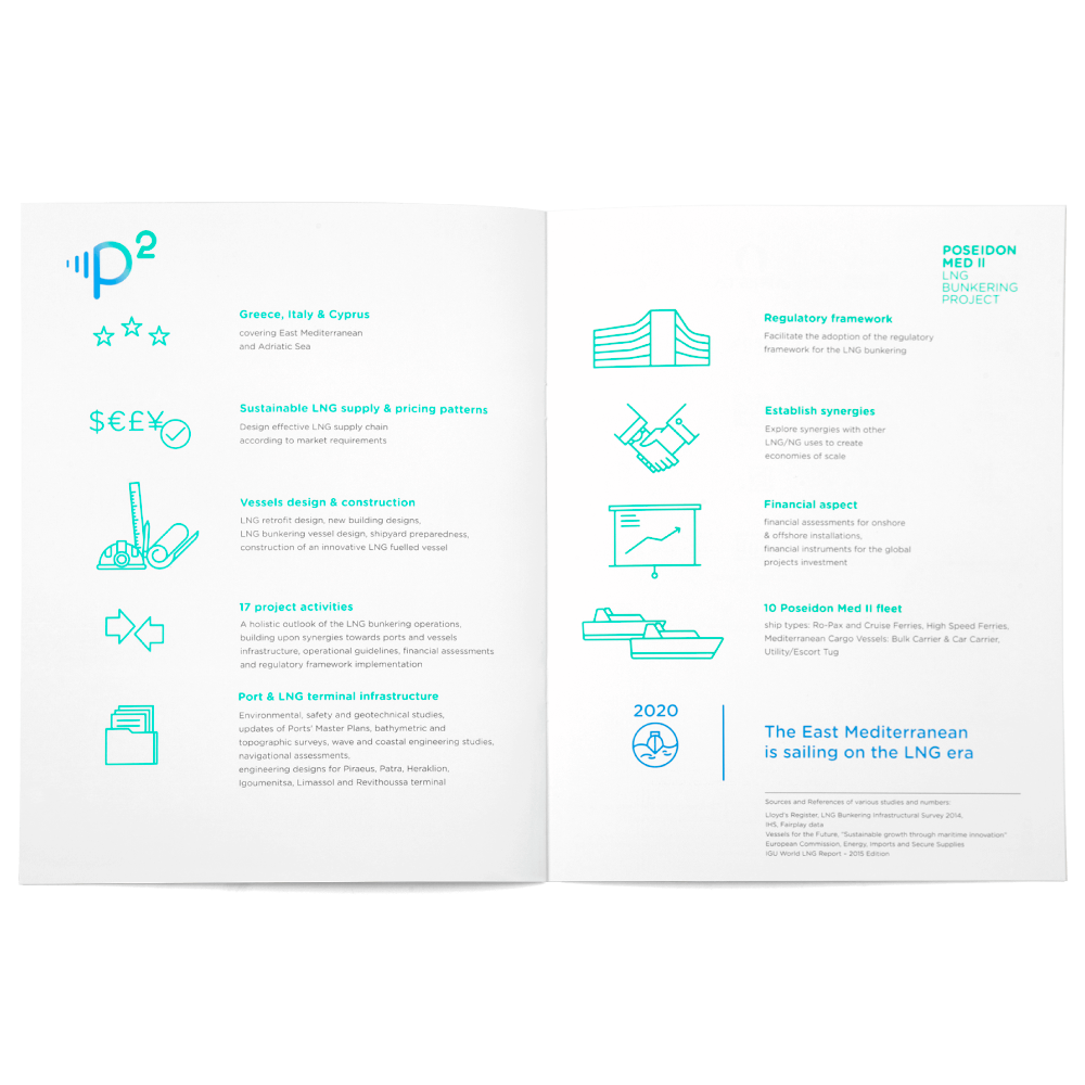
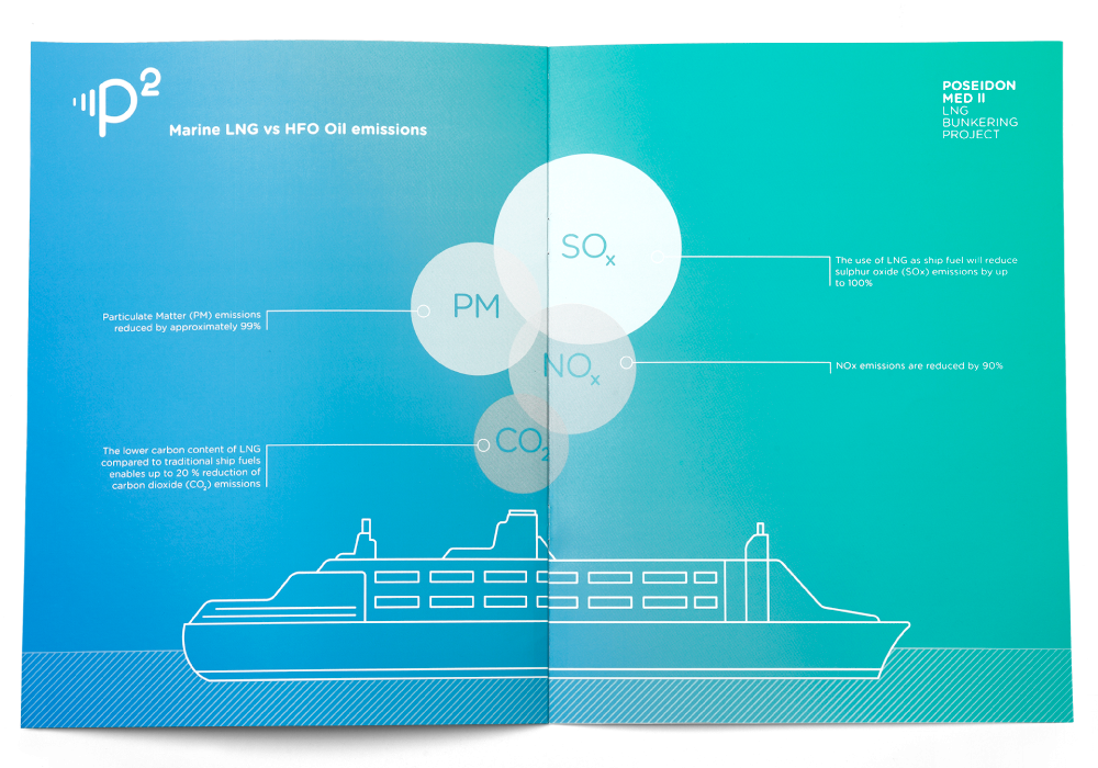
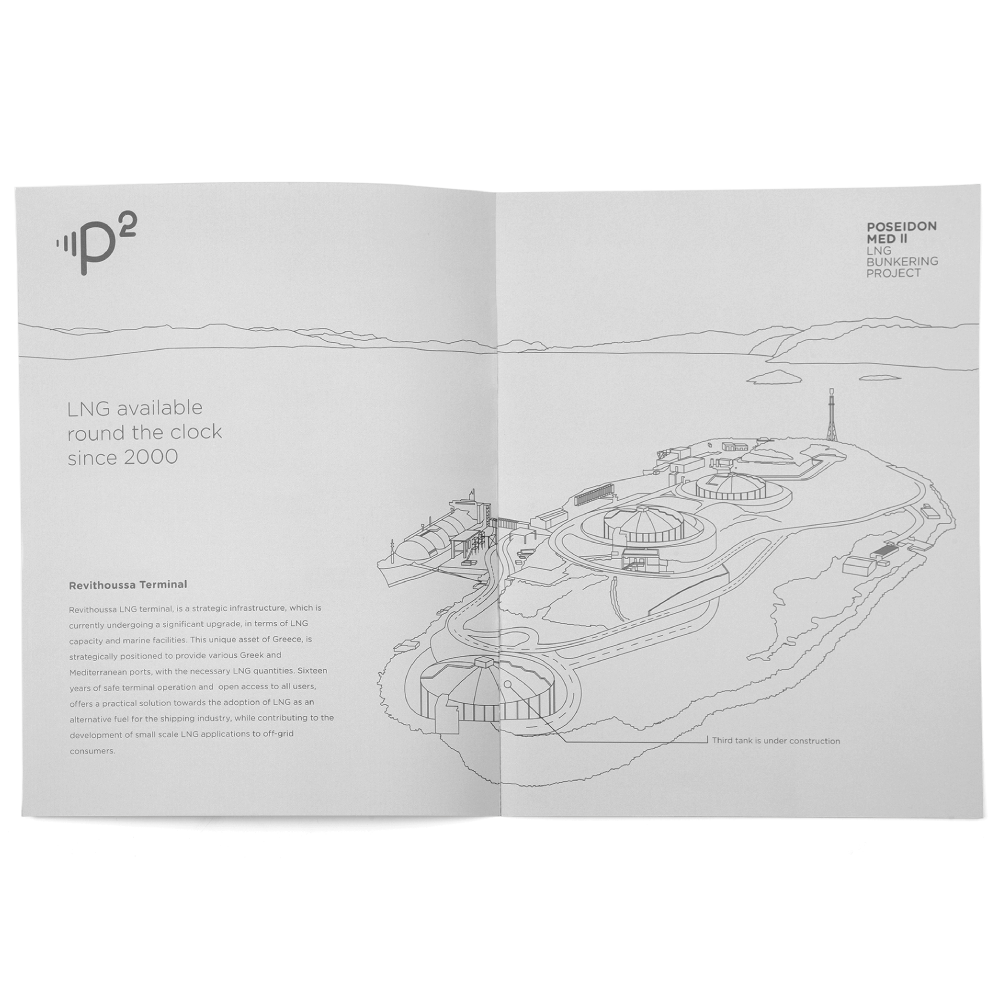
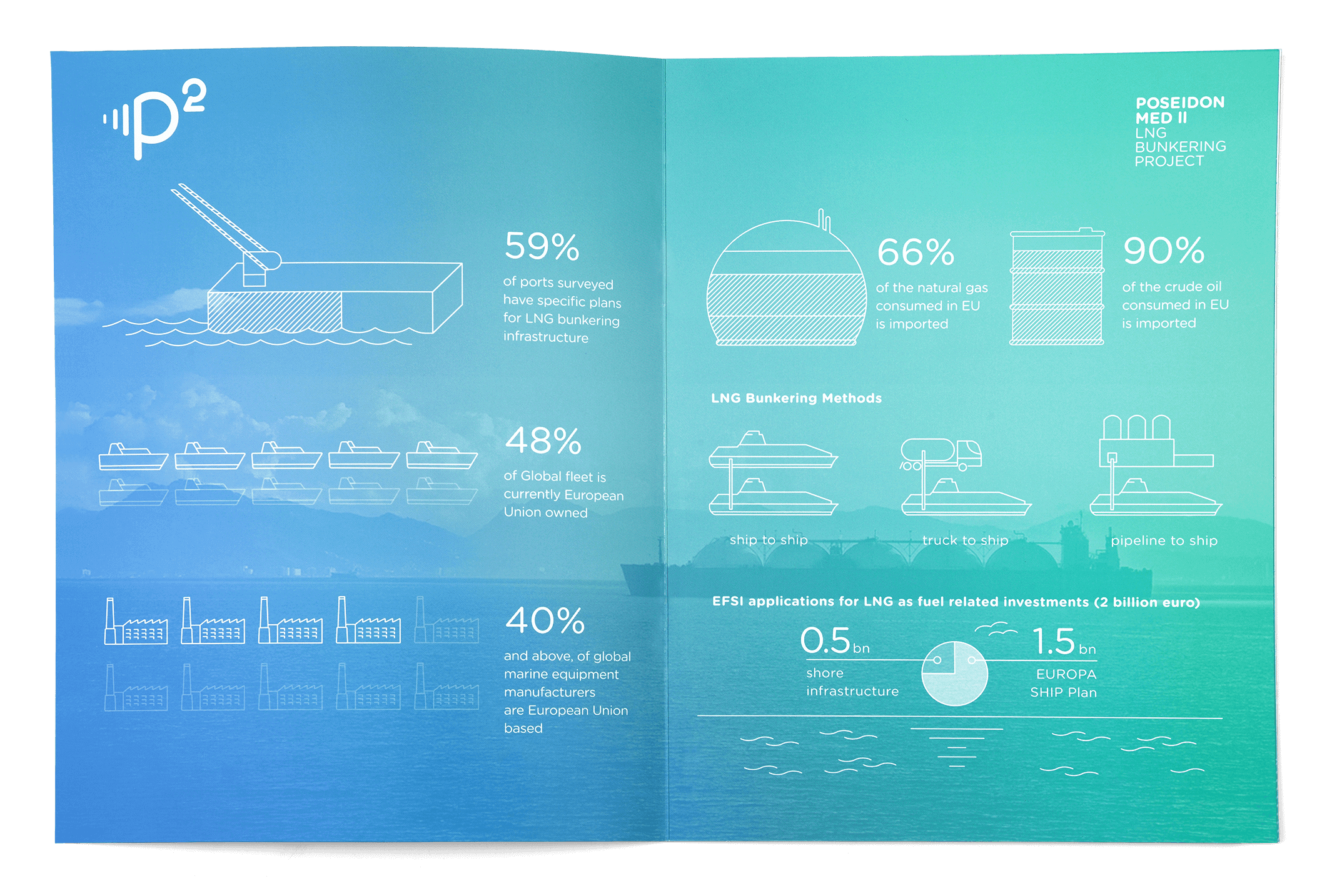
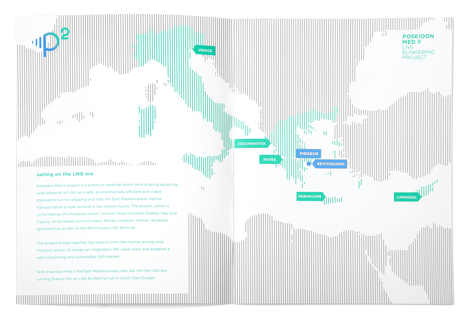
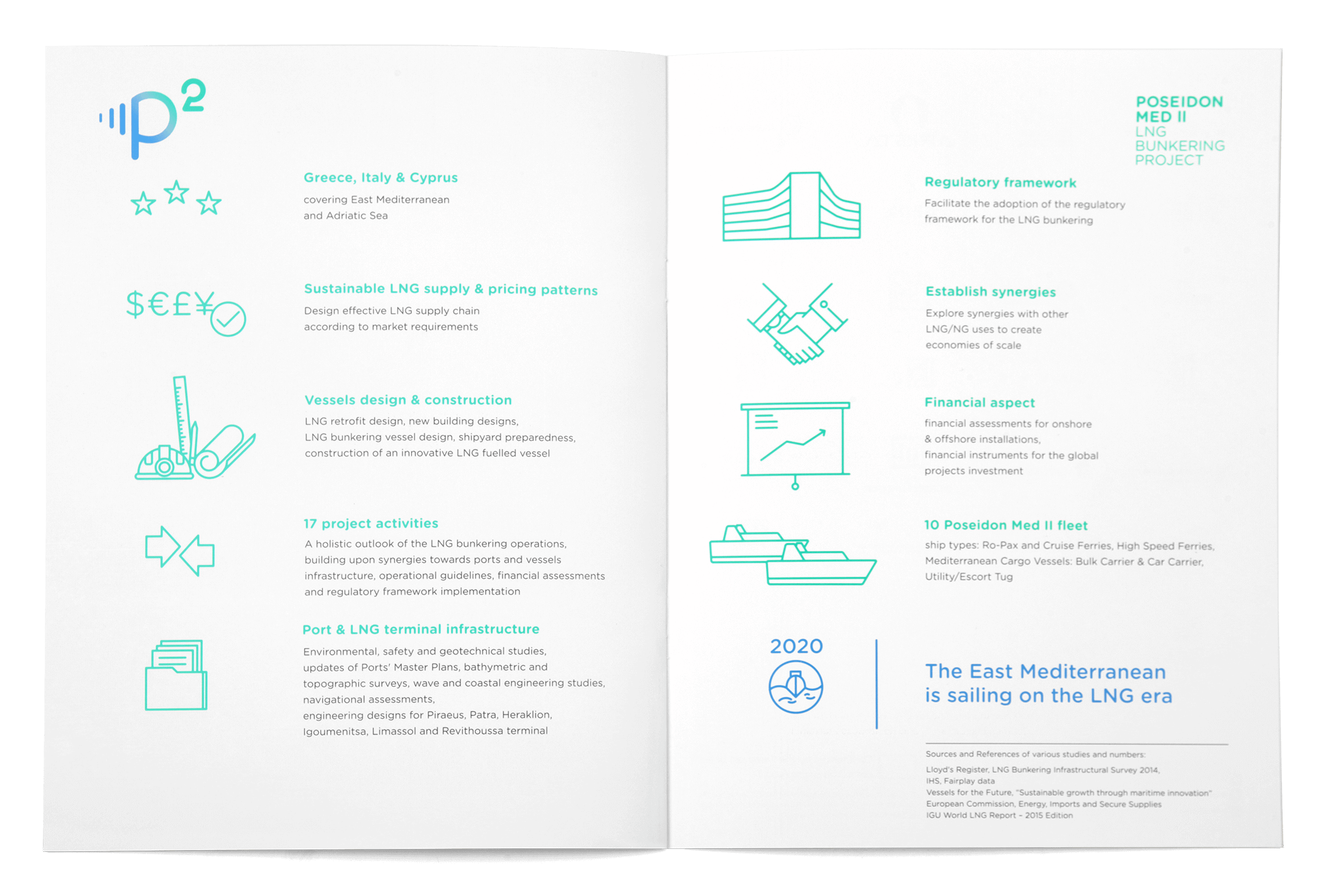
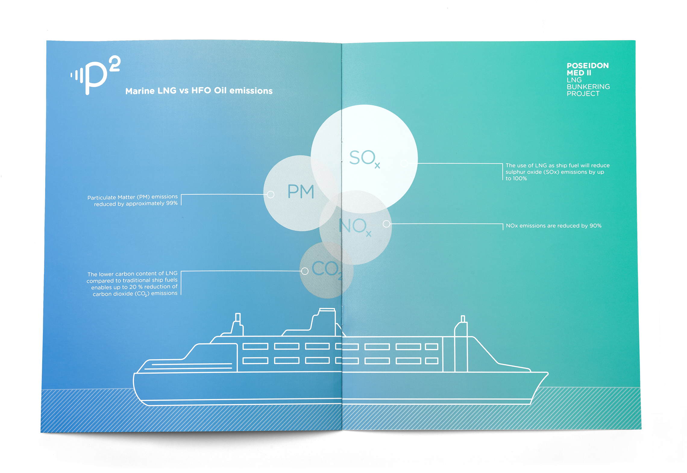
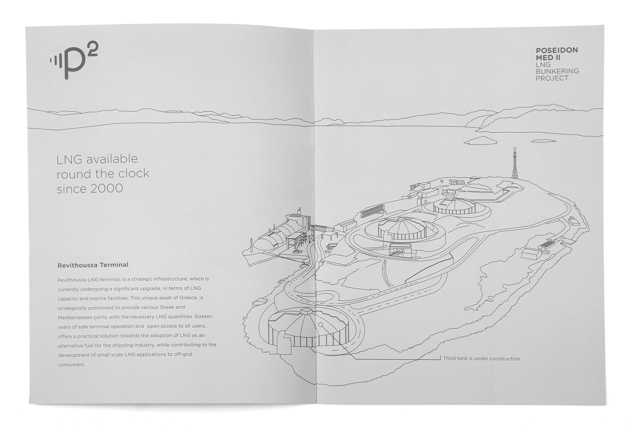
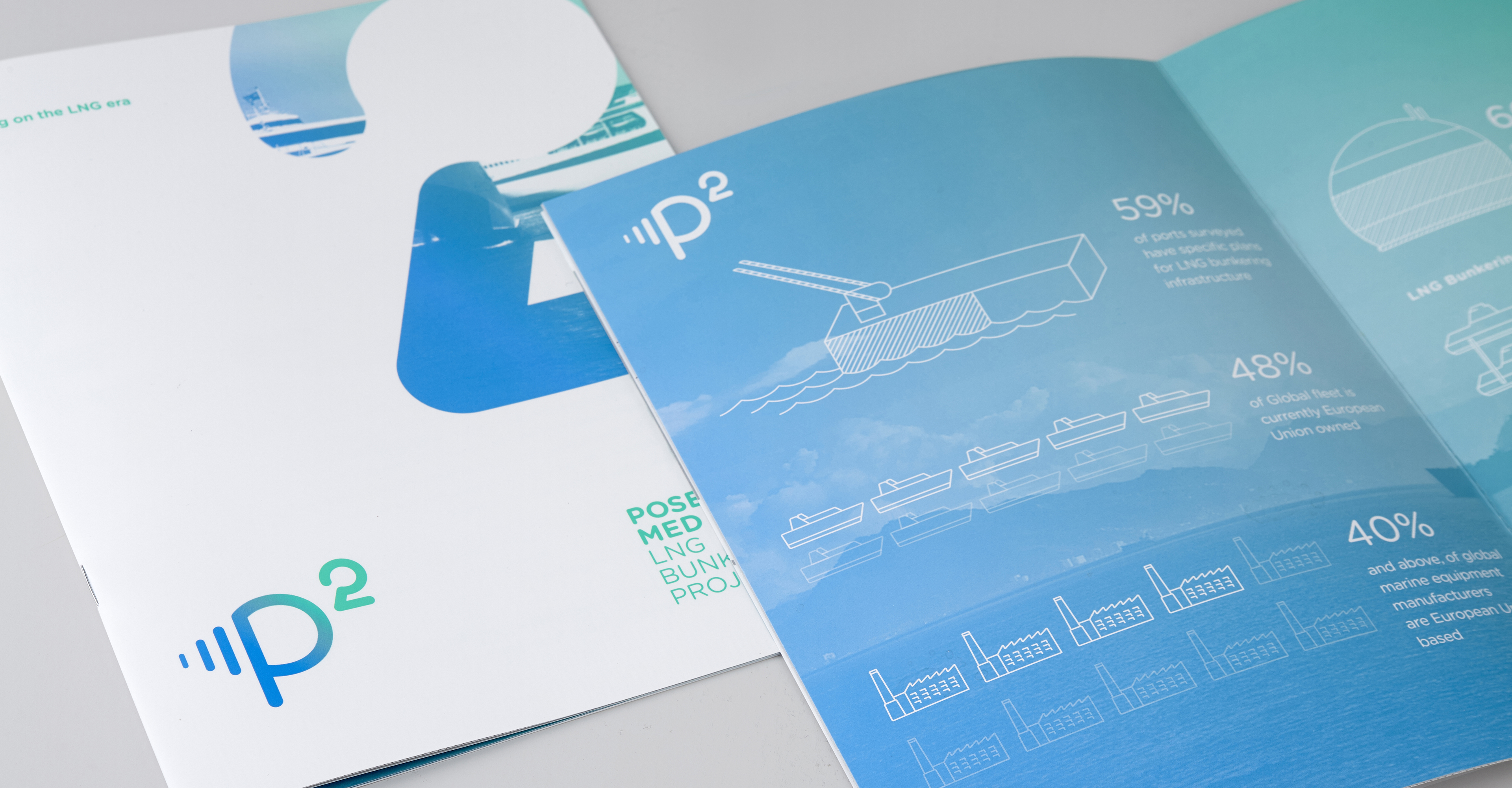
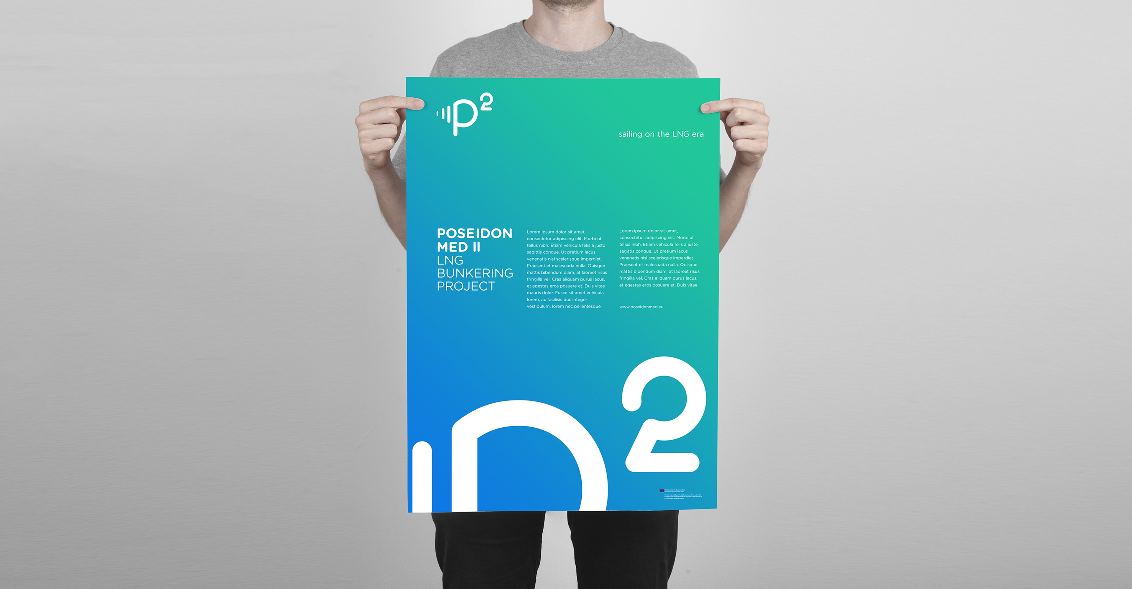
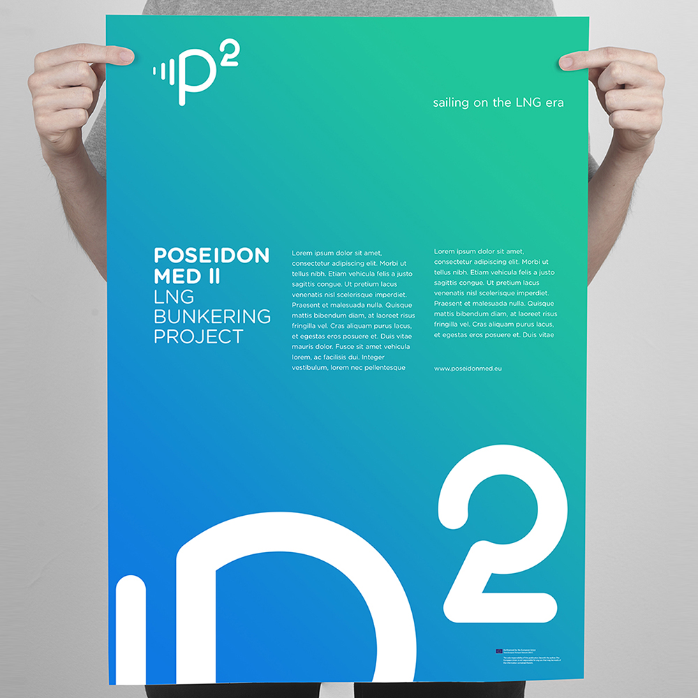
Poseidon MED II is the next phase of the Poseidon MED LNG Bunkering Project that serves the purpose of the transition from oil to natural gas ships. The main leader of the project is DEPA, who also presented this initiative along with the new logo in the European Parliament in February 2016.

Το Poseidon Med II είναι η επόμενη φάση του Poseidon Med LNG Bunkering Project που έχει ως σκοπό του την μετάβαση του καυσίμου των εμπορικών πλοίων από πετρέλαιο σε φυσικό αέριο. Ηγέτης του project είναι η ΔΕΠΑ, που παρουσίασε αυτή την πρωτοβουλία μαζί με το νέο λογότυπο στο Ευρωκοινοβούλιο το Φεβρουάριο του 2016.

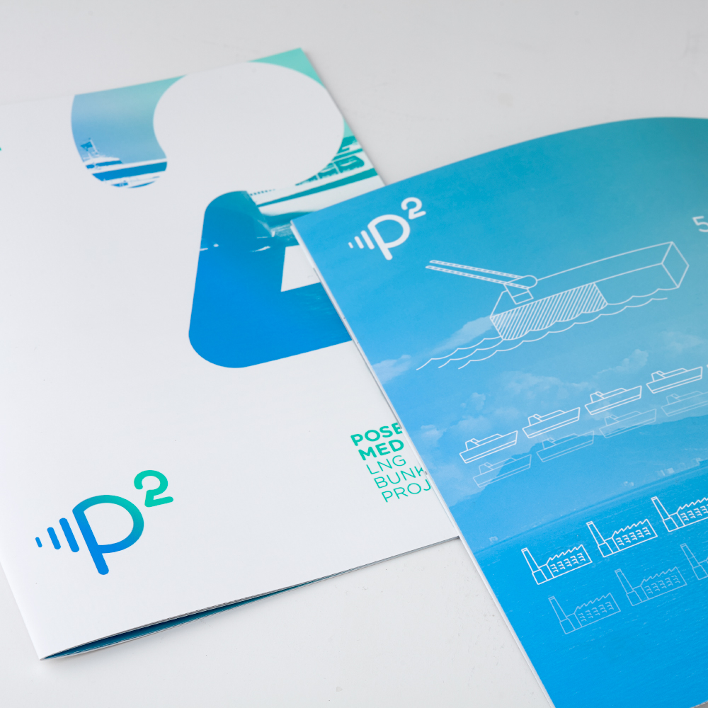
Our objective for the new identity was to further highlight the transition to a greener future.

Ο στόχος μας για την καινούργια ταυτότητα ήταν να αναδείξουμε ακόμα περισσότερο τη μετάβαση προς ένα πιο πράσινο μέλλον.

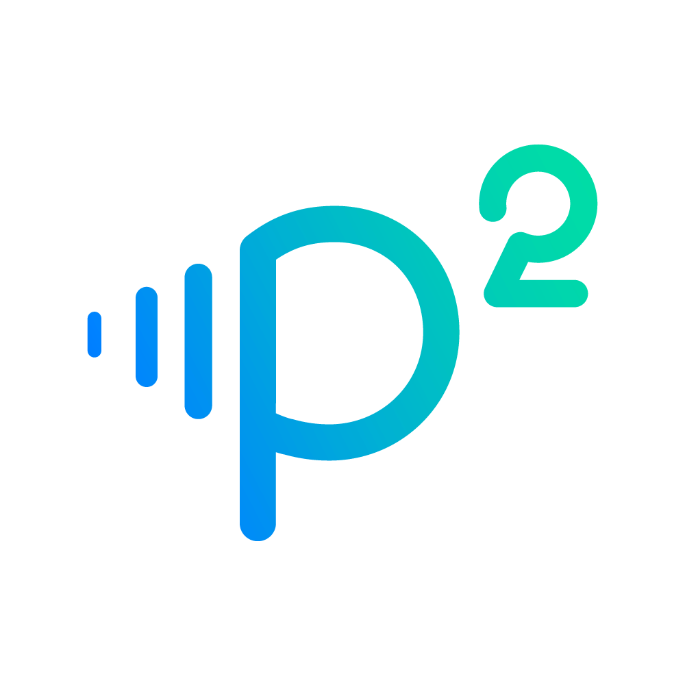
The revamp process included many core areas of refinement. An update of the typeface and a new vivid color range instead of a single color, emphasis on a friendlier approach and a more contemporary feeling, to match the ambitions of the project.

Η διαδικασία της επαναδημιουργίας περιείχε πολλές κομβικές ενότητες ανανέωσης. Μια αναβάθμιση στην γραμματοσειρά και μια νέα έντονη χρωματική γκάμα, αντί απλώς ενός χρώματος, δίνουν έμφαση σε μια πιο φιλική προσέγγιση και αναδίδουν ένα πιο σύγχρονο προφίλ, έτσι ώστε να ταιριάξει με τις φιλοδοξίες του ίδιου του project.

Along with the new logotype, we also created a new slogan for the Poseidon MED II campaign. “Sailing on the LNG era”.

Παράλληλα με το καινούργιο λογότυπο, δημιουργήσαμε ένα καινούργιο σλόγκαν για την καμπάνια του Poseidon Med II. “Sailing on the LNG era”.

poseidon_mobile17
poseidon_mobile5
poseidon_mobile8

worldbridge

worldbridge

visual identity,
rebranding
2018

οπτική ταυτότητα
2018

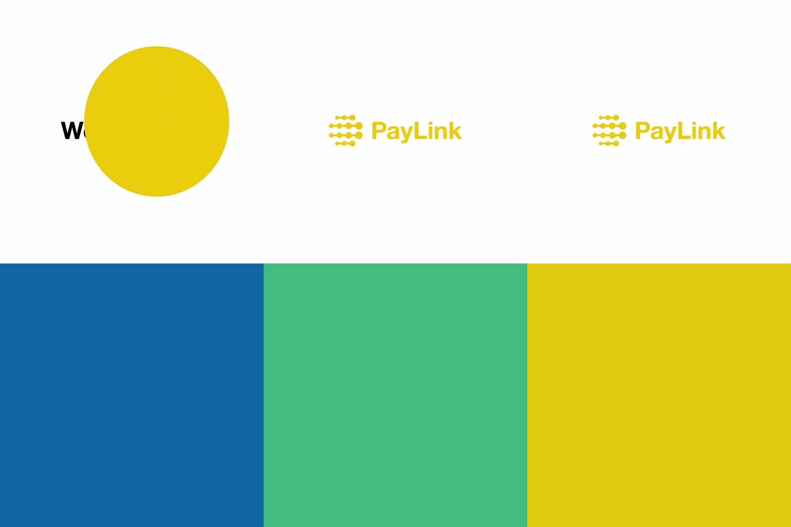
WorldBridge is a payment institution and a Western Union representative in Greece. In 2014 we created their brand name and designed the paylink network logo that marked the stores using WU services.

H WorldBridge είναι ένα ίδρυμα πληρωμών και αποκλειστικός αντιπρόσωπος της Western Union στην Ελλάδα. Το 2014 είχαμε δημιουργήσει το όνομα και σχεδιάσει το λογότυπο του δικτύου paylink που σηματοδοτούσε τα καταστήματα που χρησιμοποιούσαν τις υπηρεσίες της WU.

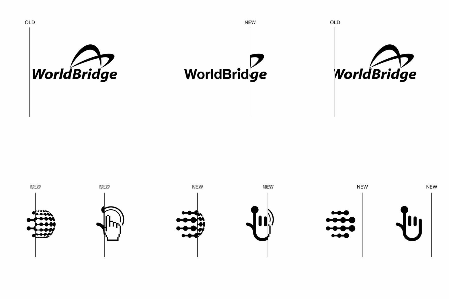
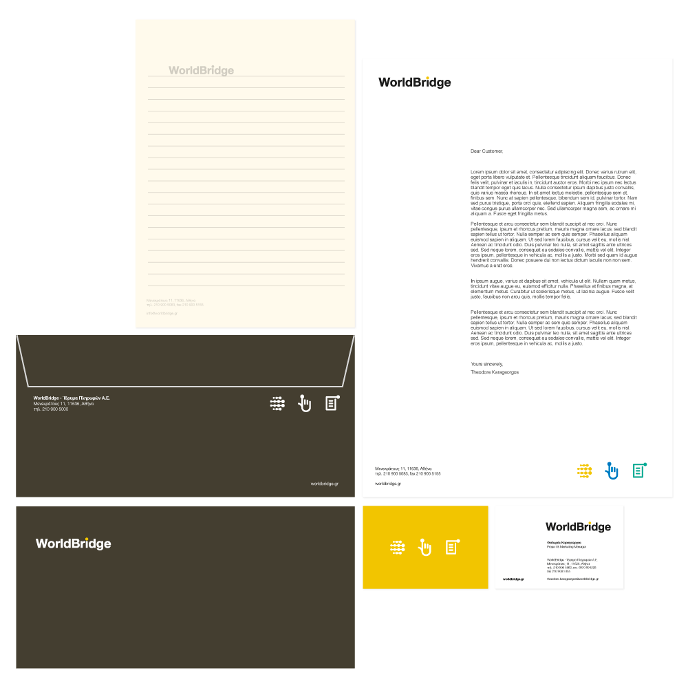
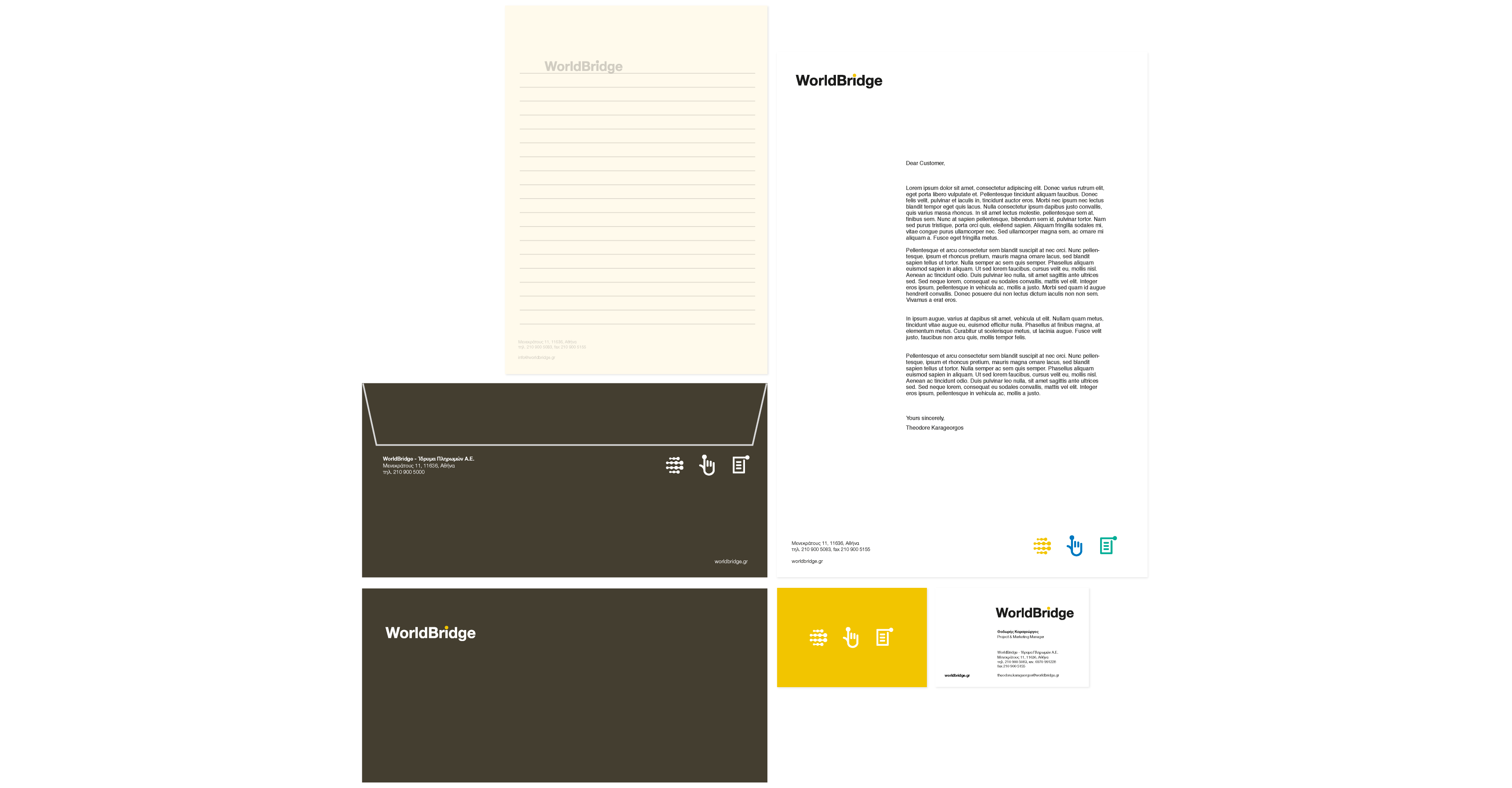
In 2018, we were tasked with designing the entire corporate identity that includes the WorldBridge central brand logo and applications as well as the three main services it provides.

Το 2018 μας ζητήθηκε να σχεδιάσουμε το σύνολο της εταιρικής της ταυτότητας που περιλαμβάνει το λογότυπο και τις εφαρμογές του κεντρικού σήματος WorldBridge καθώς και των τριών κύριων υπηρεσιών που παρέχει.

Thus, we designed four new logos to meet the B2C needs of the group and to compose the necessary unified visual language for the needs of B2C communication.

Έτσι σχεδιάσαμε εξαρχής τέσσερα νέα λογότυπα, αφενός που να ανταποκρίνονται στις Β2C ανάγκες του ομίλου, και αφετέρου να συνθέτουν την απαραίτητη ενιαία οπτική γλώσσα για τις ανάγκες της B2C επικοινωνίας.

In this challenging project, we took some bold but also very thoughtful design decisions to make an identity that is contemporary and at the same time a continuation of the previous visual language.

Σε αυτό το δύσκολο project πάρθηκαν τολμηρές αλλά καλά νοημένες αποφάσεις ώστε η ταυτότητα να είναι σύγχρονη και ταυτόχρονα να αποτελεί συνέχεια της προηγούμενης οπτικής γλώσσας.

paylink

paylink

brand name, logo, taglines
2014

ονοματολογία,
λογότυπο,
σλόγκαν
2014

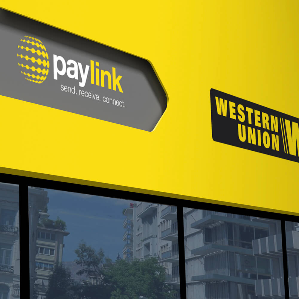
Paylink is part of the WorldBridge – Payment Institution. It refers to the retail stores network offering the Western Union services.

Η paylink είναι μέρος της WorldBridge – Ινστιτούτου Πληρωμών. Αφορά το δίκτυο καταστημάτων από τα οποία προσφέρονται πανελλαδικά οι υπηρεσίες πληρωμών της Western Union.

Our aim was to make paylink seem an accessible and easy to use service for everybody. Initially, we developed the name and the slogan to start off this brand.

Mας ζητήθηκε αρχικά μέσα από την οπτική ταυτότητα και ένα νέο όνομα να αναδείξουμε το paylink ως προσβάσιμη και εύκολη στη χρήση υπηρεσία για όλους. Αρχικά ξεκινήσαμε με το όνομα και το slogan της εταιρείας.

Later on, we designed the logo that is based on the idea of safety and corporate responsibility as well as the internationality and global connections the brand provides.

Αργότερα σχεδιάσαμε το λογότυπο βασισμένο στην ιδέα της ασφάλειας και της εταιρικής ευθύνης, όπως επίσης της διεθνικότητας και των παγκόσμιων συνδέσμων που η εταιρεία παρέχει με τις υπηρεσίες της.

We also thought of a new visual identity to further complement the new logo.

Σκεφτήκαμε επίσης μια νέα οπτική ταυτότητα για να συμπληρώσουμε περαιτέρω το νέο λογότυπο.

poopytrap

poopytrap

product identity
& packaging
2016

σχεδιασμός ταυτότητας
προϊόντος και συσκευασίας
2016

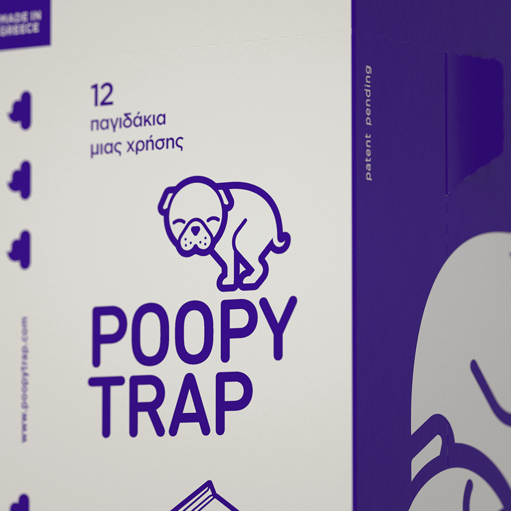
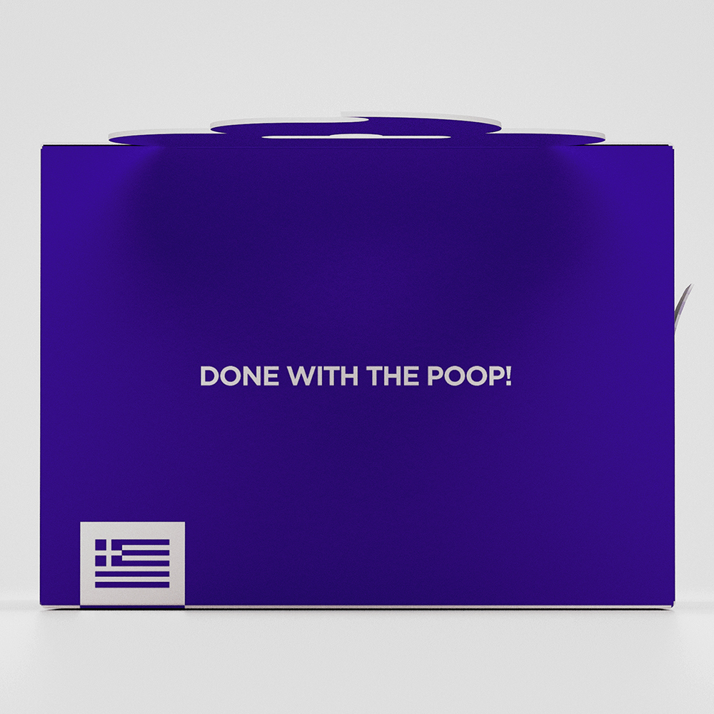
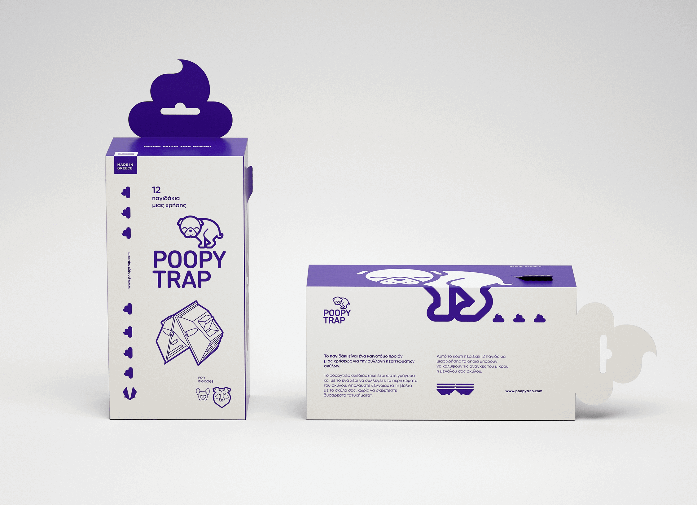
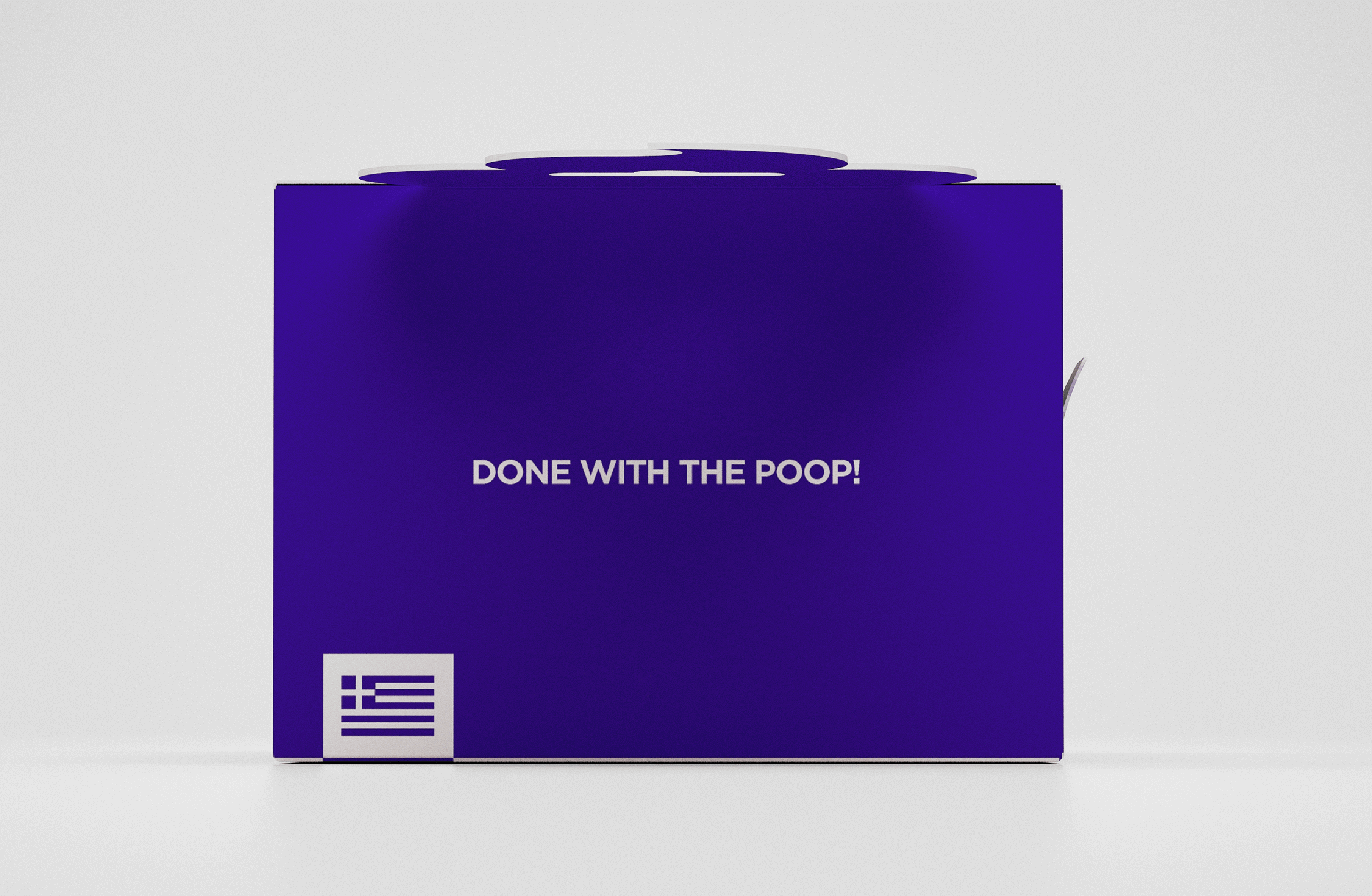
Poopytrap is an innovative product for pet care, whose ergonomic design makes collecting and discarding pet waste much easier.

Το poopytrap είναι ένα πρωτοποριακό προϊόν για την φροντίδα των κατοικίδιων ζώων το οποίο, μέσα από τον εργονομικό σχεδιασμό του, διευκολύνει την συλλογή και ασφαλή απόρριψη των περιττωμάτων.

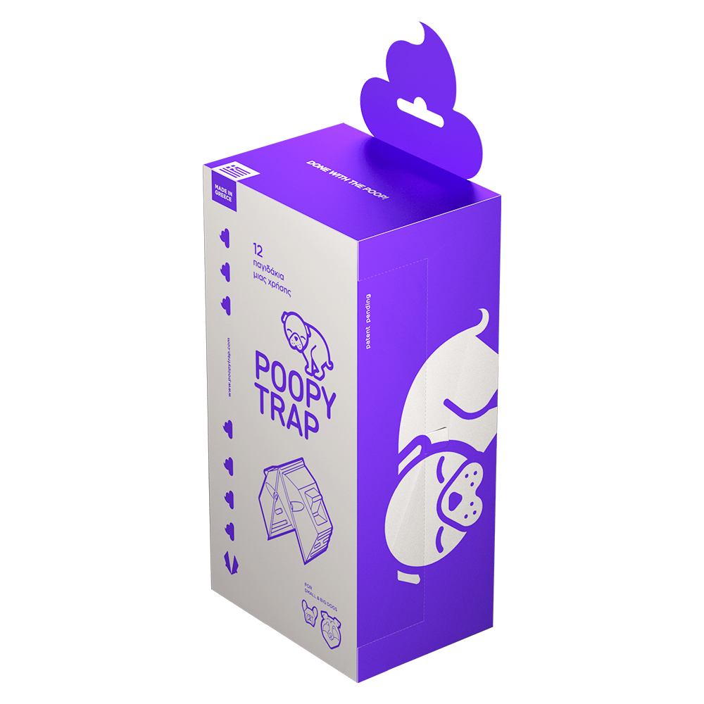
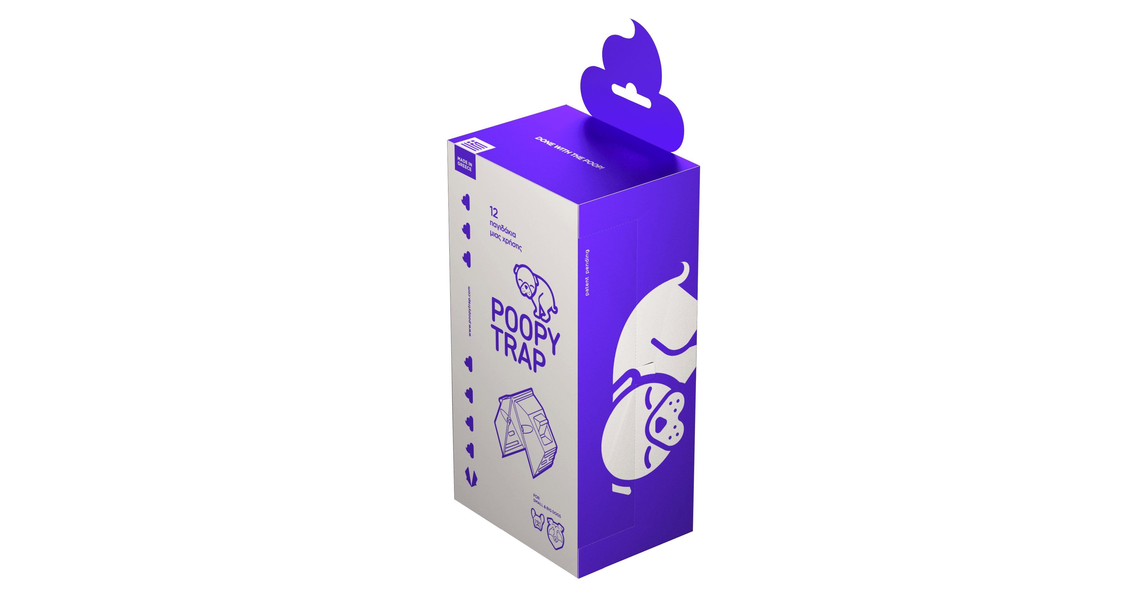
Design-wise, our target was to promote the pioneering nature of the product as well as portraying the whole process of waste collecting as a less unpleasant procedure.

Σχεδιαστικά, ο στόχος μας ήταν να προωθήσουμε την καινοτόμο φύση του προϊόντος, καθώς και να απεικονίσουμε την διαδικασία της συλλογής περιττωμάτων ως λιγότερο δυσάρεστη.

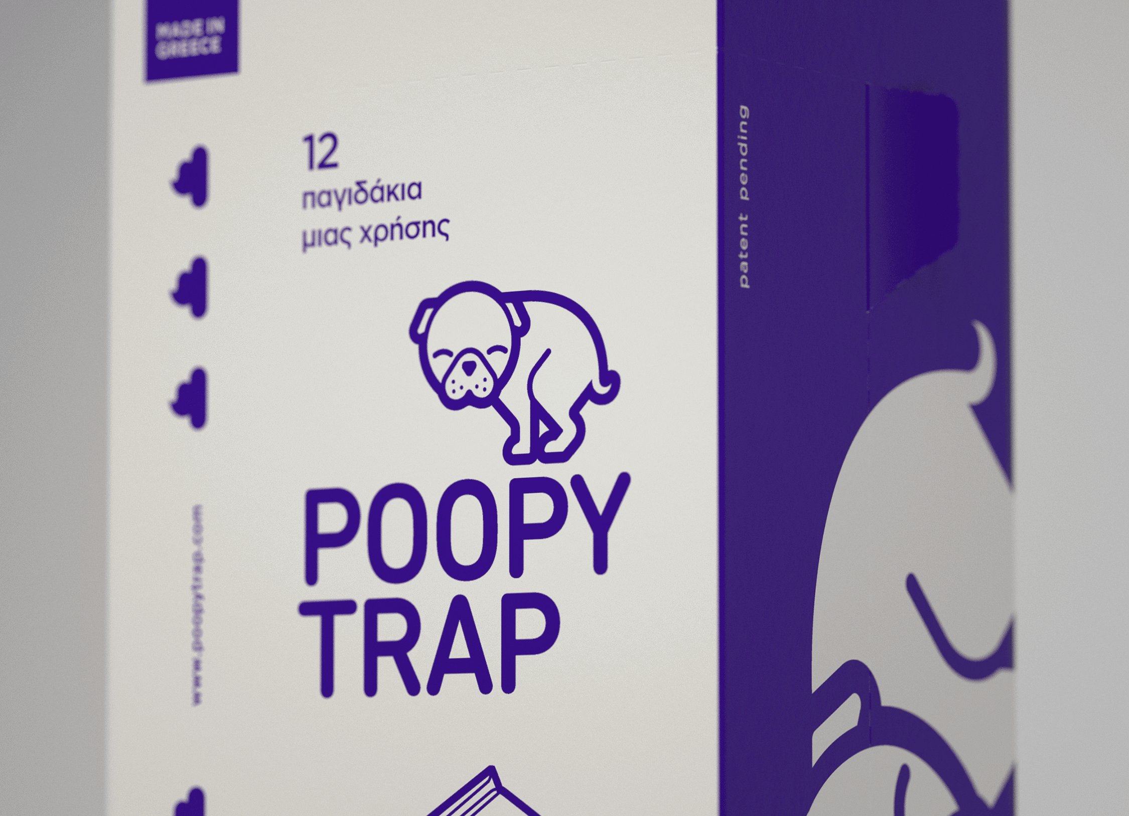
We achieved that by not hiding the process but rather by promoting it in a more illustrative and humorous way.

Με αυτό το σκεπτικό, αντί να κρύψουμε την διαδικασία αυτή, την προωθήσαμε με έναν χιουμοριστικό και εικονογραφικό χαρακτήρα.

This concept was followed not only for the logo but for the packaging design as well.

Το συγκεκριμένο concept ακολουθήσαμε στο σχεδιασμό της ταυτότητας του προϊόντος αλλά και της συσκευασίας του.

soul food

soul food

poster design
2018

σχεδιασμός αφίσας
2018

Soul food is a newly established contemporary multi-use art space in Tinos Island.

Το Soul Food είναι ένας χώρος τέχνης στο νησί της Τήνου.

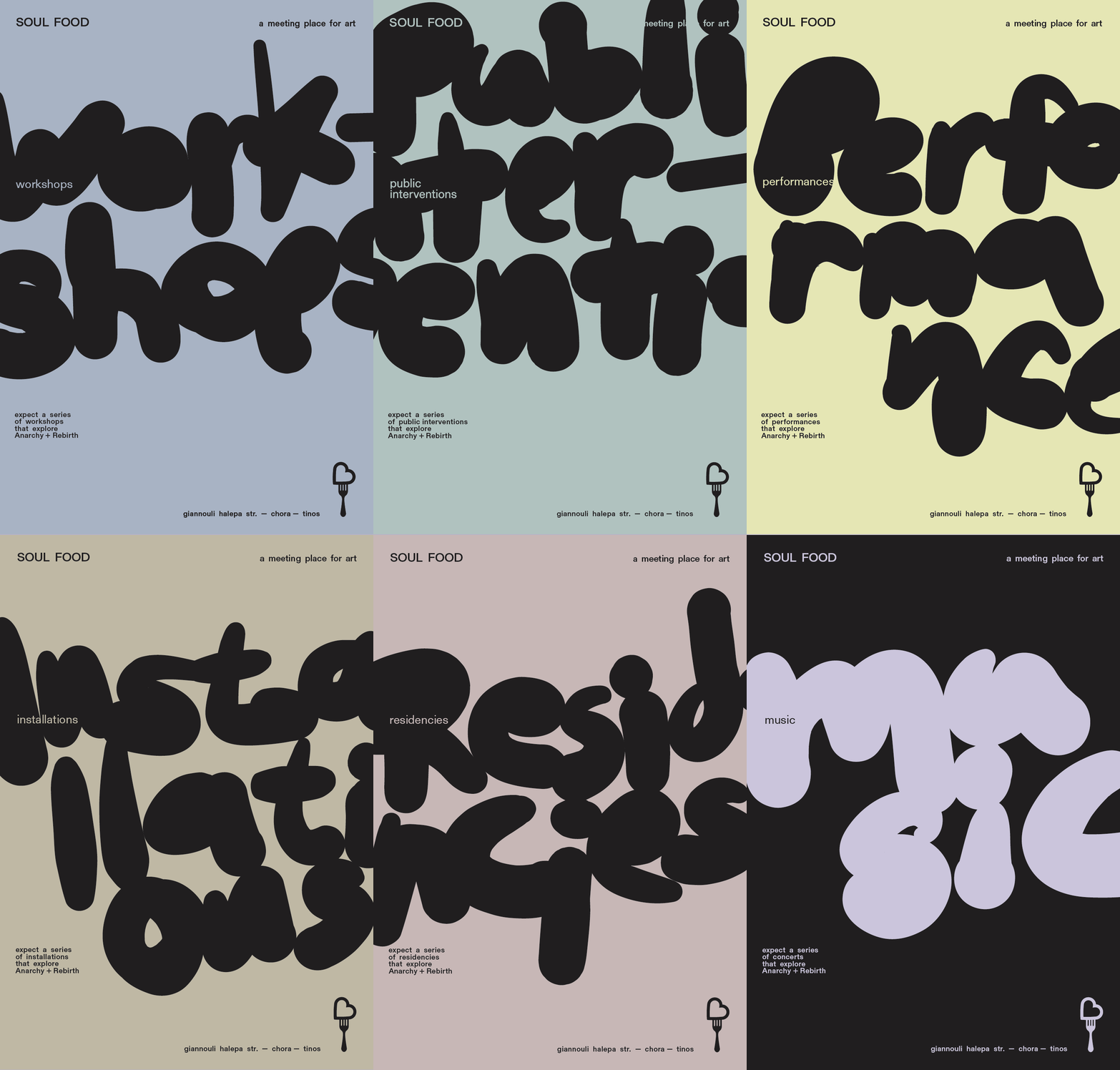
For its opening, we designed a series of posters promoting their services and events.

Για την έναρξη του χώρου σχεδιάσαμε μια σειρά από poster που επικοινωνούν τις δραστηριότητες του.

We created freehand lettering inspired by graffiti scripts in conjunction with a soft color palette for each of the six different posters, as we thought that would be intriguing for the visitors and people of Tinos Island.

Βασική ιδέα ήταν η δημιουργία χειροποίητης γραφής με σχετική συνάφεια με την αισθητική των grafitti, θεωρώντας ότι αυτό θα έχει ενδιαφέρον για τον επισκέπτη και τον κάτοικο του νησιού. Οι μεγάλες επιγραφές συνδυάστηκαν με μια ήπια χρωματική γκάμα, η οποία δημιουργεί μια επιπλέον διαφοροποίηση μεταξύ του περιεχομένου της κάθε αφίσας.

evik

evik

website
visual identity
and packaging
2012-2022

ιστοσελίδα
οπτική ταυτότητα
και συσκευασία
2012-2022

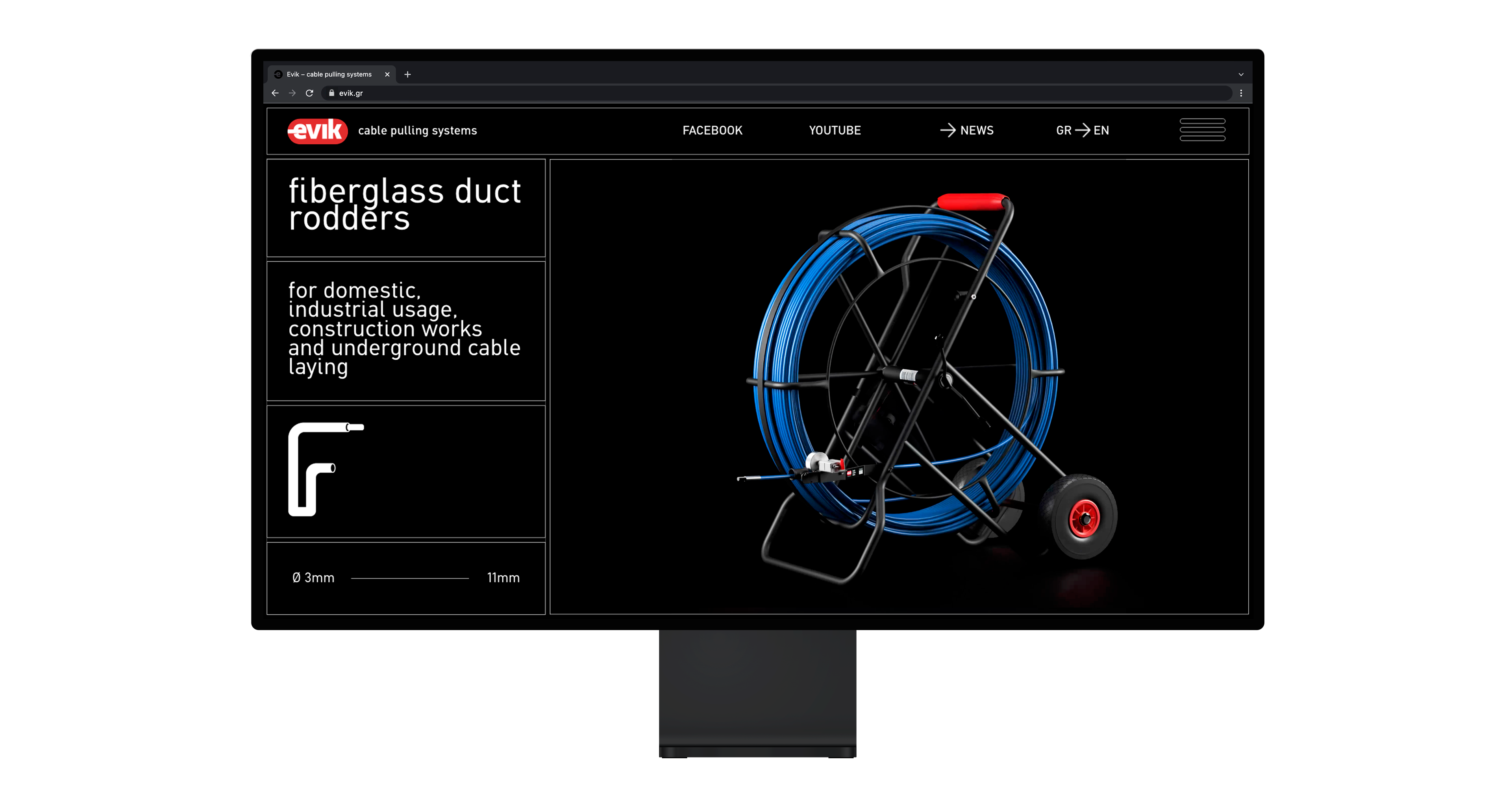
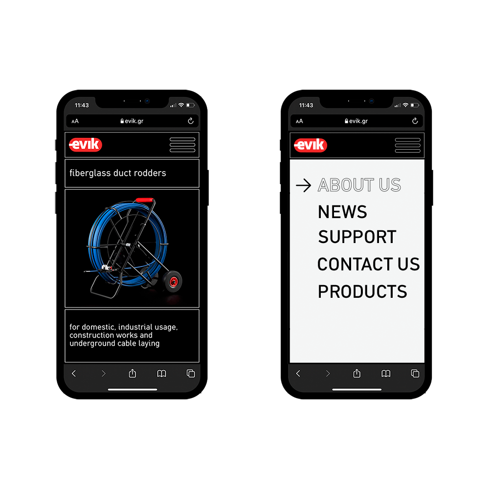
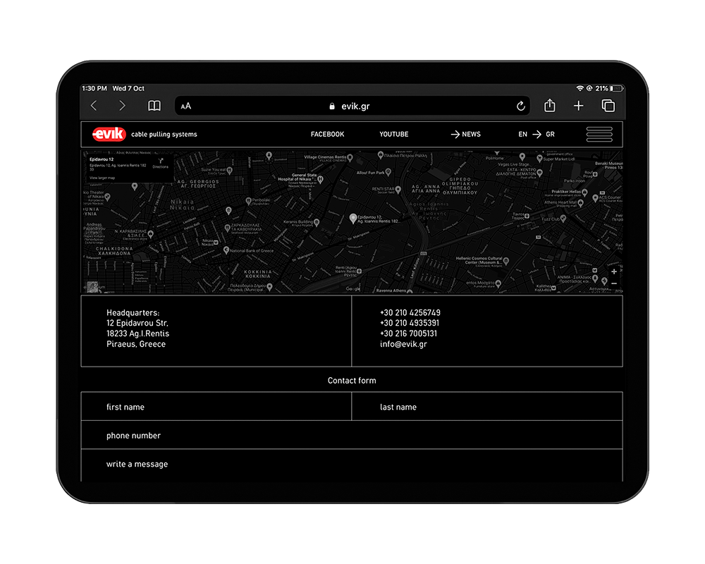
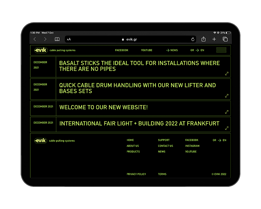
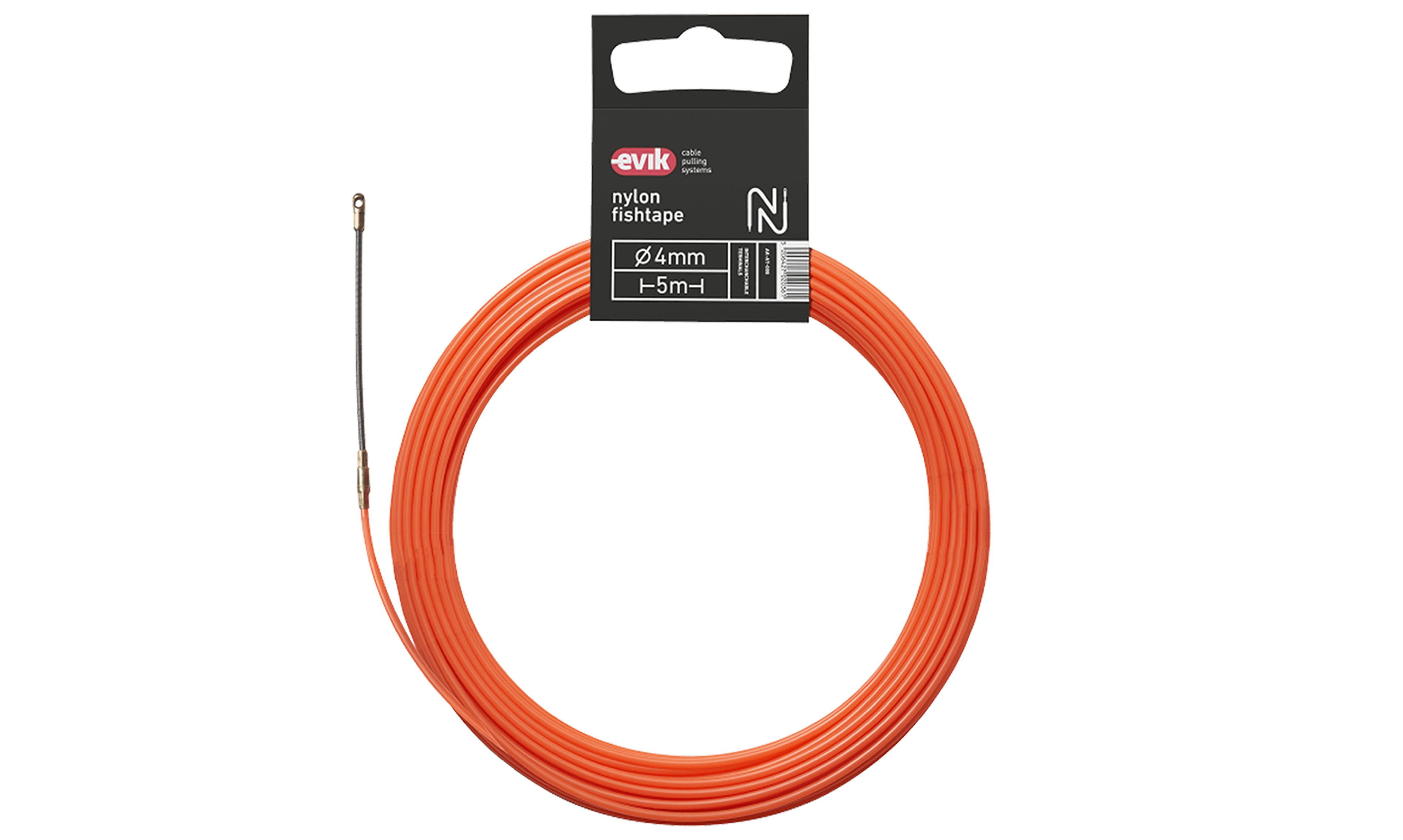
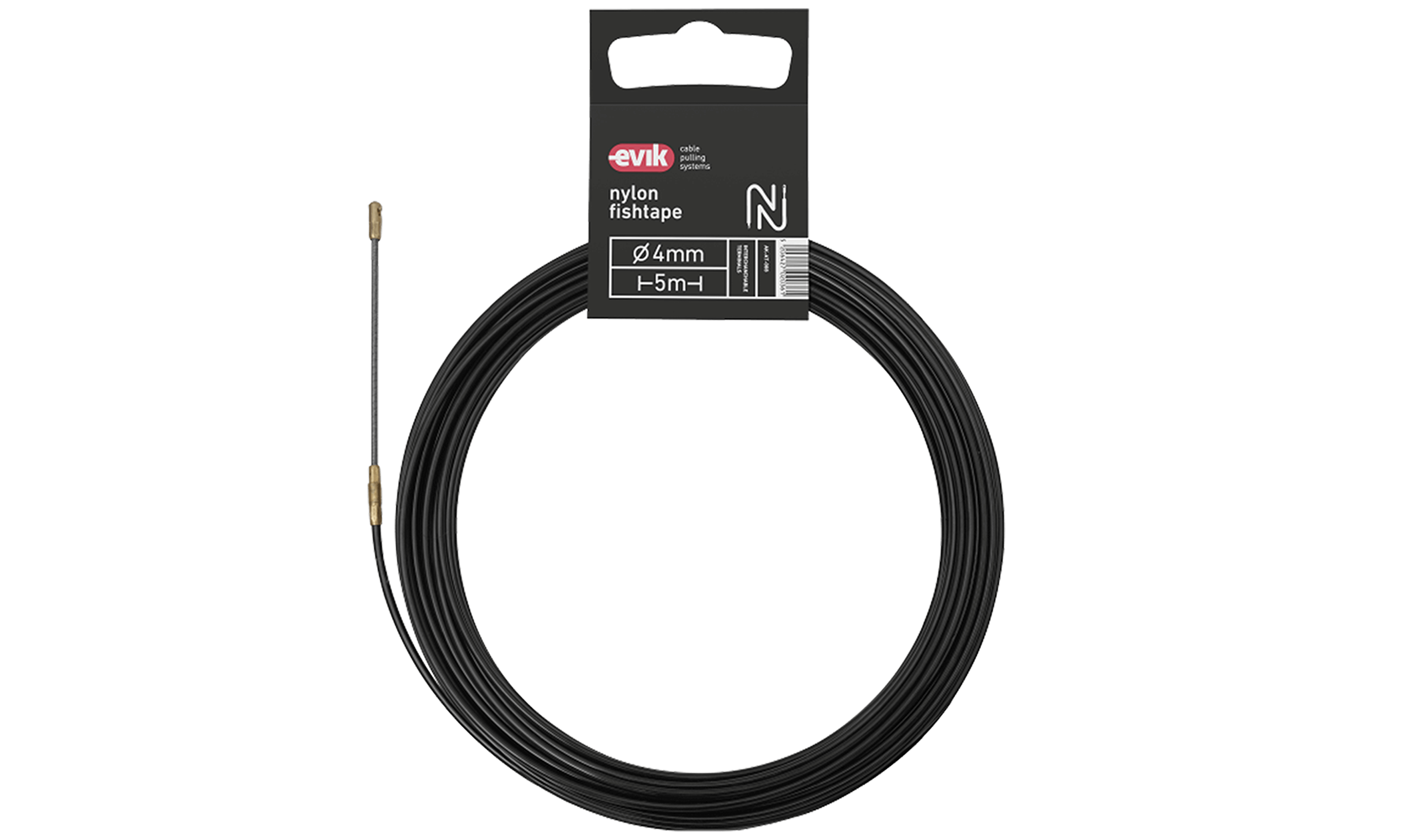
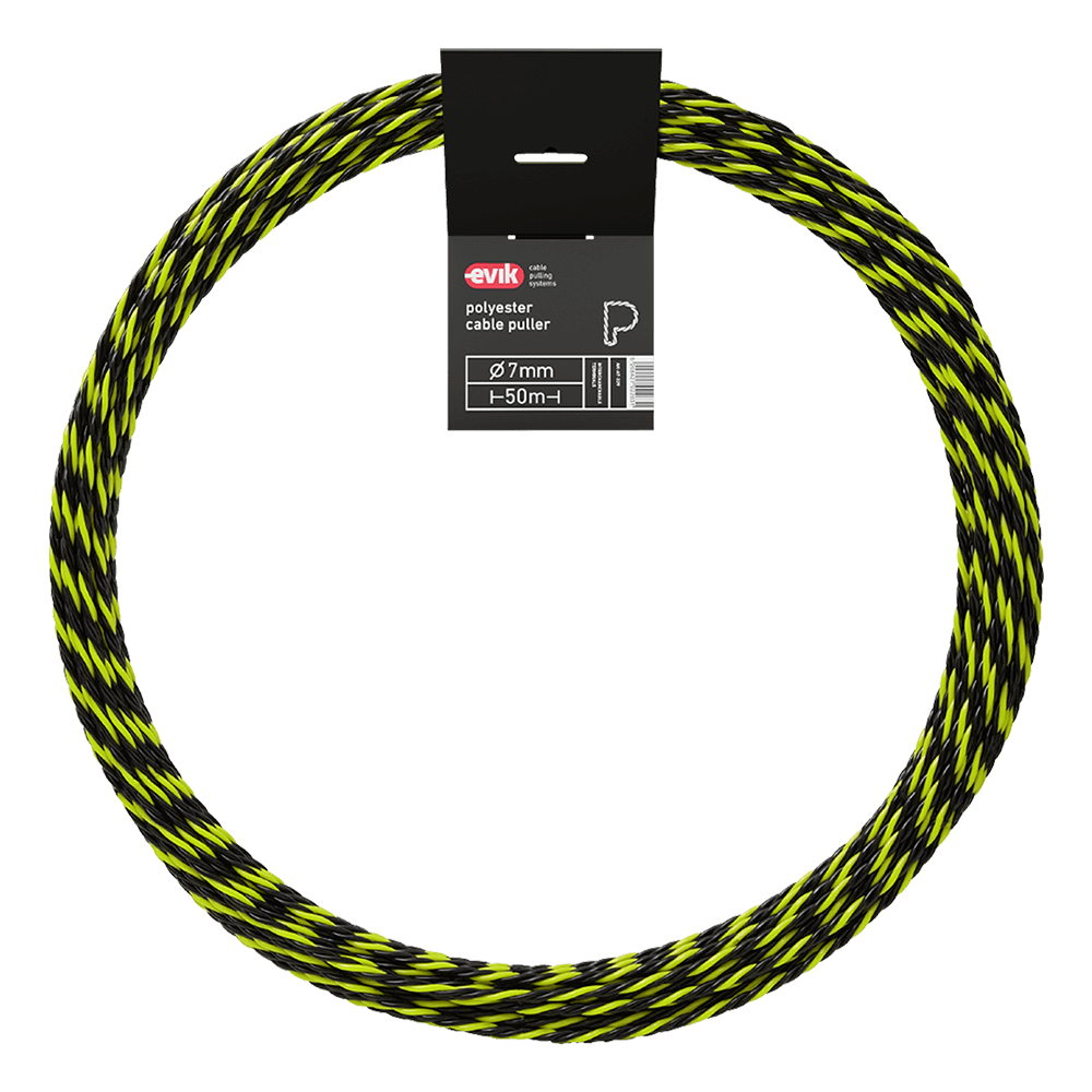
EVIK is an industrial company specializing in cable pulling grips and we designed their corporate, product and web identity – that is, the sum of the company’s visual identity.

Η EVIK συστήματα έλξης καλωδίων είναι μια σύγχρονη εταιρεία για την οποία έχουμε σχεδιάσει την εταιρική, προϊοντική και ηλεκτρονική ταυτότητα, το σύνολο δηλαδή της οπτικής ταυτότητας.

The common denominator of the three is the fully individualized design and the adjusted distribution of information within each media, whether that is the packaging of a product, exhibition booth stands or the company’s industrially focused website.

Κοινή συνθήκη στην οποία αναπτύχθηκαν τα παραπάνω είναι ο πλήρως εξατομικευμένος σχεδιασμός και η προσαρμοσμένη κατανομή πληροφοριών στον εκάστοτε χώρο, είτε αυτός είναι η συσκευασία ενός προϊόντος, είτε το περίπτερο μιας έκθεσης, είτε το website της εταιρείας βιομηχανικού ενδιαφέροντος. 

website

ιστοσελίδα

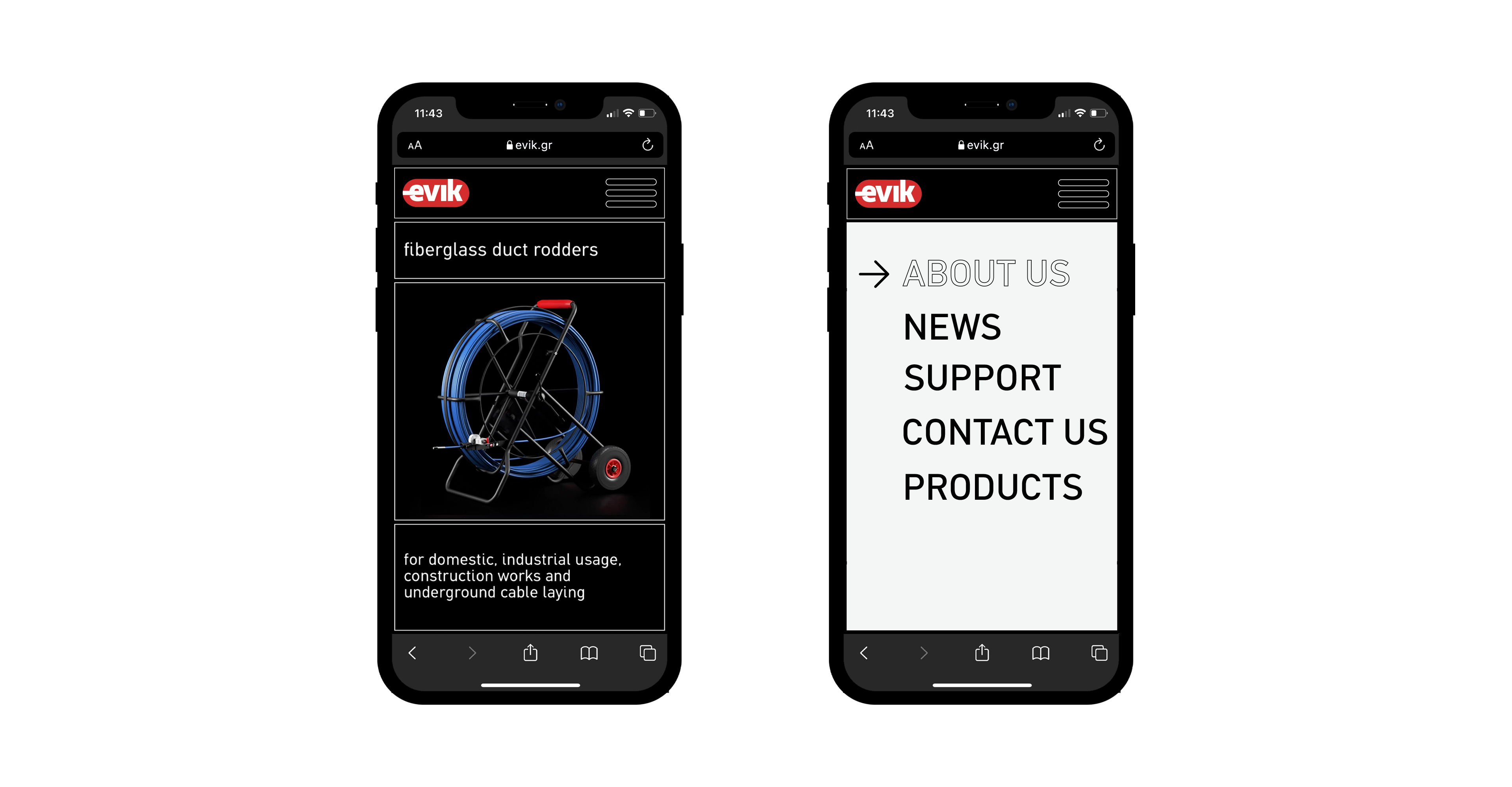
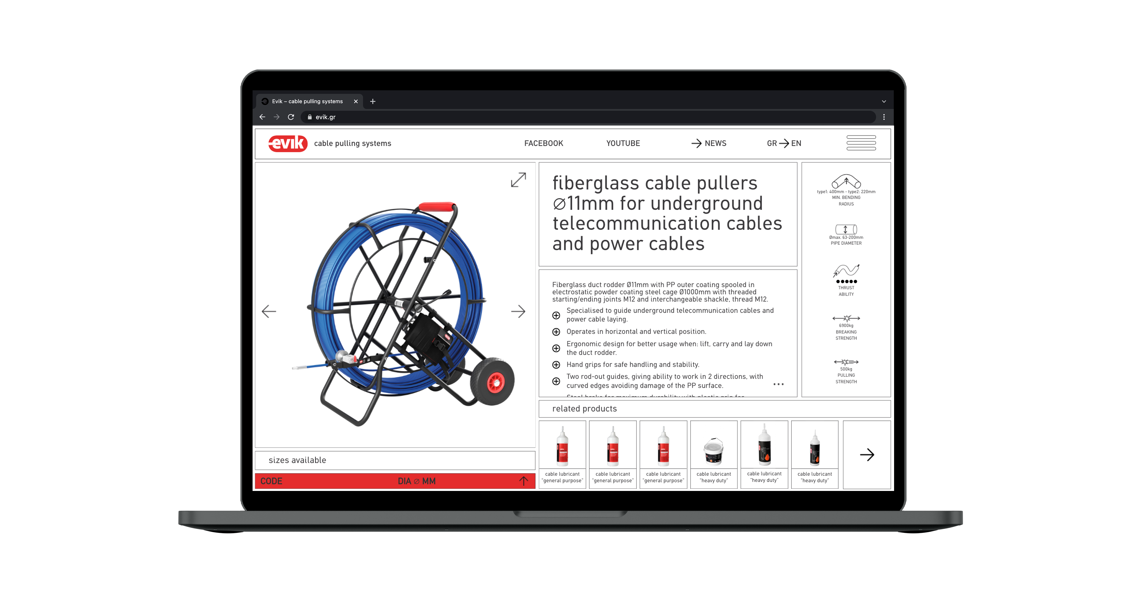
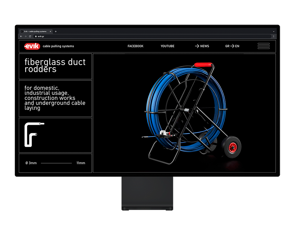
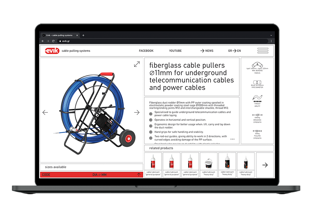
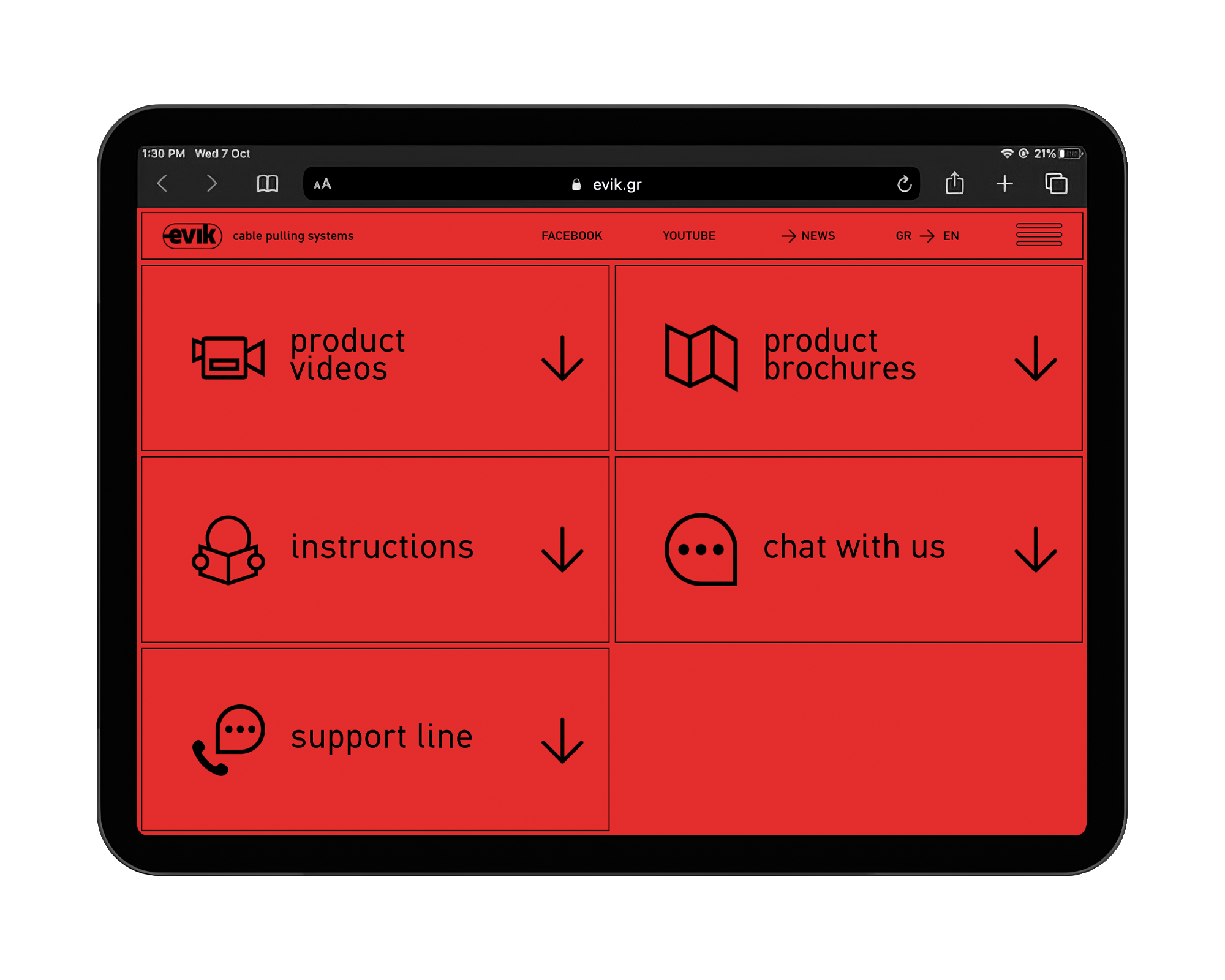
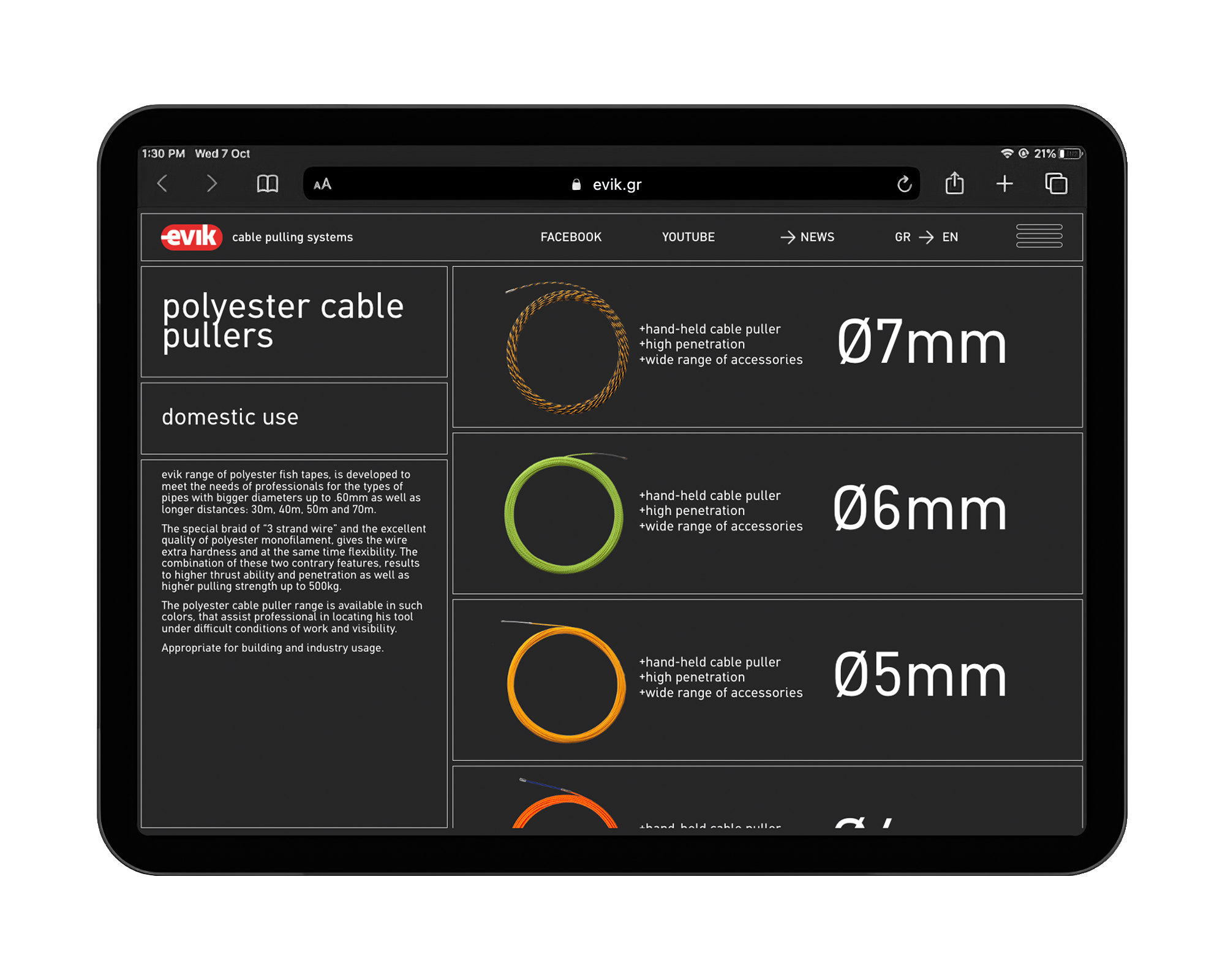
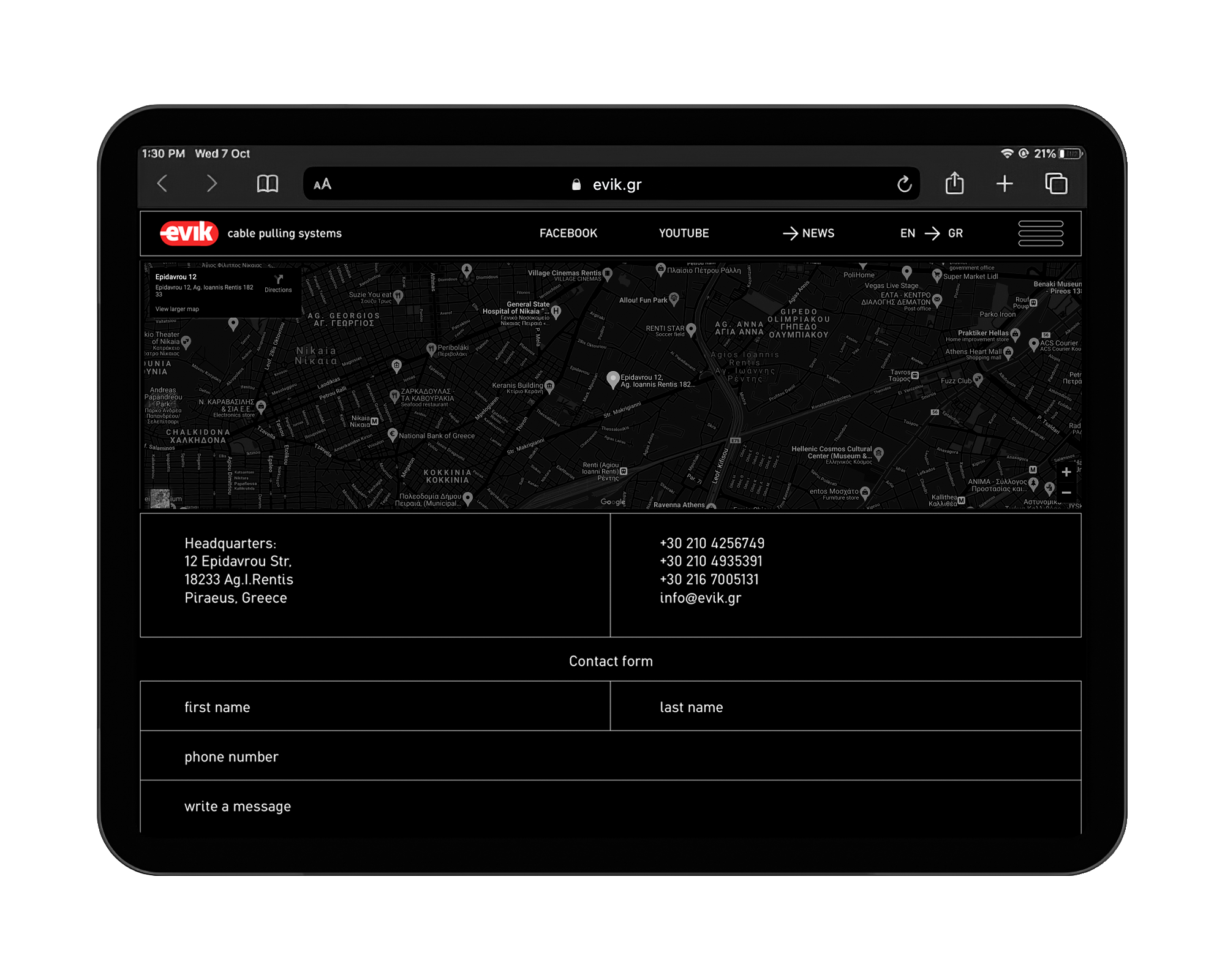
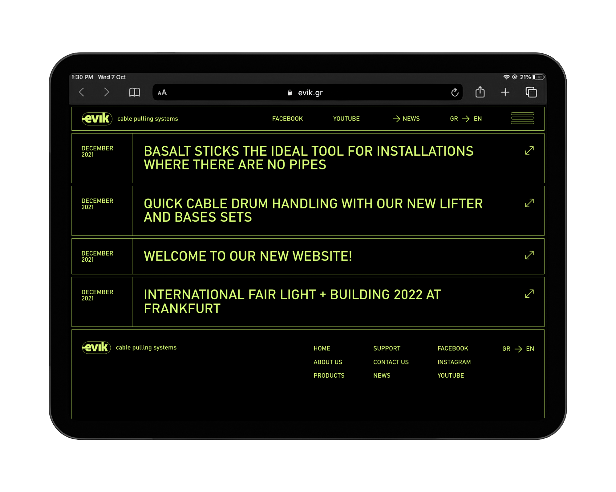
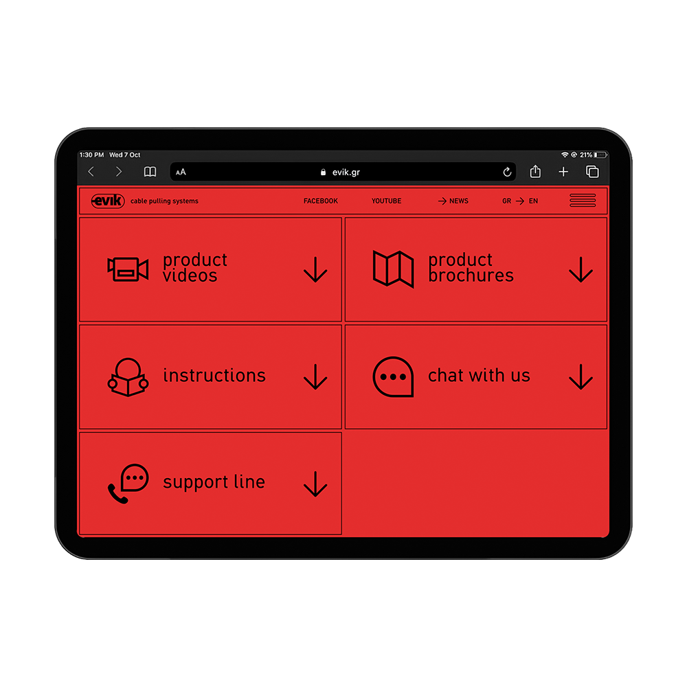
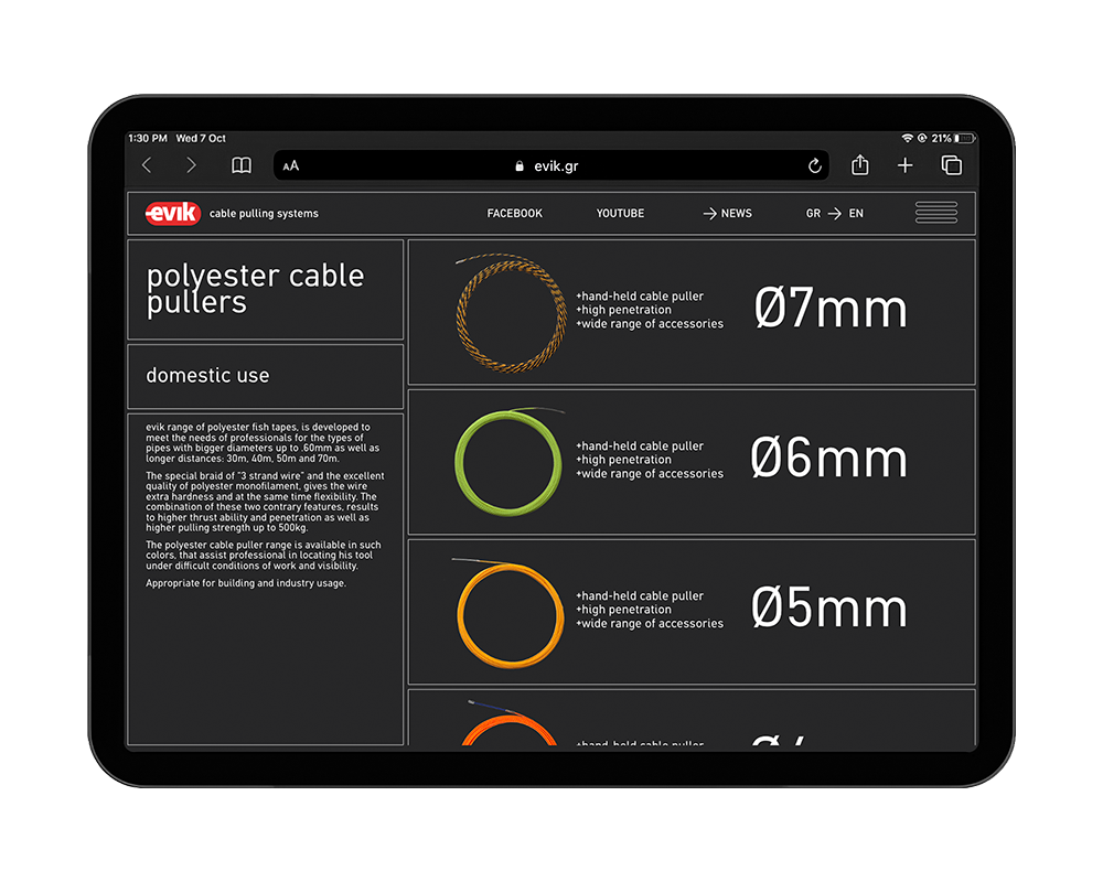
The redesign of EVIK’s website incorporated all the elements that compound the language of visual identity. From the choice of typeface to the choice of color code we designed and brought to life an interactive version of the visual identity in a new, completely customized environment that promotes and compliments the products. The main idea behind the new website was the boxy design that comes across through it, creating a «functional grid» inside which the products are presented and the user navigates.

Το εξ ολοκλήρου ανανεωμένο website της evik σχεδιάστηκε ακολουθώντας όλα τα στοιχεία που συντάσσουν το λεξιλόγιο της οπτικής ταυτότητας. Από την επιλογή της γραμματοσειράς έως τον χρωματικό κώδικα σχεδιάσαμε και υλοποιήσαμε την διαδραστική εκδοχή της οπτικής ταυτότητας σε ένα νέο, πλήρως εξατομικευμένο περιβάλλον προβολής και ανάδειξης των προϊόντων. Βασική ιδέα για το νέο site ήταν ο boxy σχεδιασμός που συναντάται σε όλο το site, δημιουργώντας έναν «λειτουργικό κάναβο» μέσα στον οποίο παρουσιάζονται τα προϊόντα και περιηγείται ο χρήστης.

Within this design concept, inspired by an electrician’s tool case, information is presented in a screen that adjusts fully depending on the device, without the need for scrolling. This uniform, compact design becomes functional through a modified, simple and easy website navigation system. Finally, the structure and design of the website have been done in a way to ensure that it can be easily upgraded in the future.

Σε αυτόν τον σχεδιαστικό κανόνα, για τον οποίο έμπνευση ήταν η εργαλειοθήκη του ηλεκτρολόγου, η πληροφορία παρουσιάζεται σε μια οθόνη που προσαρμόζεται πλήρως ανάλογα την συσκευή, χωρίς να χρειάζεται scrolling. Αυτός ο ενιαίος, συμπαγής σχεδιασμός γίνεται λειτουργικός μέσω ενός προσαρμοσμένου στο σχεδιασμό, απλού και εύκολου συστήματος πλοήγησης. Τέλος, η δομή και ο σχεδιασμός του site έγινε με τρόπο τέτοιο ώστε να είναι εύκολη η μελλοντική του αναβάθμιση σε ηλεκτρονικό κατάστημα. 

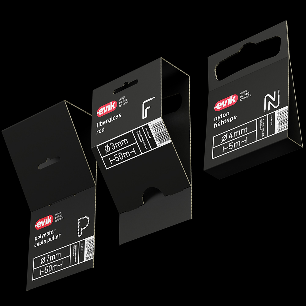
packaging

συσκευασία

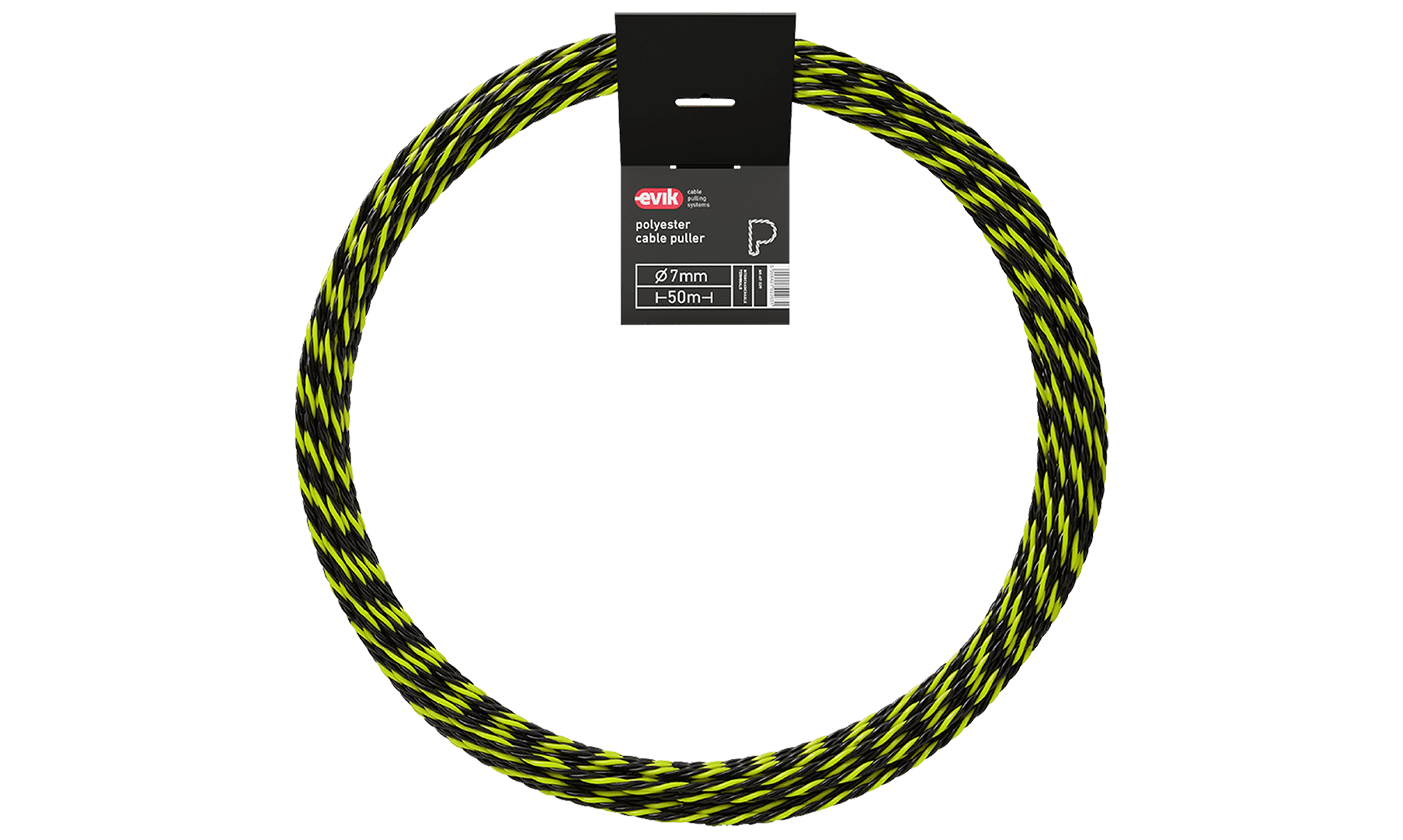
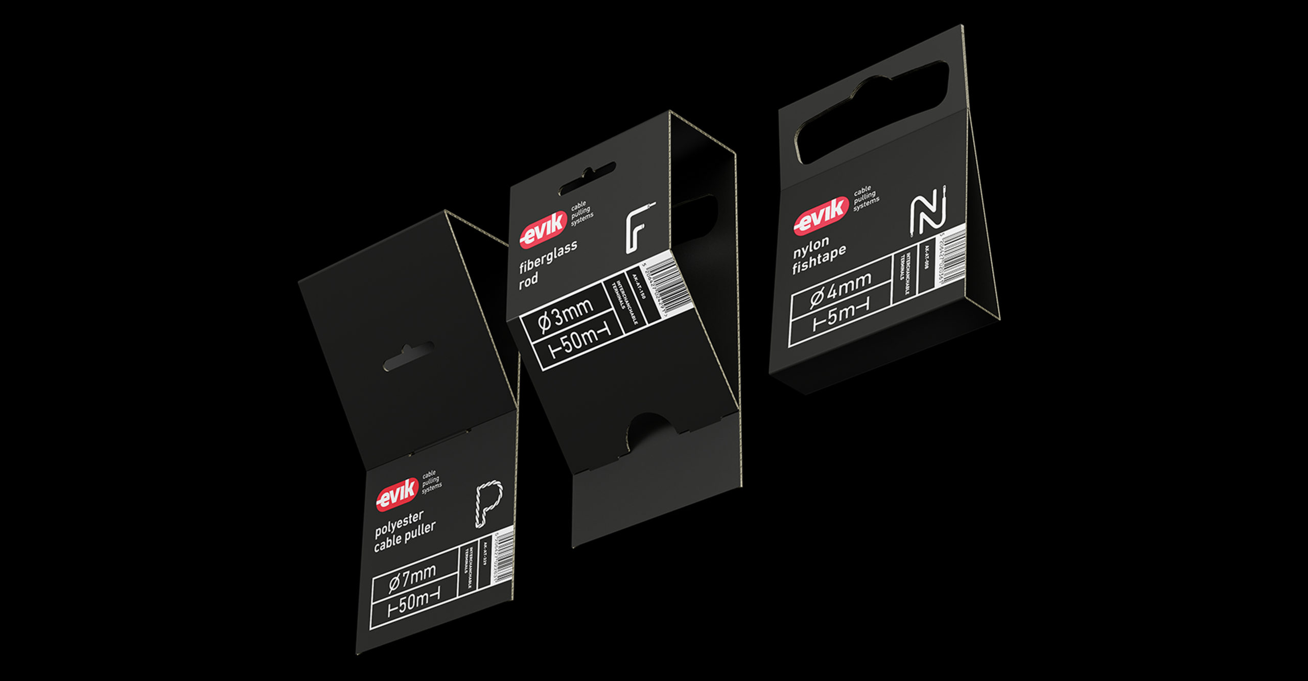
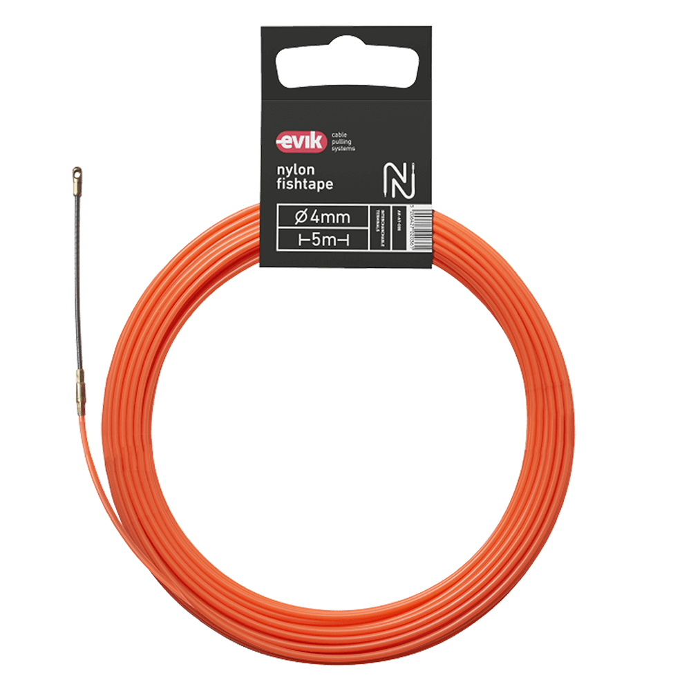
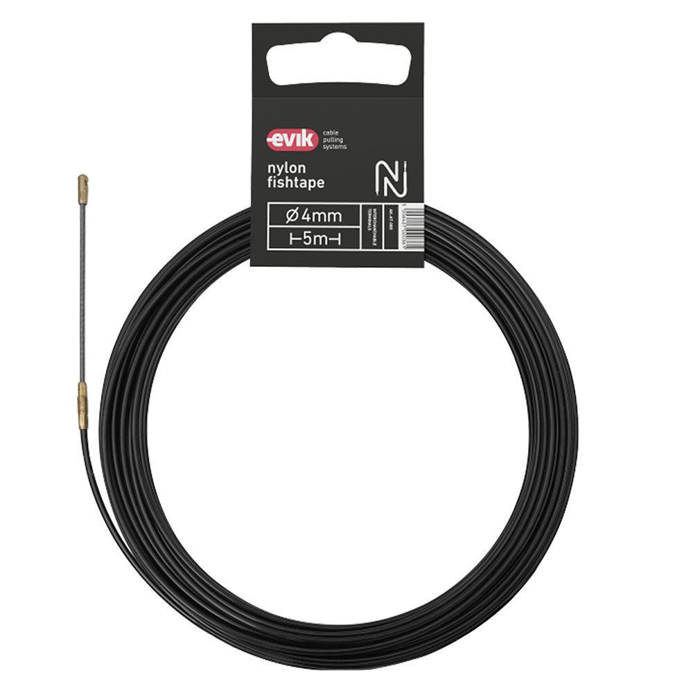
The core axis of the design process when developing the packaging for EVIK was on the one hand the creation of visual coherence between products and apps / promotion actions, and on the other hand, the resolution of various matters concerning the specific product.

Οι συσκευασίες έχουν ως κεντρικό άξονα σχεδιαστικής ανάπτυξης αφενός τη δημιουργία οπτικής συνάφειας μεταξύ των προϊόντων και των εφαρμογών / δράσεων προβολής τους, αφετέρου την επίλυση διάφορων ζητημάτων που αφορούν το συγκεκριμένο προϊόν. 

After studying the products we took into consideration the way the products are presented in the stores, how easy they are to transport, and their low cost of production as well as the straightforward fit of the product’s packaging.

Έτσι, μετά από μελέτη των προϊόντων λήφθηκε υπόψη ο τρόπος ανάρτησης των προϊόντων στα καταστήματα, η εύκολη μεταφορά τους, το χαμηλό κόστος παραγωγής και η εύκολη εφαρμογή της συσκευασίας στο προϊόν. 

exhibition booth stands

εκθεσιακά περίπτερα

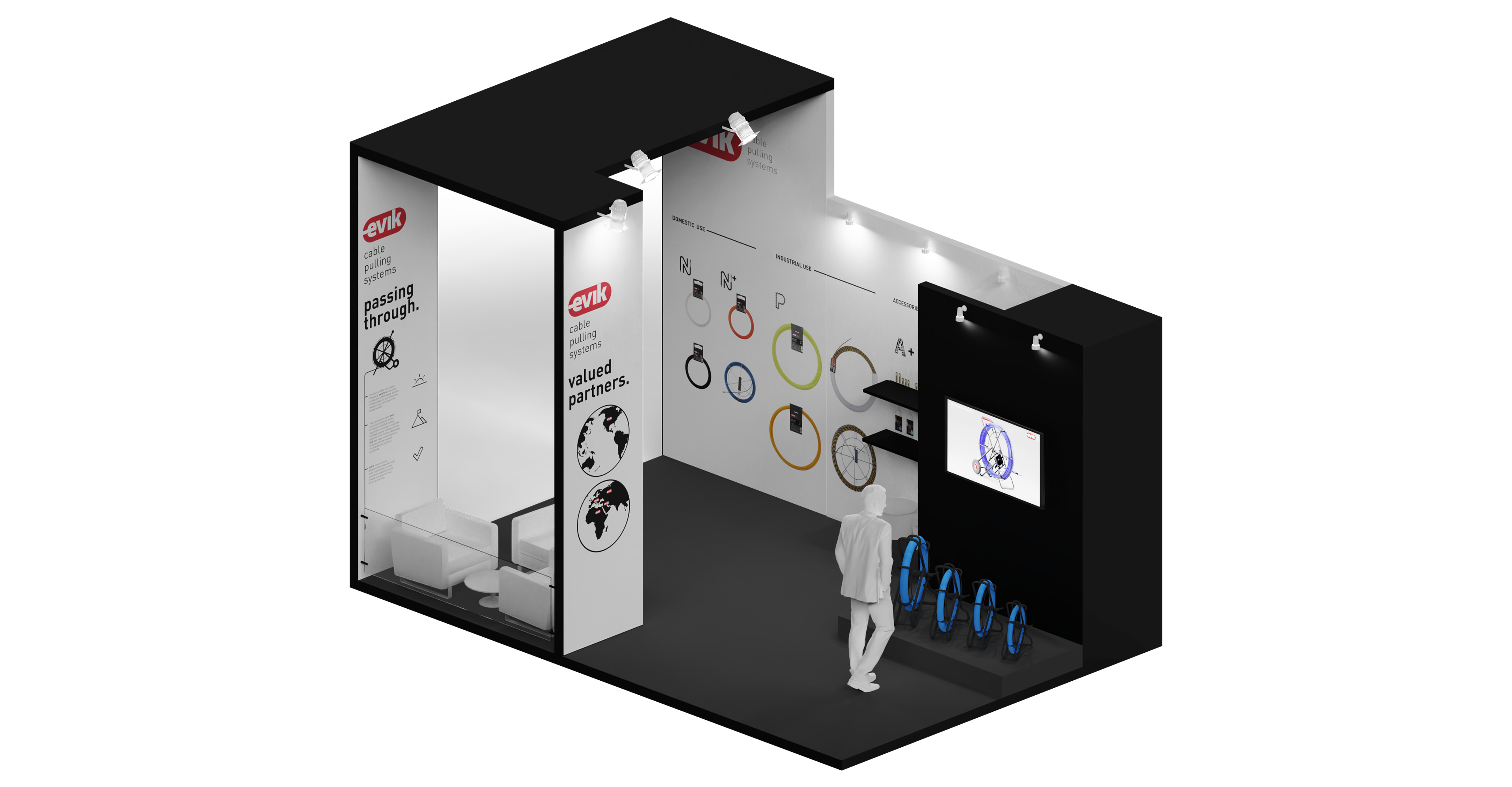
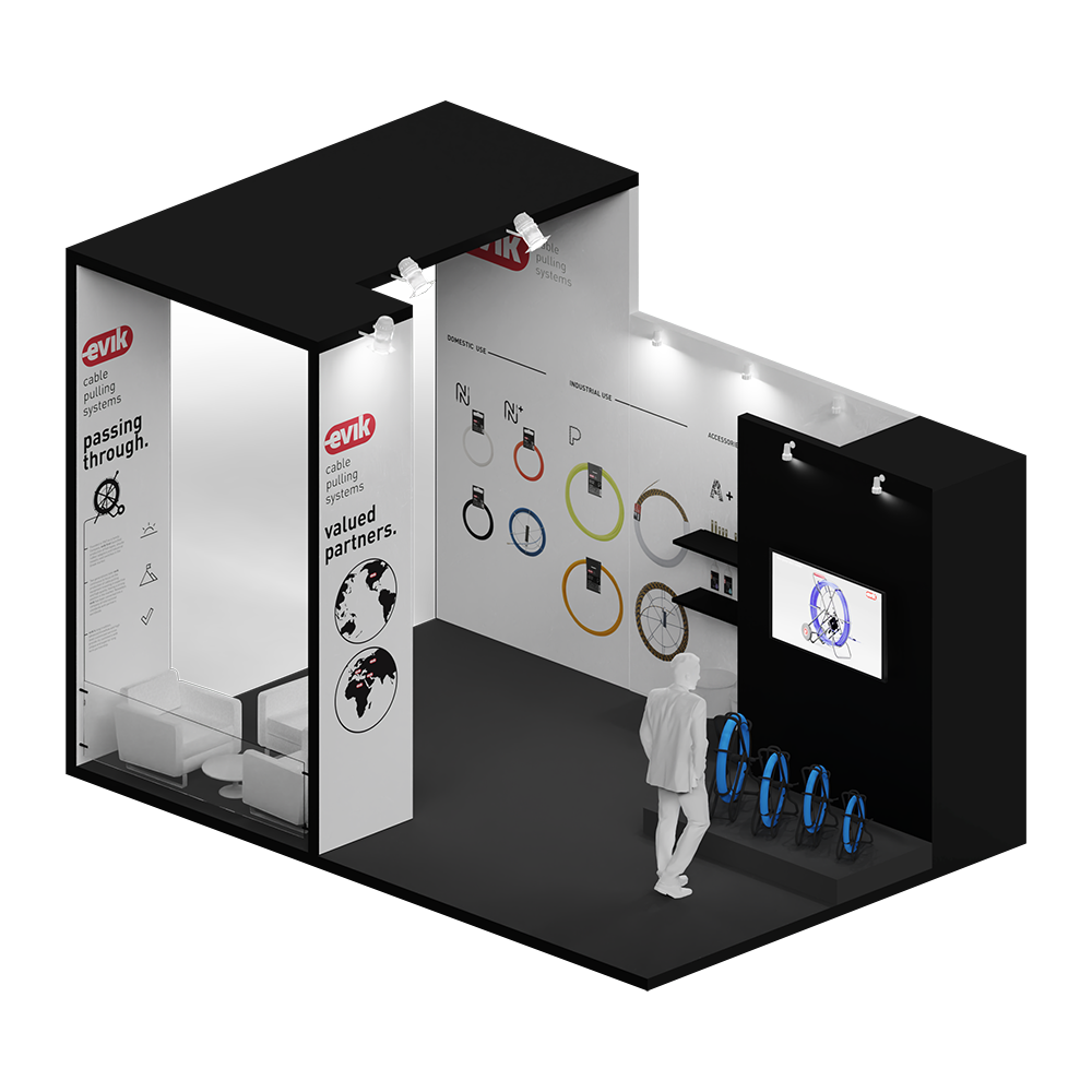
We designed the booths for EVIK exhibitions around the world, following the corporate and product identity

Για τις ανάγκες εκθεσιακής προβολής της EVIK, σχεδιάζουμε τα περίπτερα της εταιρείας για εγχώριες και διεθνείς εκθέσεις.

and adapting them to meet the need for a cohesive, yet thorough brand presentation inside the limited space of a commercial exhibition booth.

Η σχεδιαστική λογική ακολουθεί την εταιρική και προϊοντική ταυτότητα, αναπτύσσοντας την προβολή των προϊόντων στον χώρο της εκάστοτε έκθεσης με συνεκτικότητα, σαφήνεια και επάρκεια για τον επισκέπτη.

Evik exhibition booth retina copy
Exbooth size form

truezero

truezero

visual identity
2019

σχεδιασμός
οπτικής
ταυτότητας
2020

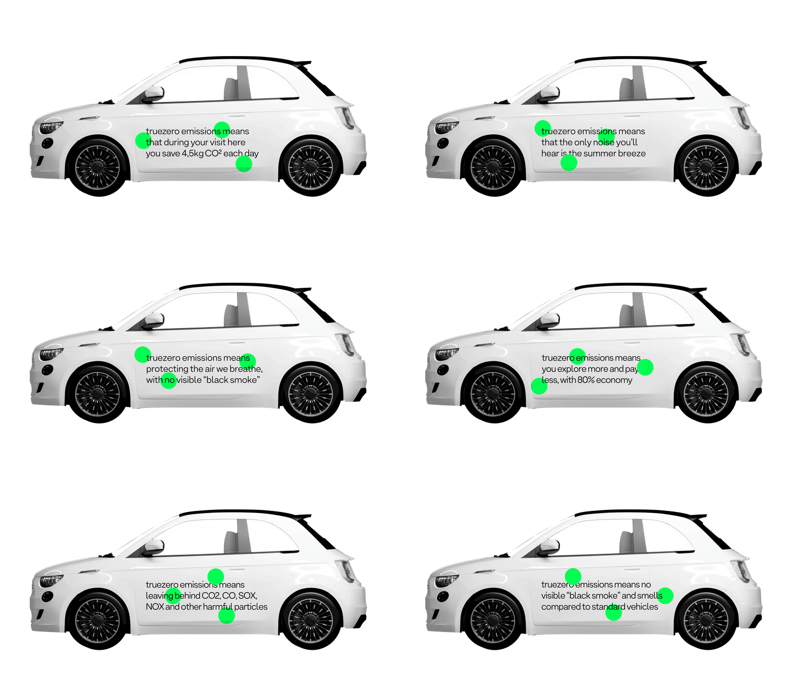
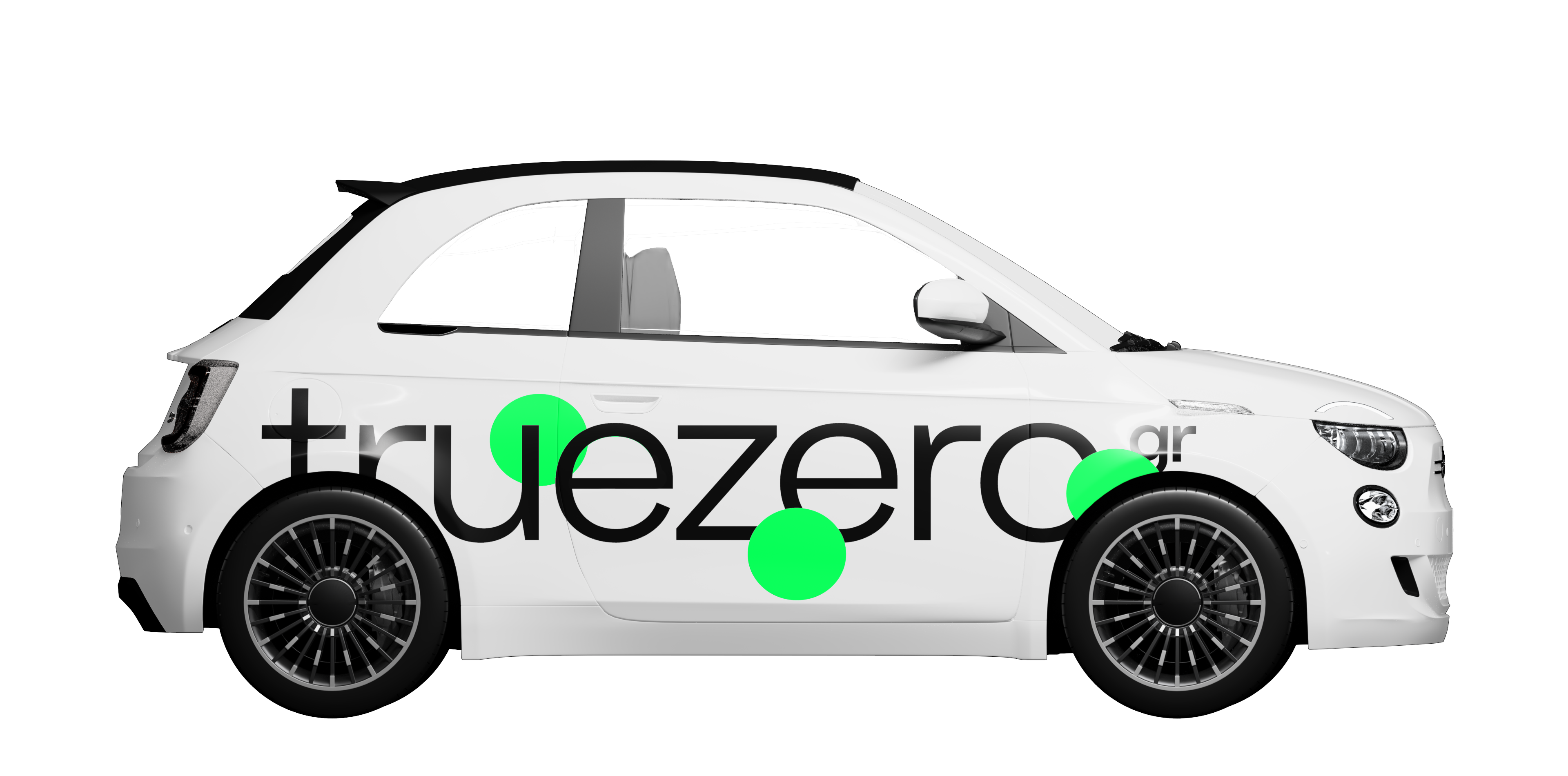
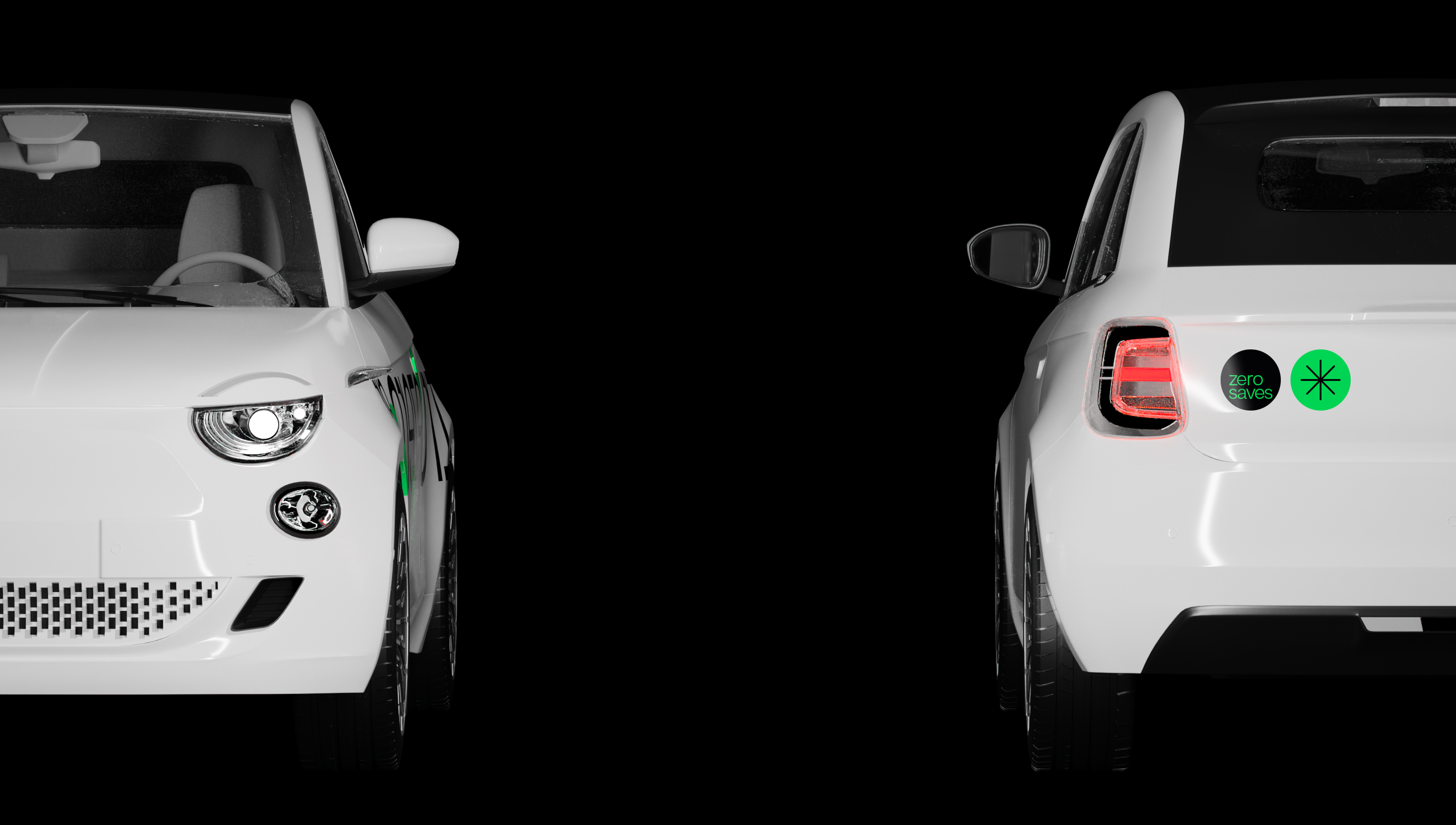
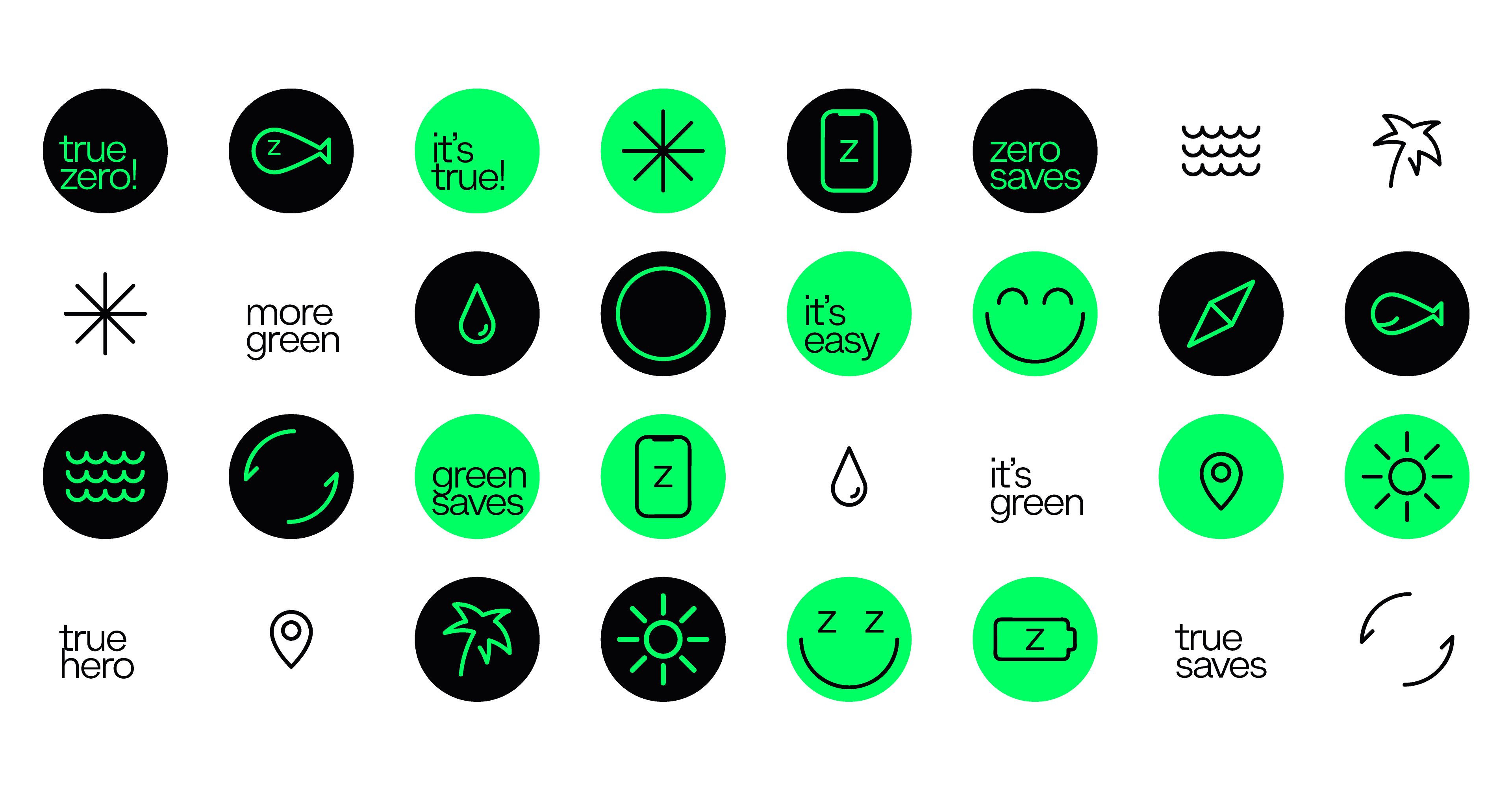
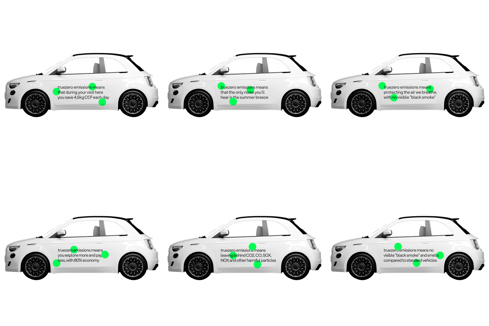
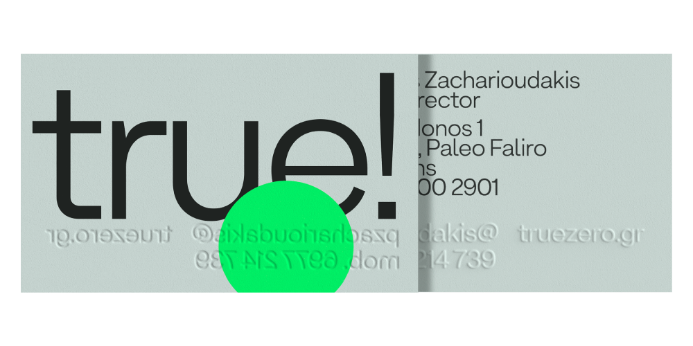
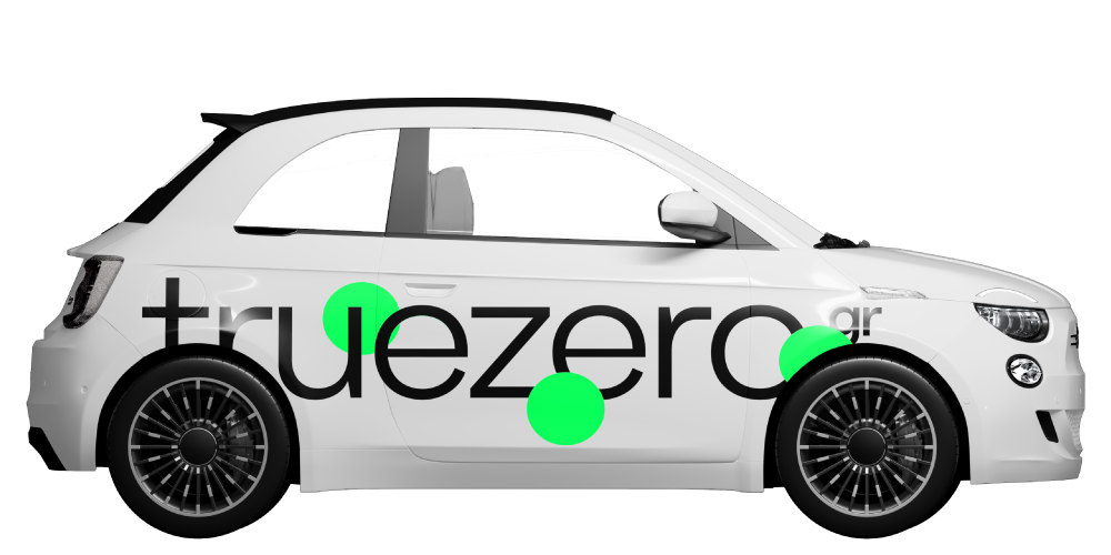
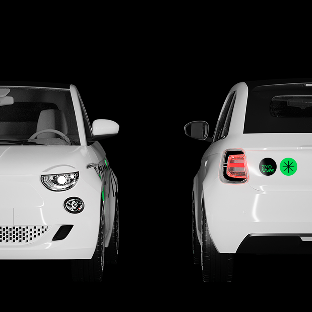
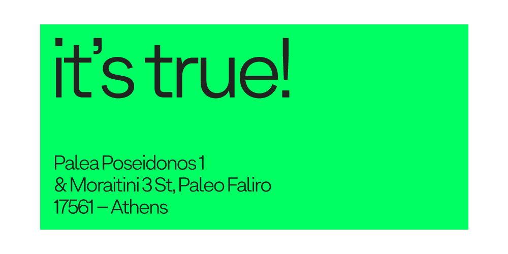
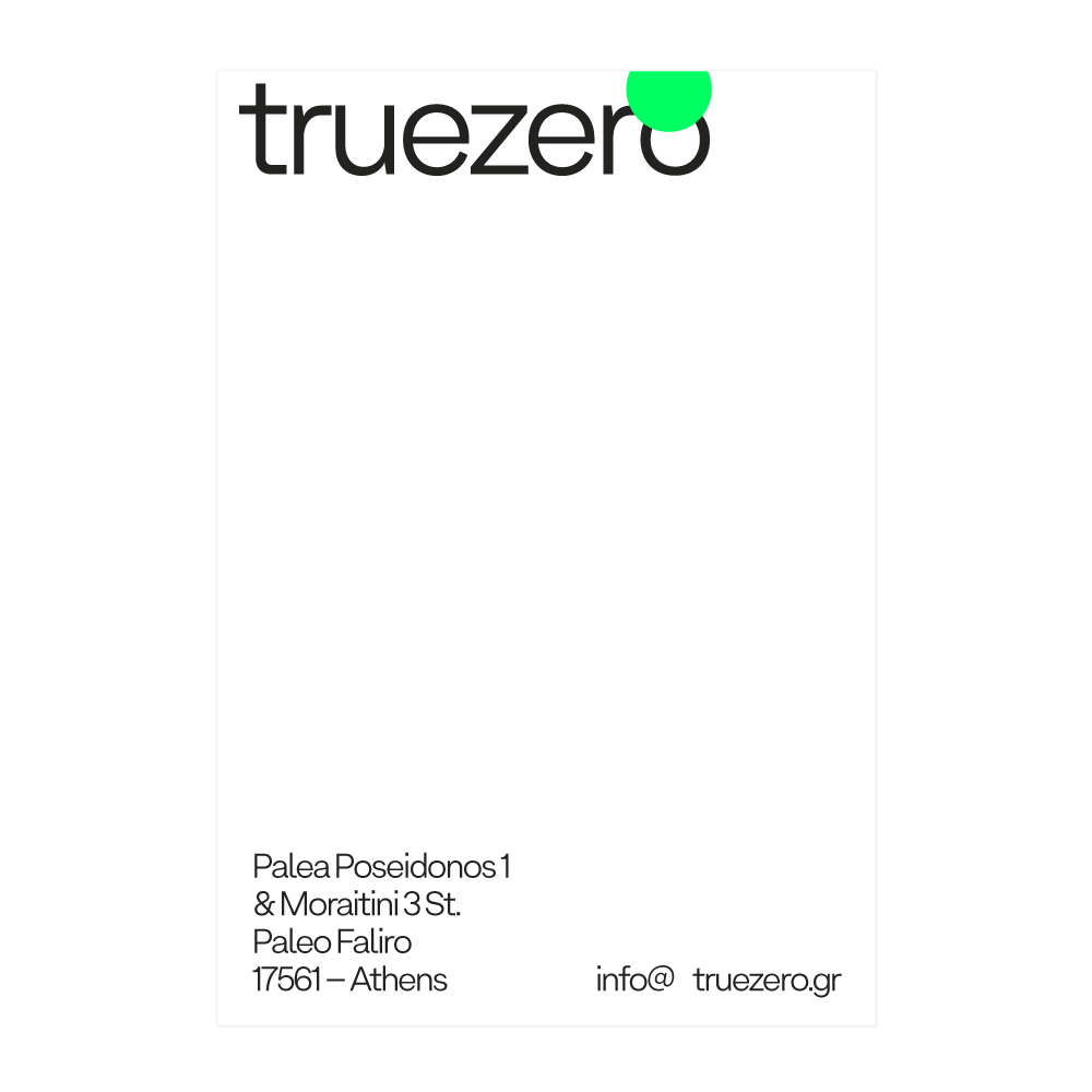
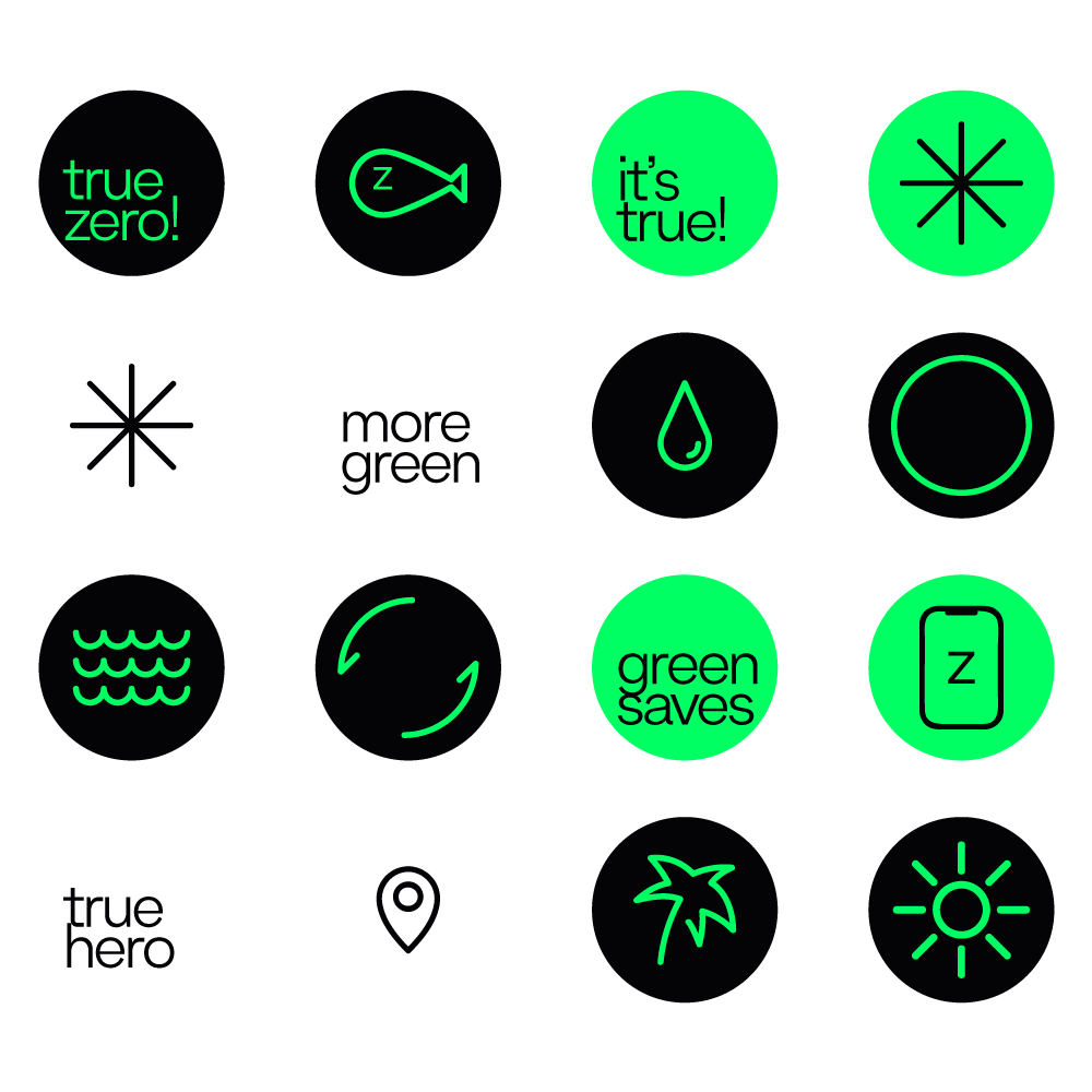
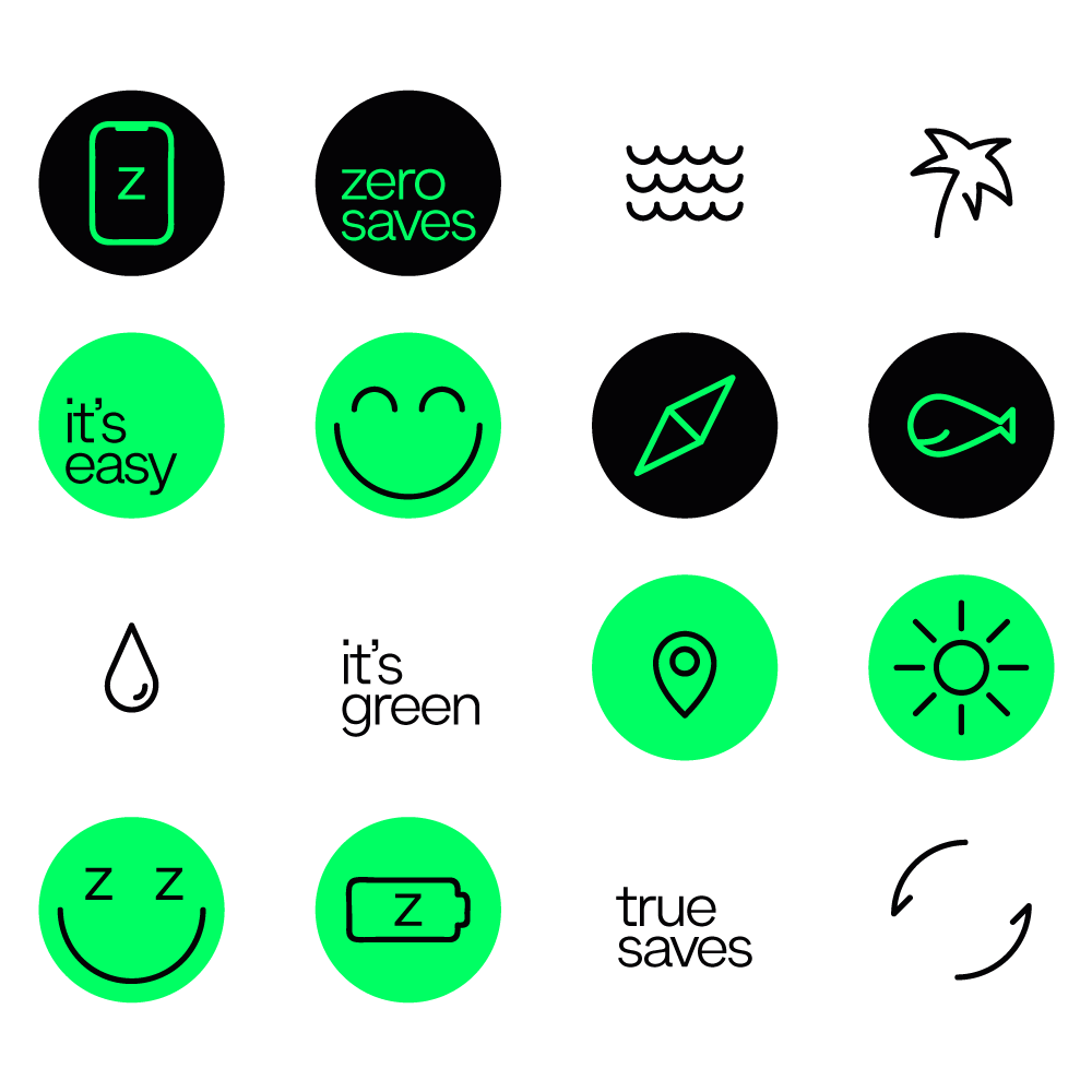
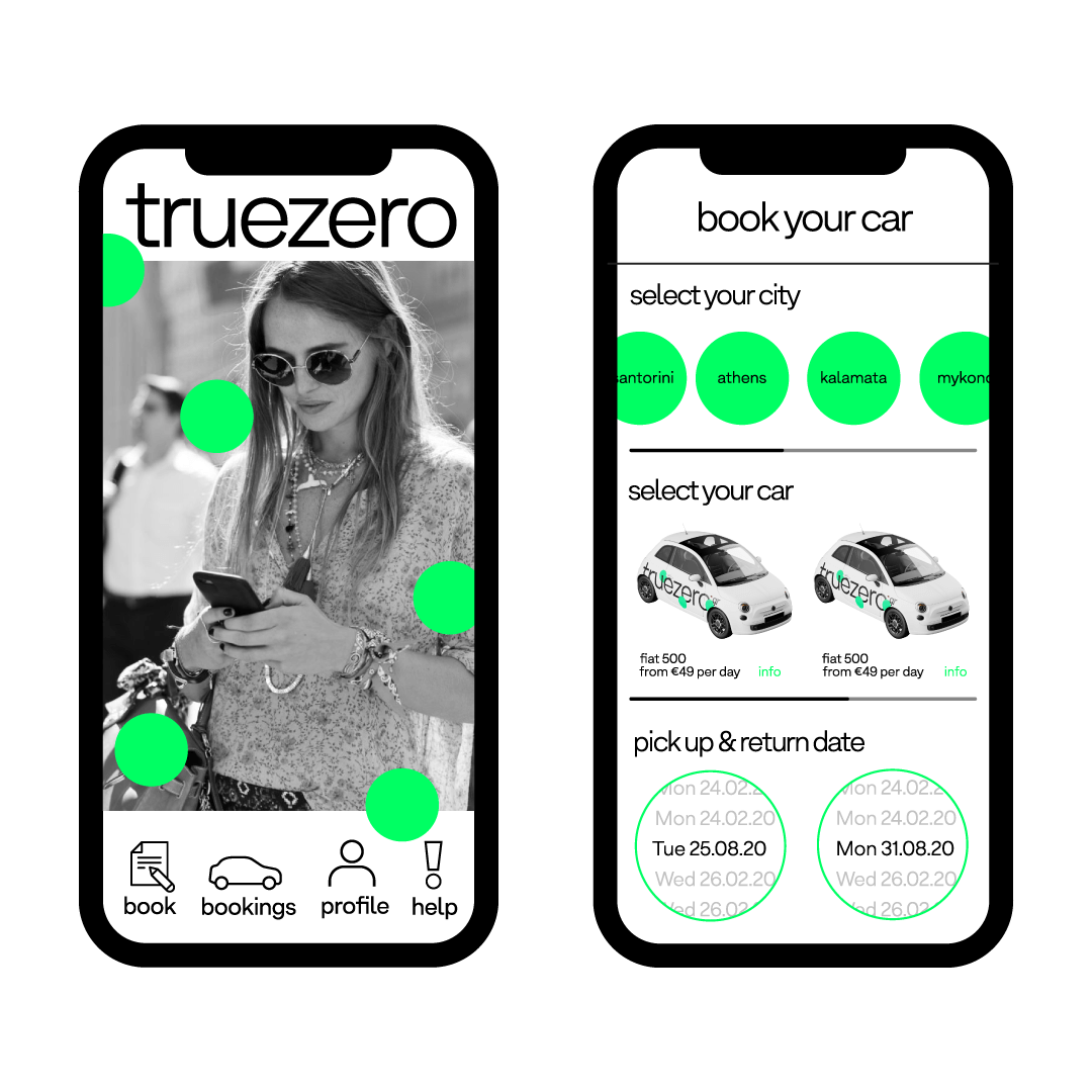
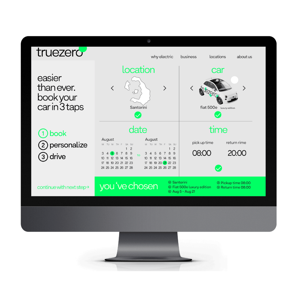
Truezero is an exclusively electric car rental company based in Santorini island. The visual identity we created for this new business entity is a result of blending visual and verbal elements aiming to enhance environmental awareness, while simultaneously constructing a memorable and vibrant identity system.

Η Τruezero είναι μια εταιρία ενοικίασης αποκλειστικά ηλεκτρικών οχημάτων για το νησί της Σαντορίνης. Η οπτική ταυτότητα που δημιουργήσαμε είναι ένα αποτέλεσμα συνδυασμού οπτικών και λεκτικών στοιχείων που εξυπηρετούν διττό σκοπό. Τη γνωριμία με το νέο brand και την περιβαλλοντολογική ευαισθητοποίηση μέσα από το branding.

Following that notion, we created a set of quotes presenting facts that favor the use of electric cars.

Με αυτό το σκεπτικό εντάξαμε ένα σετ μηνυμάτων από τα πλεονεκτήματα της χρήσης ηλεκτρικού οχήματος.

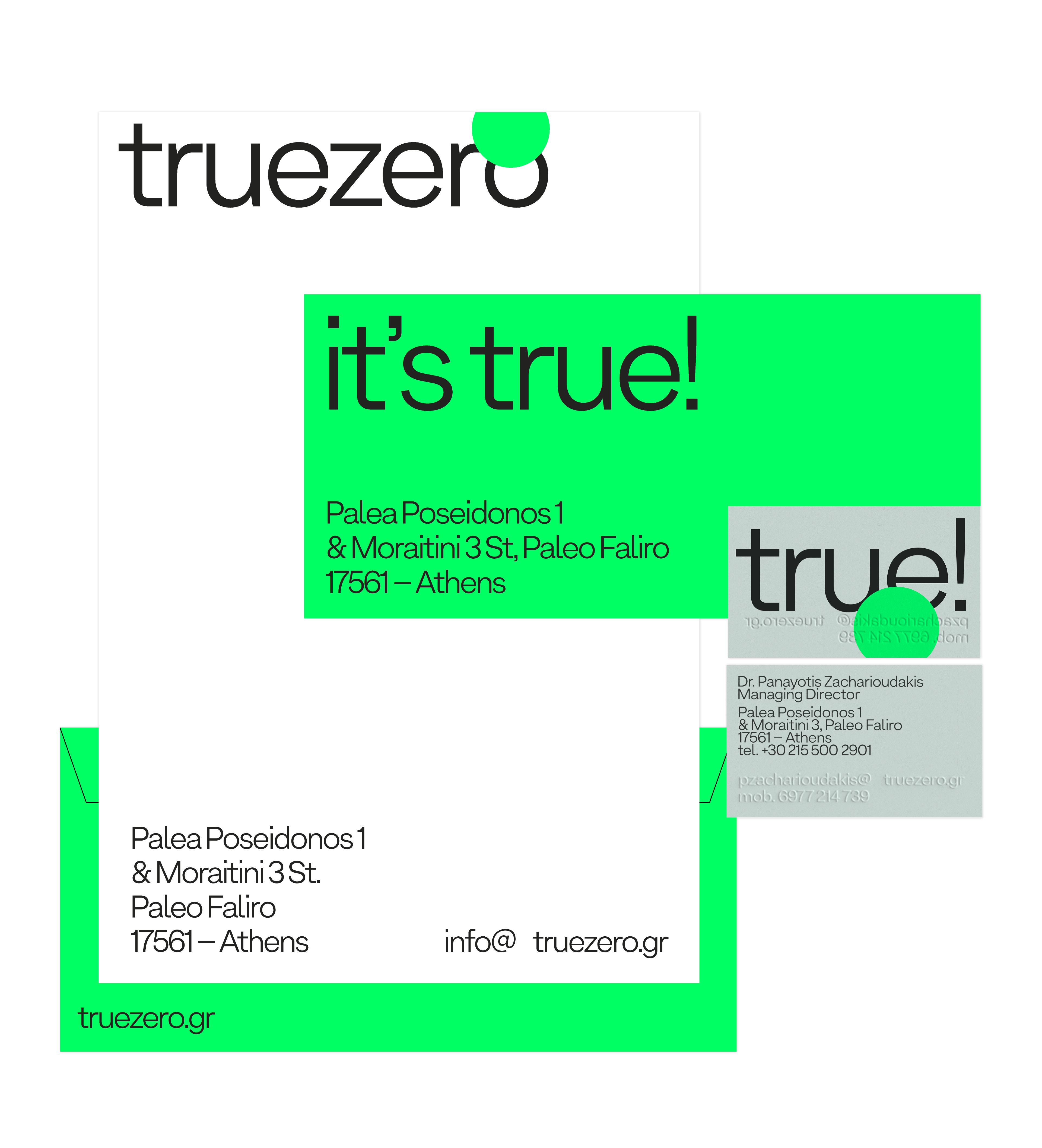
This fusion of branding and direct messaging along with bold typographic decisions and oversaturated (fluo) color coding was also preserved in the stationary design.

Αυτό το μείγμα branding / μηνυμάτων, μαζί με τις τυπογραφικές και άλλες αποφάσεις, διατηρήθηκε και στο σχεδιασμό του υπολοίπου της εταιρικής ταυτότητας.

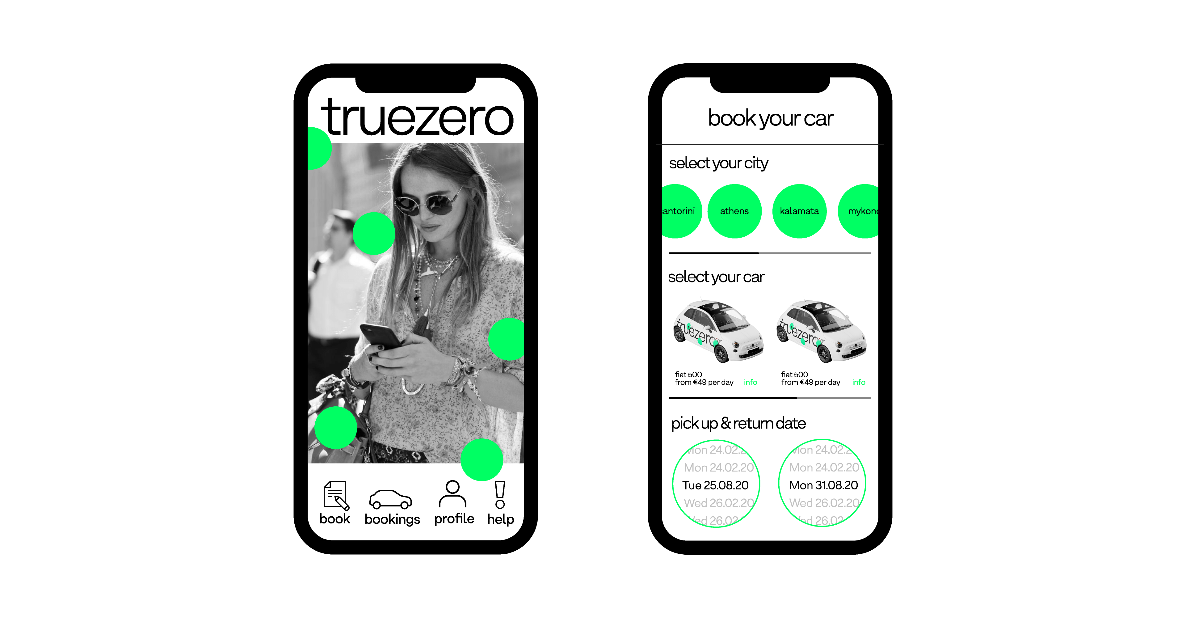
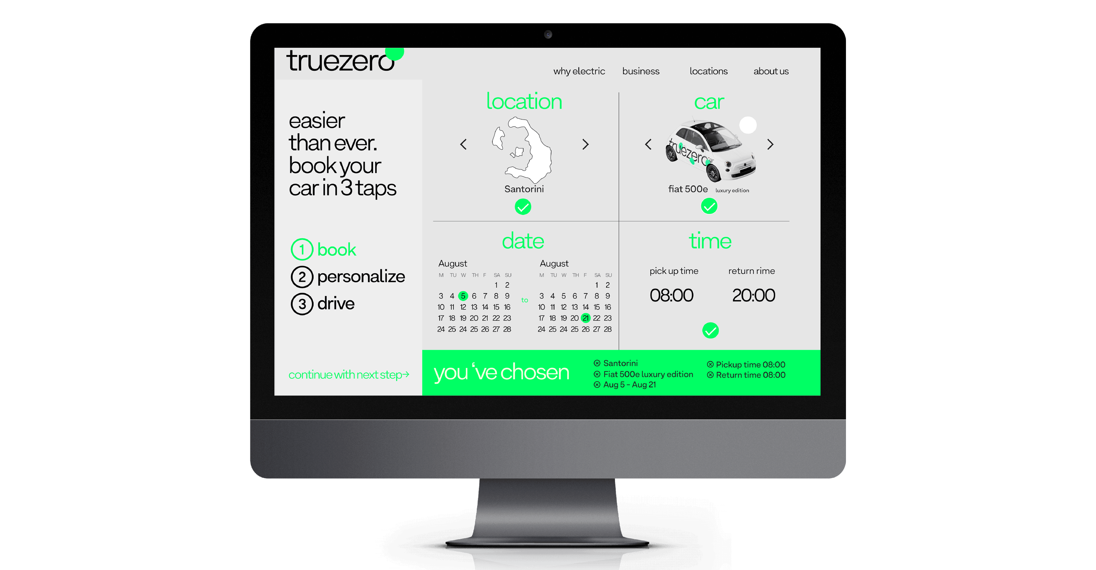
Finally, we designed the templates for the application and the website which will be developed by the digital agency.

Τέλος σχεδιάσαμε τις εφαρμογές για το website για ανάπτυξη από τους developers της εφαρμογής.

truezero_factsarecool
truezero_new_cards_site
truezero_realcar_side_logo
truezero_mobile1
truezero_mobile4
truezero_mobile2
truezero_new_mockup-copy_mobile3
truezero_new_mockup-copy_mobile2

akzonobel

akzonobel

calendar
2015-2016

ημερολόγιο
2015-2016

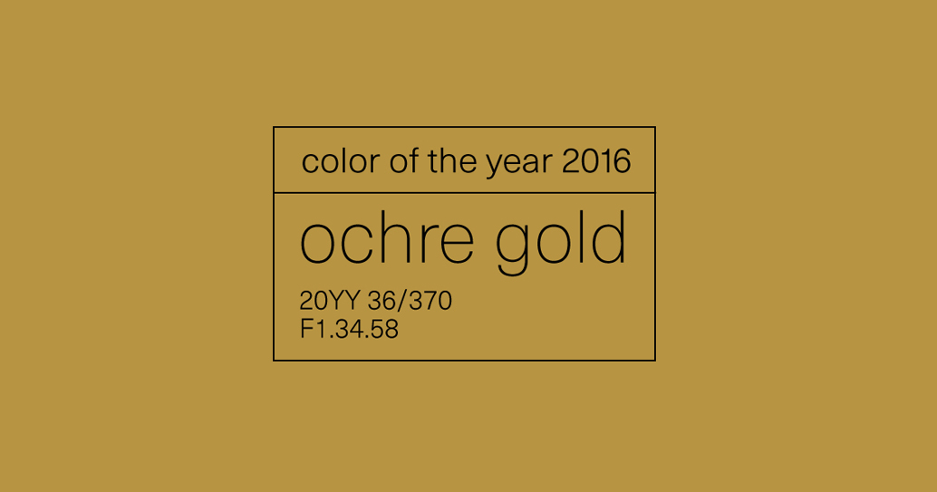
So how can something be both familiar and new at the same time? We designed the 2016 AkzoNobel calendar with the mindset of answering the above question.

Πως μπορεί κάτι οικείο να είναι ταυτόχρονα και καινούργιο; Σχεδιάσαμε το ημερολόγιο της AkzoNobel για το 2016 απαντώντας στην παραπάνω ερώτηση.

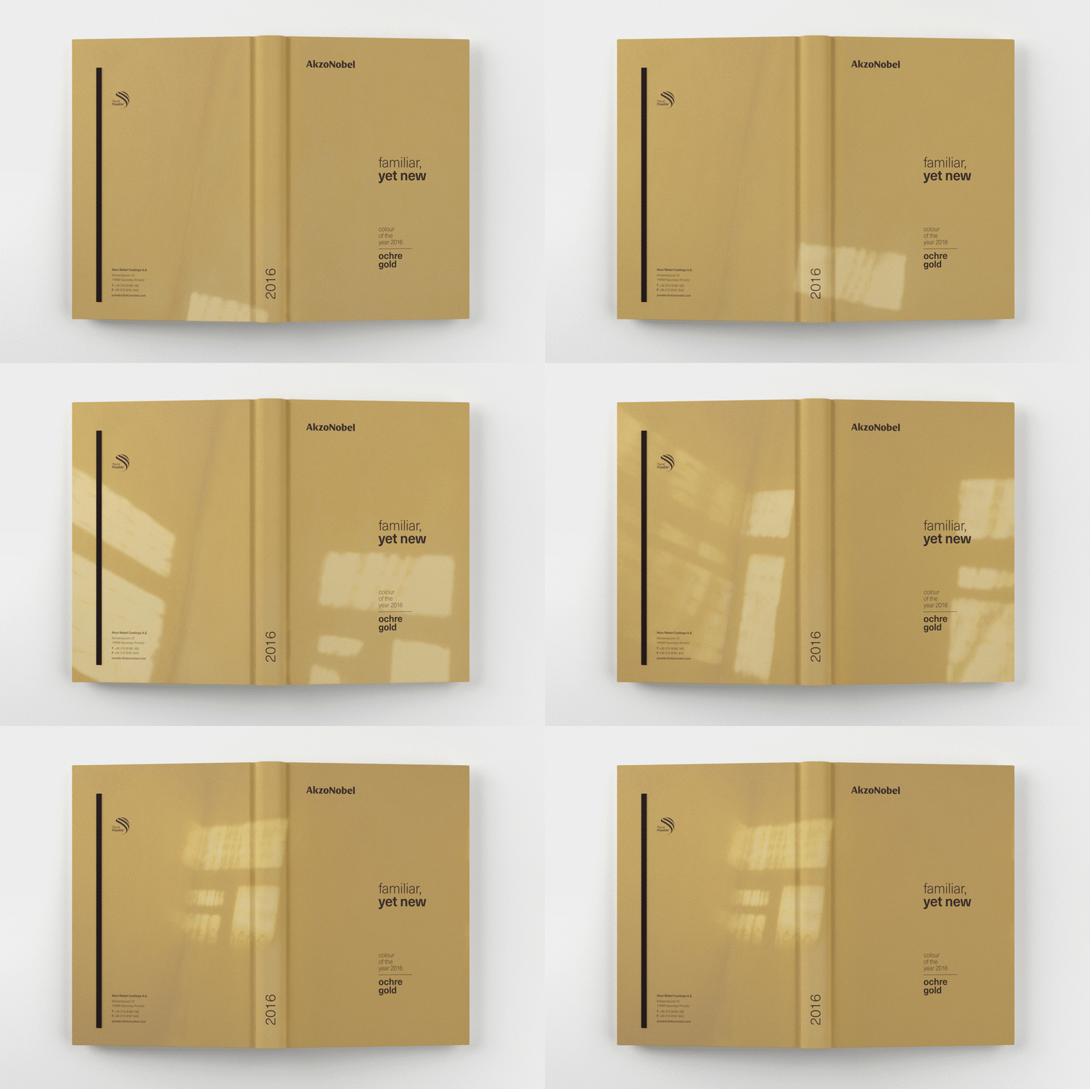
Our idea was simple; we illustrated the passing of time, alongside the familiar feel of light sliding through the window and then spreading its golden glow on the wall.

Η ιδέα μας ήταν απλή, οπτικοποιούμε το πέρασμα του χρόνου, το οικείο συναίσθημα του φωτός που γλιστράει μέσα από το παράθυρο και διαχέεται στον τοίχο.

But this sequence would have never been really actualized in print if it wasn’t for the variable data technology of digital printing.

Αυτή όμως η διαδοχή δε θα μπορούσε ποτέ να πραγματοποιηθεί σε έντυπη ύλη χωρίς την τεχνολογία μεταβλητών δεδομένων της ψηφιακής εκτύπωσης.

The calendar for AkzoNobel is printed in a variety of covers, visualizing our concept for the project. Familiar, yet new.

Το ημερολόγιο για την AkzoNobel τυπώθηκε με μια ποικιλία εξωφύλλων, οπτικοποιώντας άριστα την ιδέα μας για το συγκεκριμένο project.

OR project

OR project

packaging design,
augmented reality
application
2018

σχεδιασμός συσκευασίας,
εφαρμογή augmented reality
2018

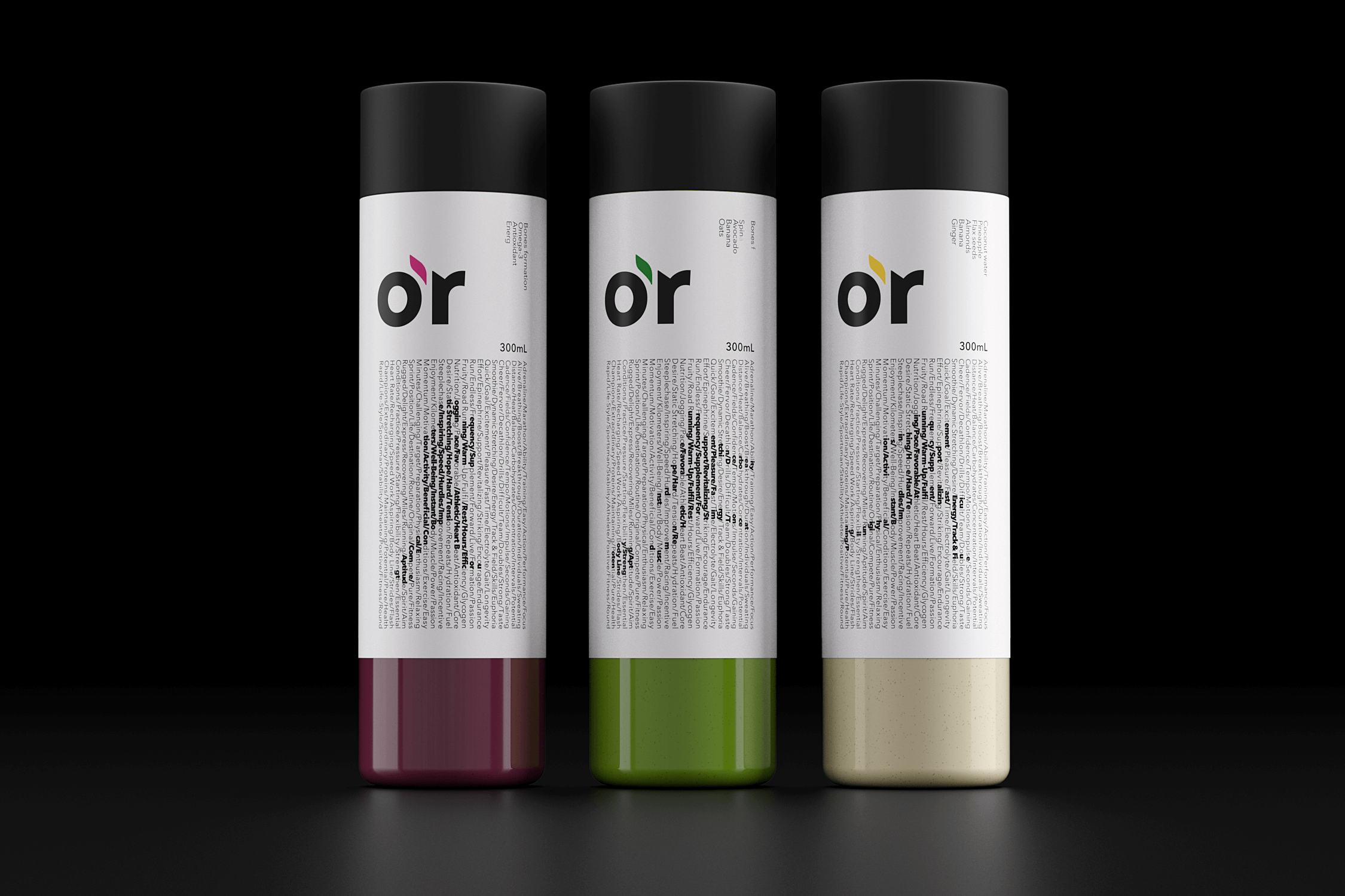
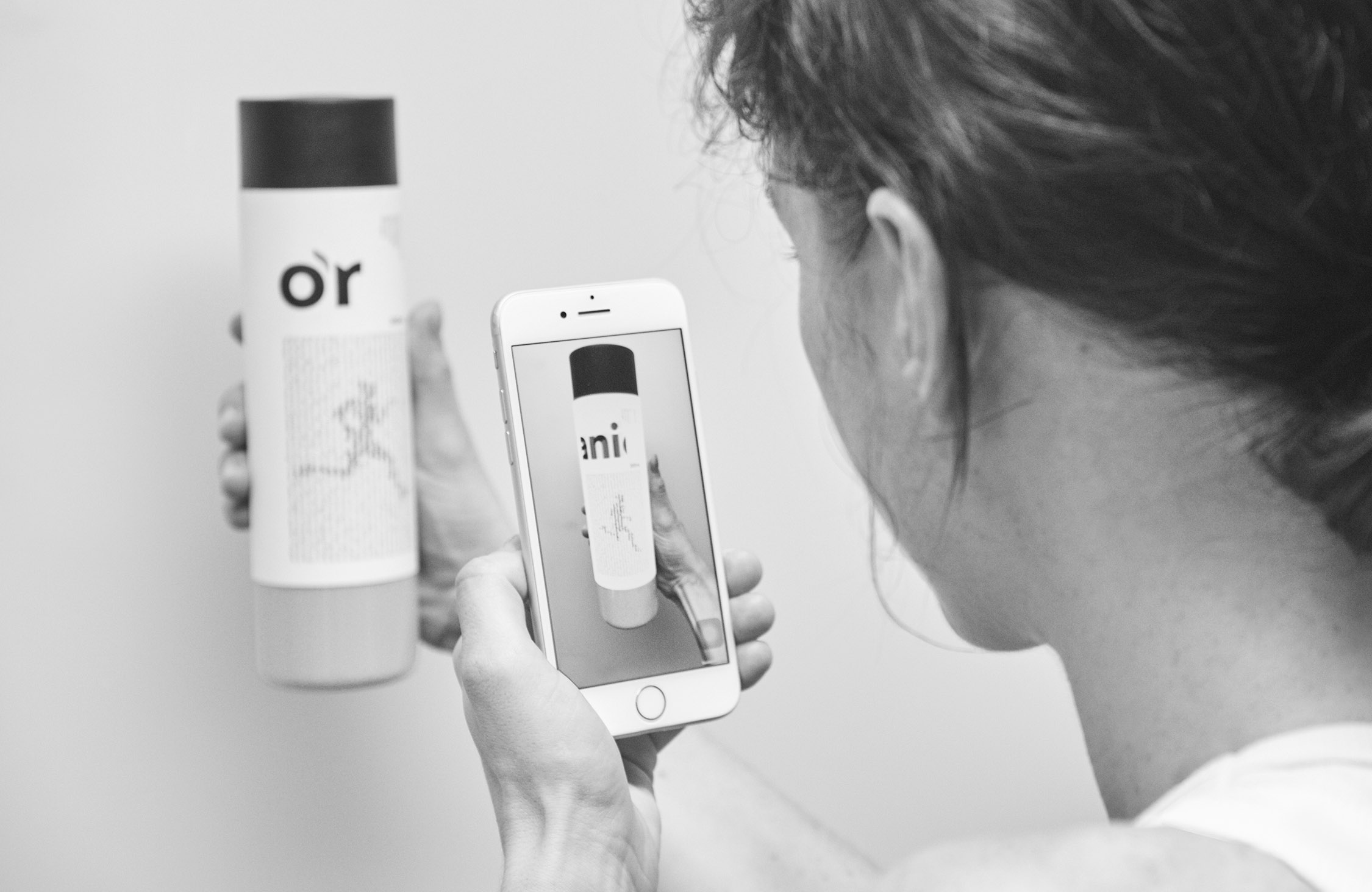
The OR project is a packaging design fusion research combining augmented reality, typography and animation.
The project includes the design of three energy recovery smoothie products. The name OR derives from the word organic.

To ΟR project είναι μια μελέτη πάνω στο σχεδιασμό συσκευασίας που χρησιμοποιεί την τεχνολογία Augmented Reality. Το project περιλαμβάνει το σχεδιασμό τριών συσκευασιών για smoothies αναπλήρωσης ενέργειας. Το ονομάσαμε OR από το ΟRGANIC.

The central concept behind the design is the use of the enhanced capabilities that AR technology offers, as a natural evolution of packaging design. We were interested in combining the element of surprise and impressiveness with the advantage of providing a whole new set of additional information, thus creating a new kind of experience between the product and the consumer.

Κεντρικό σκεπτικό ήταν οι επαυξημένες δυνατότητες της AR τεχνολογίας να είναι η φυσική εξέλιξη του σχεδιασμού της συσκευασίας. Μας ενδιέφερε το στοιχείο της έκπληξης και του εντυπωσιασμού να συνδυαστεί με το πλεονέκτημα της παροχής περισσότερων πληροφοριών για τον καταναλωτή.

To set an aesthetic limit to the infinite possibilities of augmented reality, we mainly implemented the design using various ways to manipulate and utilize the typography.

Για το σύνολο του σχεδιασμού χρησιμοποιήσαμε αποκλειστικά χειρισμούς τυπογραφικών στοιχείων, θέτοντας έτσι ένα αισθητικό όριο στις απεριόριστες επιλογές που παρέχει η AR τεχνολογία.

Finally, we developed the corresponding OR application which currently runs on iOS devices.

Τέλος, το OR application σχεδιάστηκε να τρέχει σε iOS συσκευές.

eeriee

eeriee

visual identity,
website design
2019

οπτική ταυτότητα
και σχεδιασμός
ιστοσελίδας
2019

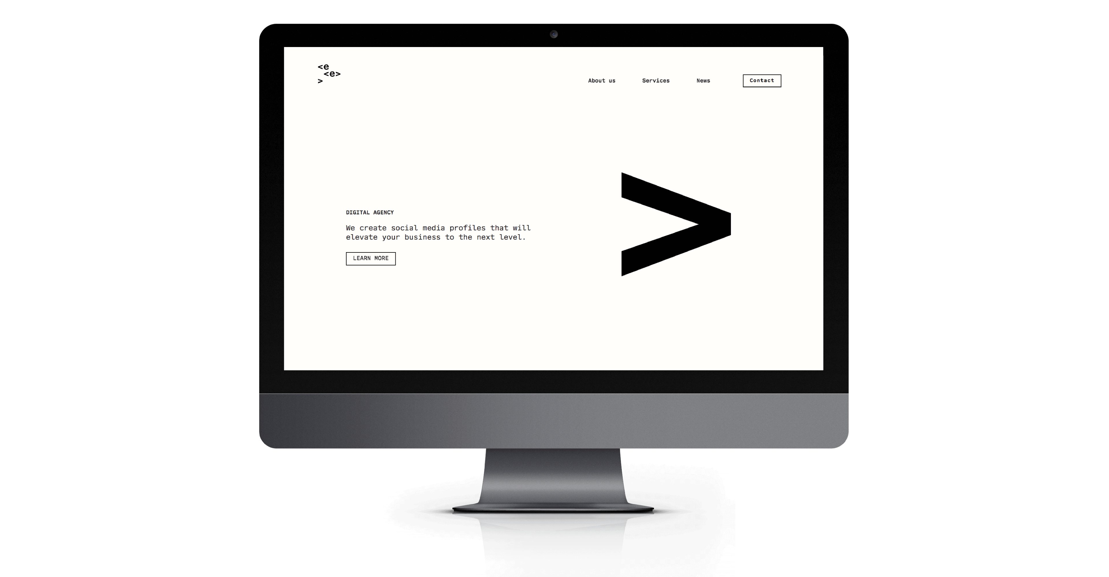
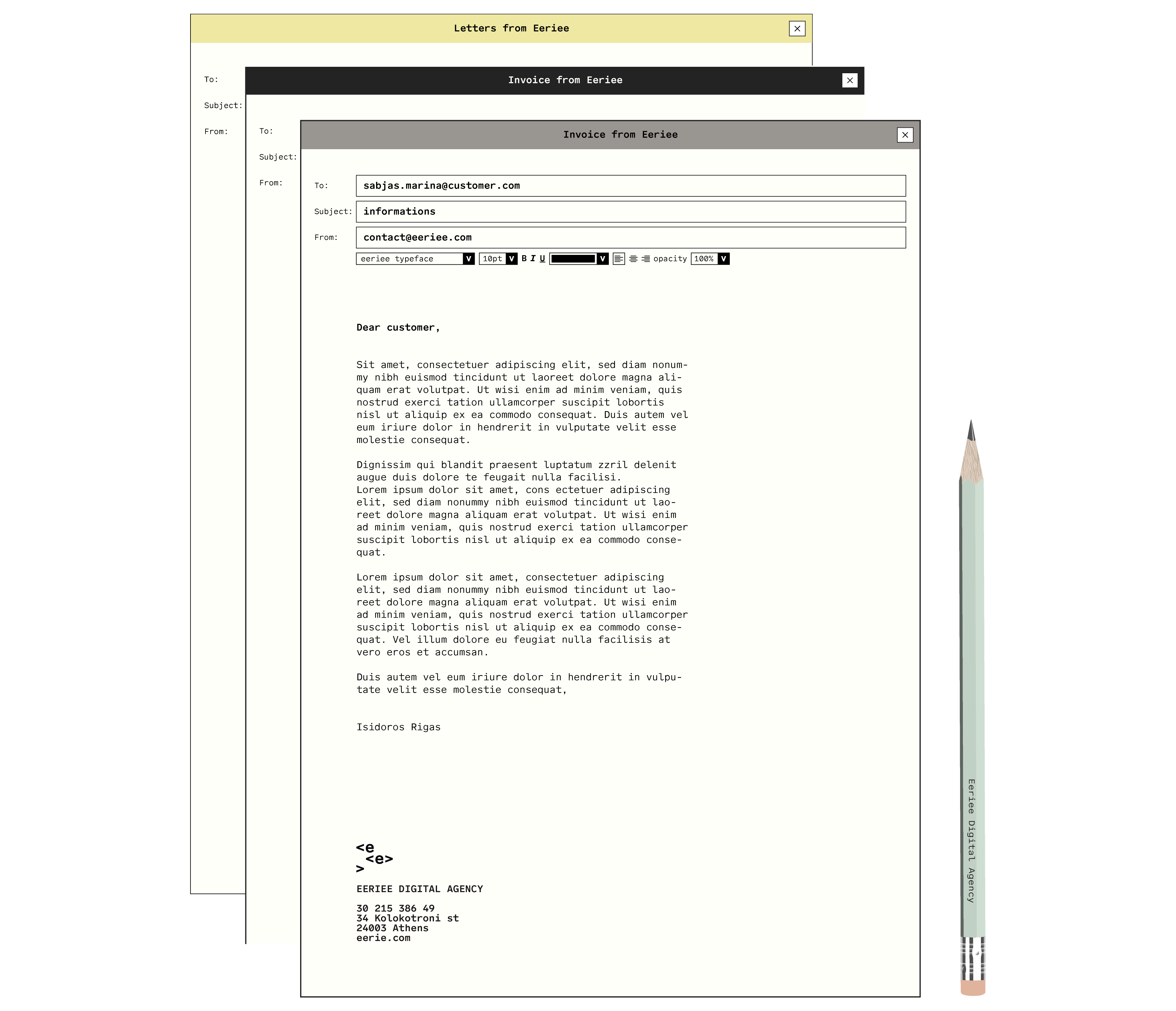
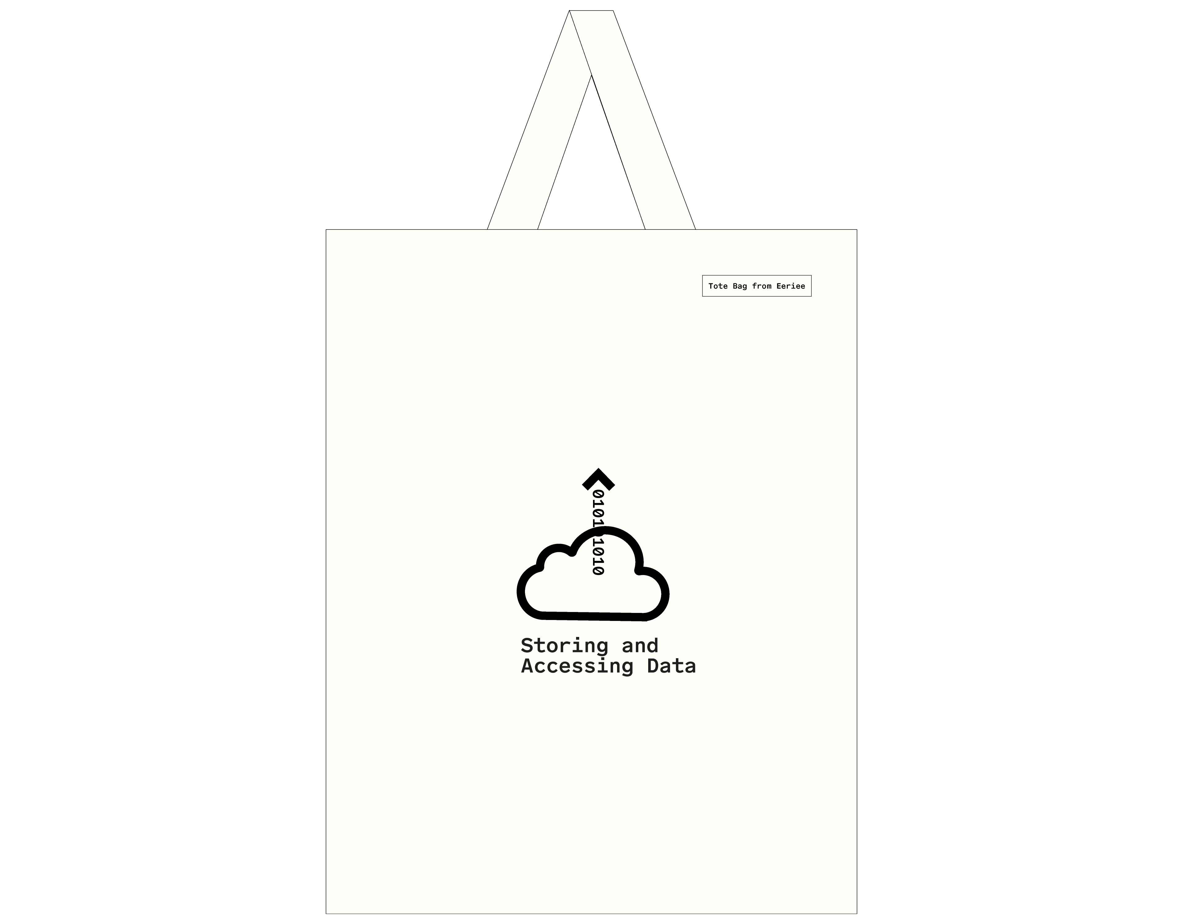
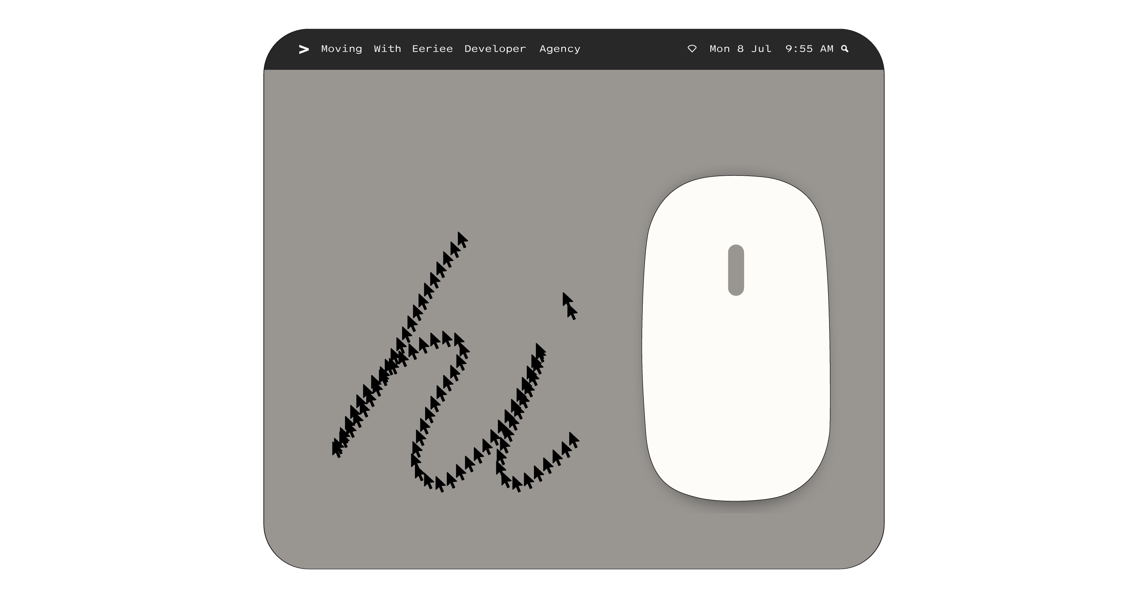
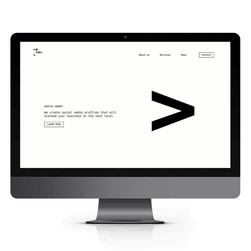
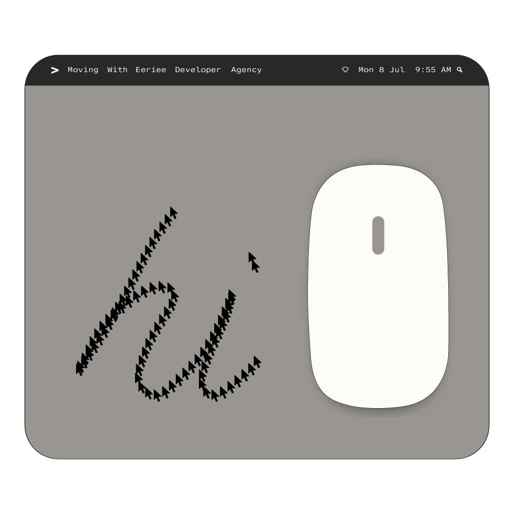
Eeriee, a new digital agency, asked us to design its visual identity and website. Our aim was a feeling of interaction while at the same time maintaining a simplistic design approach.

Η Εeriee είναι μια εταιρία ψηφιακών εφαρμογών για την οποία σχεδιάσαμε την ταυτότητα αλλά και το website από την αρχή. Αρχικά, θέλαμε να δώσουμε μια αίσθηση αλληλεπίδρασης κρατώντας ταυτόχρονα μια απλή σχεδιαστική λογική.

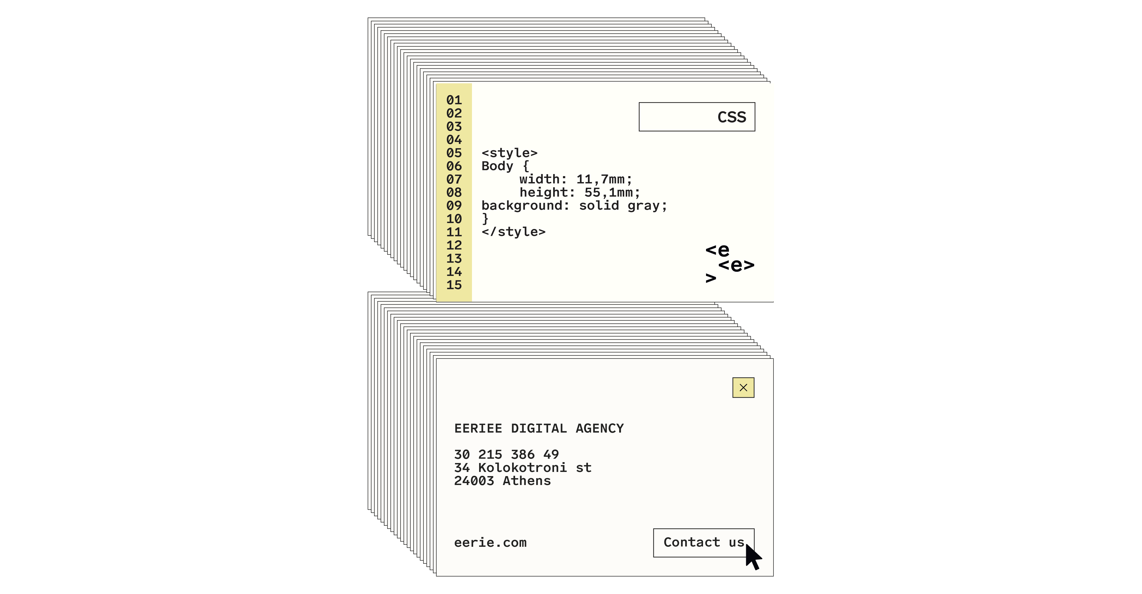
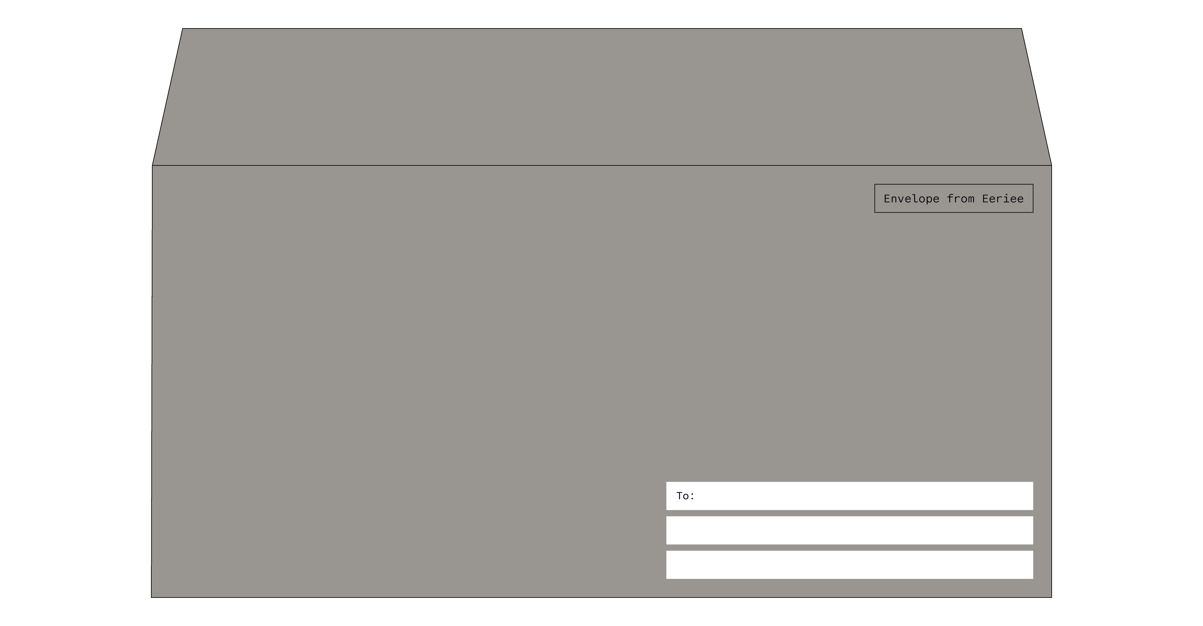
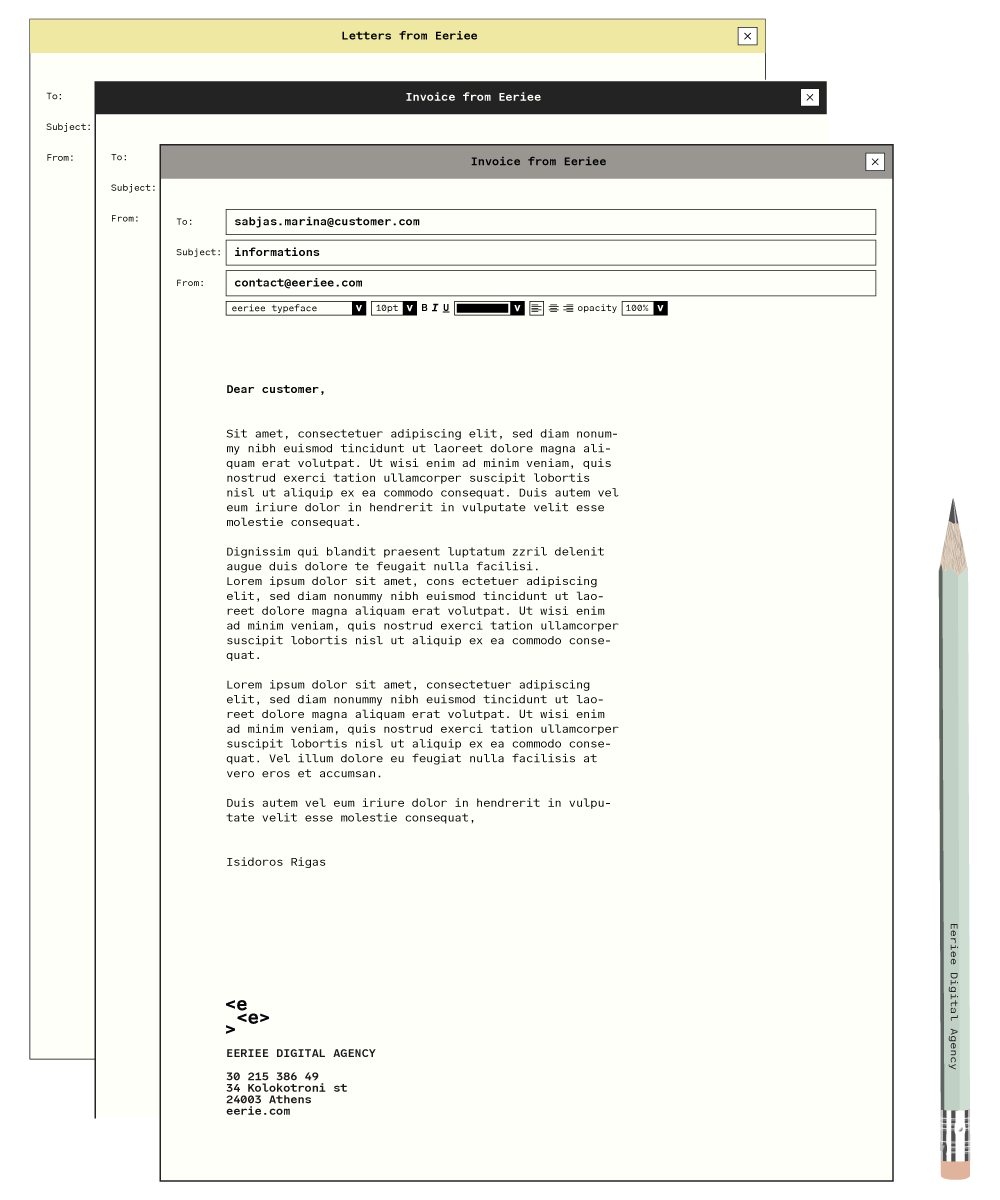
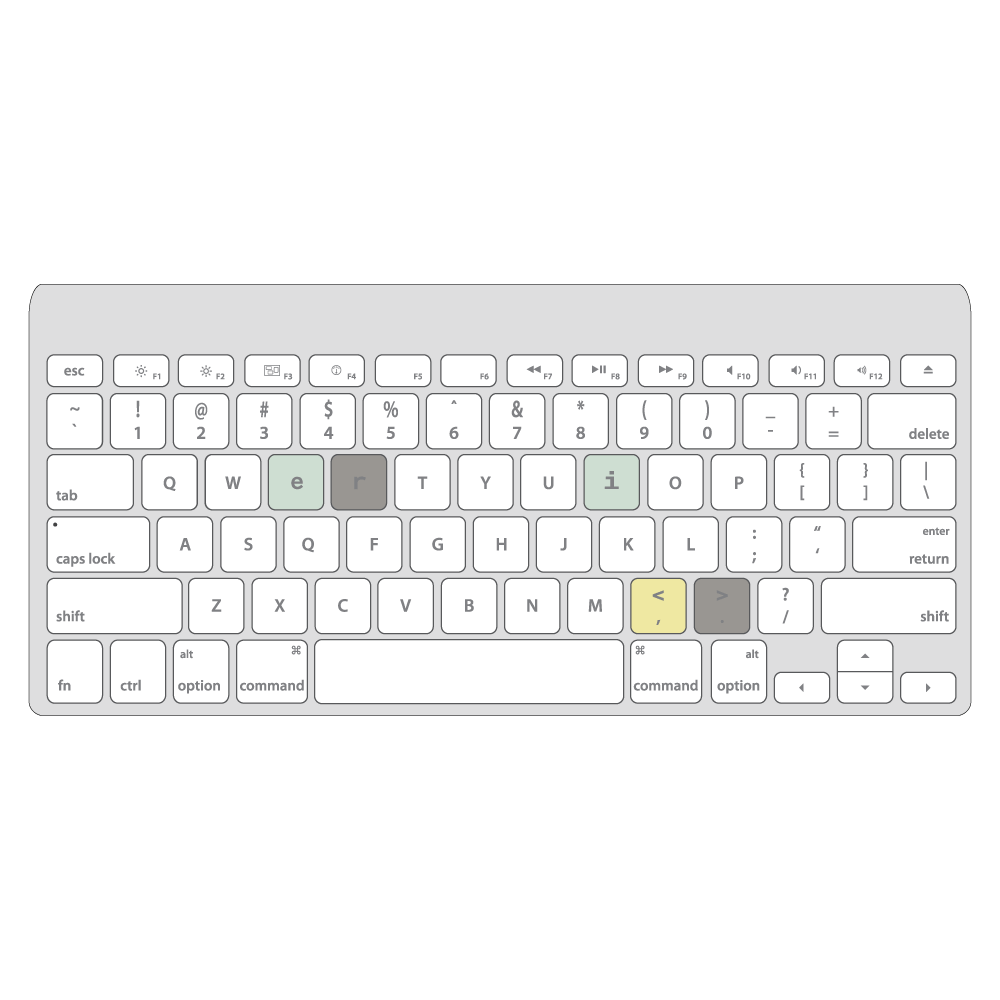
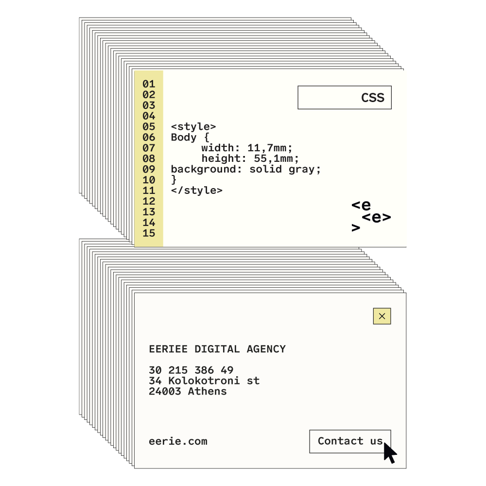
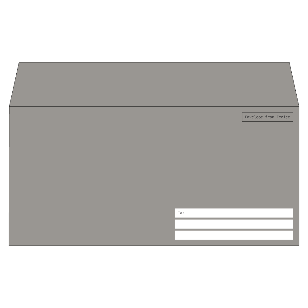
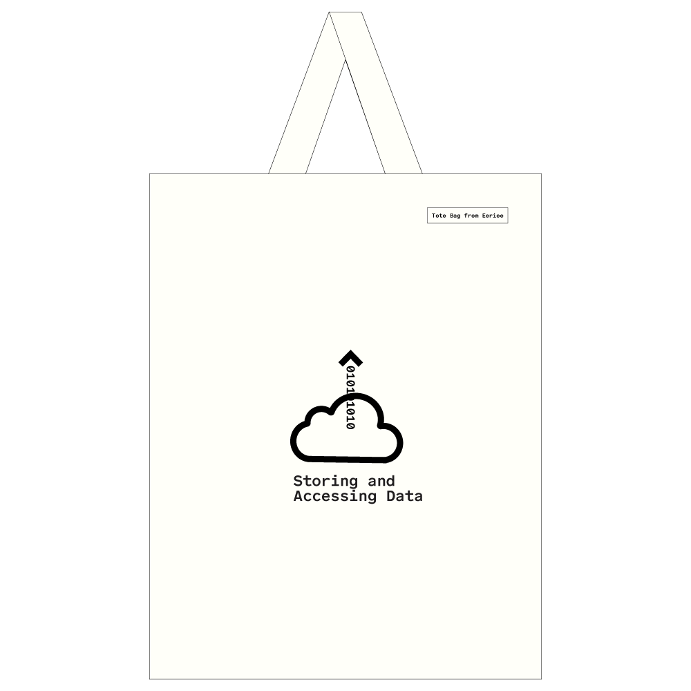
This project, which is still in progress, also included the design of stationery material that was inspired by computer language and monolithic operating systems aesthetics.

Το project, το οποίο είναι σε εξέλιξη, περιλάμβανε επίσης το σχεδιασμό του στατικού μέρους της ταυτότητας, το οποίο είναι εμπνευσμένο από τον κώδικα προγραμματισμού και την αισθητική των πρώτων λειτουργικών συστημάτων.

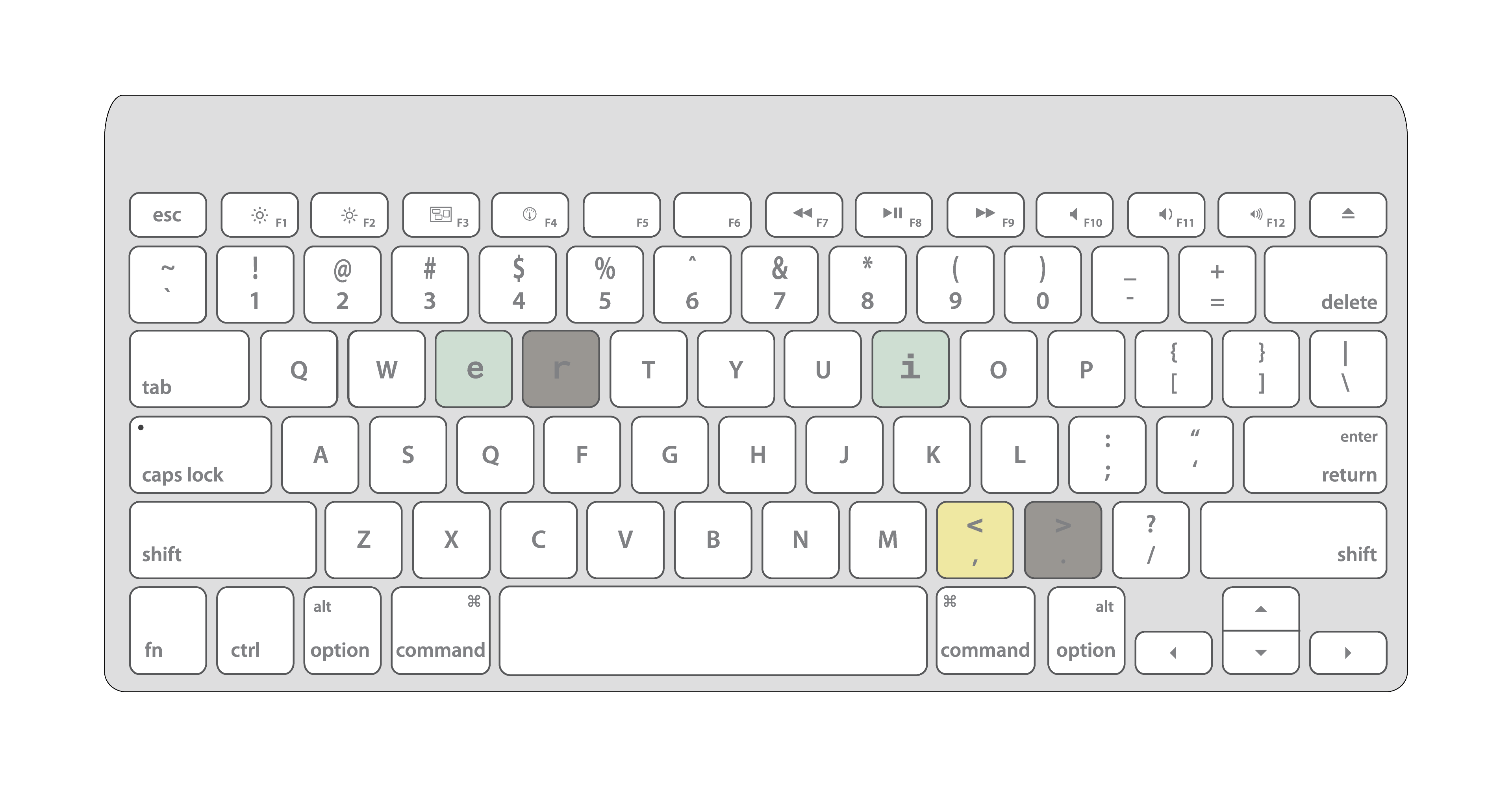
Typographically, we chose a typeface that refers to programming code language, while at the same time offers excellent legibility.

Τυπογραφικά, επιλέξαμε μια γραμματοσειρά monospaced, που ενώ εμπνέεται σχεδιαστικά από τη γλώσσα προγραμματισμού, διατηρεί πολύ καλή αναγνωσιμότητα για εφαρμογές κειμένου.

privacy policy and terms of use

Brand.new design agency (brand.new) provides this website, brandnew.com.gr, for informational and showcase purposes. By accessing the website, you accept these Terms and Conditions of use and Privacy Policy, as may be amended from time to time, without limitation or qualification. If you do not wish to be bound by these Terms and Conditions, please refrain from further use of the website. All Content is Protected by Copyright Laws. Images, text, software, documentation, electronic text and image files, audio and video files and clips, and other materials on the Website are protected by copyright laws and may be covered by other restrictions as well. brand.new retains all rights it may hold, including copyright, in data, image, text, and any other information contained in these files. Copyrights and other proprietary rights in the material on the Website may also subsist in individuals and entities other than, and in addition to, brand.new. Brand.new expressly prohibits the copying of any protected materials on the Website. Commercial Use is Restricted Unauthorized publication or exploitation of brand.new’s files is specifically prohibited. Anyone wishing to use any of these files or images for commercial use, publication, or any other purpose must request and receive prior written permission. All requests to reproduce content from the Website should be made withi info@brandnew.com.gr or call 210.321.4.123 Reservation of Rights All rights not expressly granted by brand.new herein are specifically and completely reserved. Nothing on the Website or in these Terms and Conditions grants, expressly or implicitly, by estoppel or otherwise, any right or license to use any content or property of any third party, or may be construed to mean that tbrand.new has authority to grant any right or license on behalf of any third party.

Trademarks
“Brand.new” is a registered trademark of Mentzos Konstantinos (the “brand.new Trademark”). You may not use the brand.new Trademark without brand.new’s prior, written permission in each case. The names, titles, trademarks, service marks, and logos of third parties on the Website from time to time are registered and unregistered marks of those third parties; you may not use these trademarks without prior, written permission of their respective owners. You acknowledge and agree that nothing on the Website grants, expressly or implicitly, by estoppel or otherwise, any right or license to use the brand.new Trademark or may be construed to mean that brand.new has authority to grant any right or license on behalf of any third party trademark owner. Protection of Privacy brand.new is committed to protecting the privacy of its Website visitors in accordance with applicable laws and regulations. brand.new collects and stores aggregated, anonymized or pseudonymized information about your activity on and interaction with the Website, such as your IP address, the type of device or browser you use, and your actions on the Website. brand.new uses the information it collects for the following purposes: To track and analyze use of the Website so brand.new can provide users with the best experience possible. Brand.new will indefinitely retain the aggregated, anonymized or pseudonymized information brand.new collects from you to protect the safety and security of the Website, improve the Website, or comply with legal obligations. You will always have the opportunity to unsubscribe from future Newsletter correspondence. Brand.new may share the information with certain trusted third-party services to help provide, improve, promote, or protect the Website. When brand.new shares information with third-party services that support its delivery of the Newsletter, brand.new requires that they use your information only for the purposes brand.new has authorized, and that they protect your information at least to the same standards brand.new does. brand.new may also share information that has been aggregated and anonymized in a way so it does not directly identify you. brand.new may include links to other websites or services whose privacy practices may differ from brand.new’s. When you use a link to an external website or service, the privacy policy and data processing disclosures for that website or service governs. Links to Third-Party Websites brand.new has not reviewed all the websites or services linked to or from the Website. brand.new provides these links as a convenience and linking to any third-party websites or services is at the user’s own risk. A link does not imply endorsement or affiliation with the linked website by brand.new. DISCLAIMER BRAND.NEW PROVIDES THE WEBSITE ON AN “AS IS” BASIS. YOUR USE OF THE WEBSITE OR ITS CONTENTS, IS AT YOUR OWN RISK. BRAND.NEW DISCLAIMS ALL WARRANTIES OF ANY KIND, WHETHER EXPRESS OR IMPLIED, INCLUDING BUT NOT LIMITED TO THE IMPLIED WARRANTIES OF MERCHANTABILITY, FITNESS FOR A PARTICULAR PURPOSE, COPYRIGHT OR TRADEMARK OWNERSHIP AND/OR NONINFRINGEMENT OF COPYRIGHTS OR OTHER THIRD PARTY PROPRIETARY RIGHTS. BRAND.NEW DOES NOT WARRANT THAT THE WEBSITE WILL PROVIDE CONTINUOUS, PROMPT, SECURE, OR ERROR-FREE SERVICE. BRAND.NEW MAKES REASONABLE, ONGOING EFFORTS TO REVISE AND UPDATE THE WEBSITE, BUT ASSUMES NO LIABILITY FOR ANY ERRORS OR OMISSIONS, INCLUDING THE INACCURACY OF CONTENT, OR FOR ANY DAMAGES OR LOSSES THAT YOU OR ANY THIRD PARTY MAY INCUR AS A RESULT OF THE UNAVAILABILITY OF THE WEBSITE. BRAND.NEW ASSUMES NO RESPONSIBILITY, AND SHALL NOT BE LIABLE FOR, ANY DAMAGES TO YOUR COMPUTER EQUIPMENT OR OTHER PROPERTY ARISING FROM YOUR USE OF THE WEBSITE, INCLUDING BUT NOT LIMITED TO THE REPRODUCTION OF THE WEBSITE’S CONTENT. LIMITATION OF LIABILITY NEITHER BRAND.NEW, ITS AFFILIATES, DIRECTORS, OFFICERS, EMPLOYEES, OR AGENTS WILL HAVE ANY LIABILITY FOR ANY DAMAGES, INCLUDING, WITHOUT LIMITATION, ANY DIRECT, INDIRECT, INCIDENTAL, COMPENSATORY, PUNITIVE, SPECIAL, OR CONSEQUENTIAL DAMAGES (EVEN IF BRAND.NEW HAS BEEN ADVISED OF THE POSSIBILITY OF SUCH DAMAGES) ARISING FROM OR RELATED TO YOUR USE OF THE WEBSITE AND/OR ITS CONTENTS. Indemnification By using the Website in any manner, you represent and warrant that your use will be consistent with these Terms and Conditions. You agree to indemnify, defend, and hold brand.new, its affiliates, directors, officers, employees, and agents harmless from all claims, causes, costs, expenses, fees (including reasonable attorneys’ fees), judgments, liabilities, losses, and damages arising from or relating to your use of the Website. Venue and Choice of Law The Terms and Conditions and any counterparts, amendments, or revisions there to will be governed and construed in accordance with the laws of Greece and European Union, without regard to principles of conflicts of laws. Any case, controversy, suit, action, or proceeding arising out of, in connection with, or related to the Terms and Conditions will be brought in any Greek court located in Athens, and you hereby waive any objection that you may have to personal jurisdiction in these courts. Entire Agreement; Severance; Waiver These Terms and Conditions incorporate by reference any notices on the Website constitute the entire agreement regarding user access to the Website. If any provision of the Terms and Conditions -is deemed unlawful, void, or unenforceable, that provision will be severable from the remaining provisions and will not affect their validity and enforceability. Brand.news failure to enforce a provision on any occasion will not be construed as a waiver of such provision.

Close